Google analytics was not built for the arts. Most of the time that’s fine: as a museum we still care about all kinds of standard metrics. Pageviews still matter, session behavior matters, referrals matter, ecommerce matters, and when we need something specific to our platform or its extensions we can usually cover it with custom event tracking or find another tool that can give us what we need. But as we’ve tried to more cohesively analyze data around our exhibitions, it’s become more and more labor intensive to identify the throughlines between content spread across different aspects of our online presence. There are a number of ways we’re working to answer this challenge, and one is through better utilizing custom dimensions.
What are custom dimensions?
Custom dimensions are a feature of Google analytics that allows you to create your own organizing principles for your data. For the Whitney, this means we could associate behavior by internally important concepts like exhibitions, events, artists, or visitor motivations. Dimensions can slice across all the metrics we already track, but allow for different ways to frame investigations of our content. They are effectively a label, following rules of our choosing, to brand existing data in ways that are meaningful for an art museum.
Isn’t there [x] [y] or [z] platform that could do this?
Adding more tags and the burden (both human and technical) of more platforms fragments our ability to cohesively analyze our data, and impacts our ability to answer basic questions about the things we do and the exhibitions and artists we support. What we need are faster ways to look at our data in the proper contexts, and as a relatively small organization we simply don’t have the time to be endlessly checking and supporting a large number of reporting platforms.
So how are custom dimensions useful in practice?
The original question that instigated much of our work with custom dimensions was, on the surface, a straightforward one:
“How can we measure of the performance of online exhibition content before, and after it opens?”
Fundamentally that’s a question with two primary components: 1) Time, and 2) Performance relative to that time. And both aspects are theoretically available with all of our existing web analytics data: we know when shows are open and when they’re closed, and we have all manner of metrics to track the videos and features that we could review during those windows. But what becomes immediately apparent after any attempt to start collecting that data for review is just how much labor would be involved in comparing across exhibitions.
Exhibitions do not all open at the same time, and they don’t close at the same time. Shows are almost always operating under their own schedules, so something as basic as choosing the time range in Google Analytics becomes horrendously tedious as it means doing separate reporting for each and every show, since Google Analytics has no concept of an exhibition opening date. And even if that were feasible for a small team, the second ruining factor for this approach is that not all of our exhibition focused content lives on a single page — important media like essays, or audio guides, or Whitney Stories live outside the traditional exhibition pages we put together, so any review centered only on say whitney.org/exhibitions/programmed, won’t cover everything we need it to. And that isn’t even starting to cover related behavior that is absolutely tied to exhibition performance like selling tickets or memberships online, or diving into other related resources like the collection or events.
In short, exhibition performance depends on multiple aspects of whitney.org, and a concept of time that is not natively accessible within Google Analytics.
Solving the problem
Starting with the assumption that someone interested in an exhibition will visit the exhibition page on whitney.org, we built out a number of custom dimensions to assist us in tracking exhibition performance across the site. The dimensions we added for exhibitions all depend on a user first visiting an exhibition page. Once they’ve done that, their session is tagged with three dimensions:
- Exhibition. The title of the exhibition.
- Exhibition phase. “Present,” “future,” or “past” depending on if the exhibition is currently open, yet to open, or closed.
- Exhibition relative date. A numerical value representing the number of days from the opening date (4 days before would be “-4”, 10 days after would be “10”, and opening day would be “0”).
With these three dimensions in place it becomes possible to build segments or reports based only on a single exhibition, but review data from everything they did across the site during that session, from watching videos to diving into the collection after reading about a show to purchasing tickets. It also becomes possible to build reports for all exhibitions, but limit it to a specific phase (e.g., pre-opening), or an exact range of days (e.g., the week before opening). All of that data was possible to gather before, but by building the attribution into the Google Analytics structure it becomes far less labor intensive.
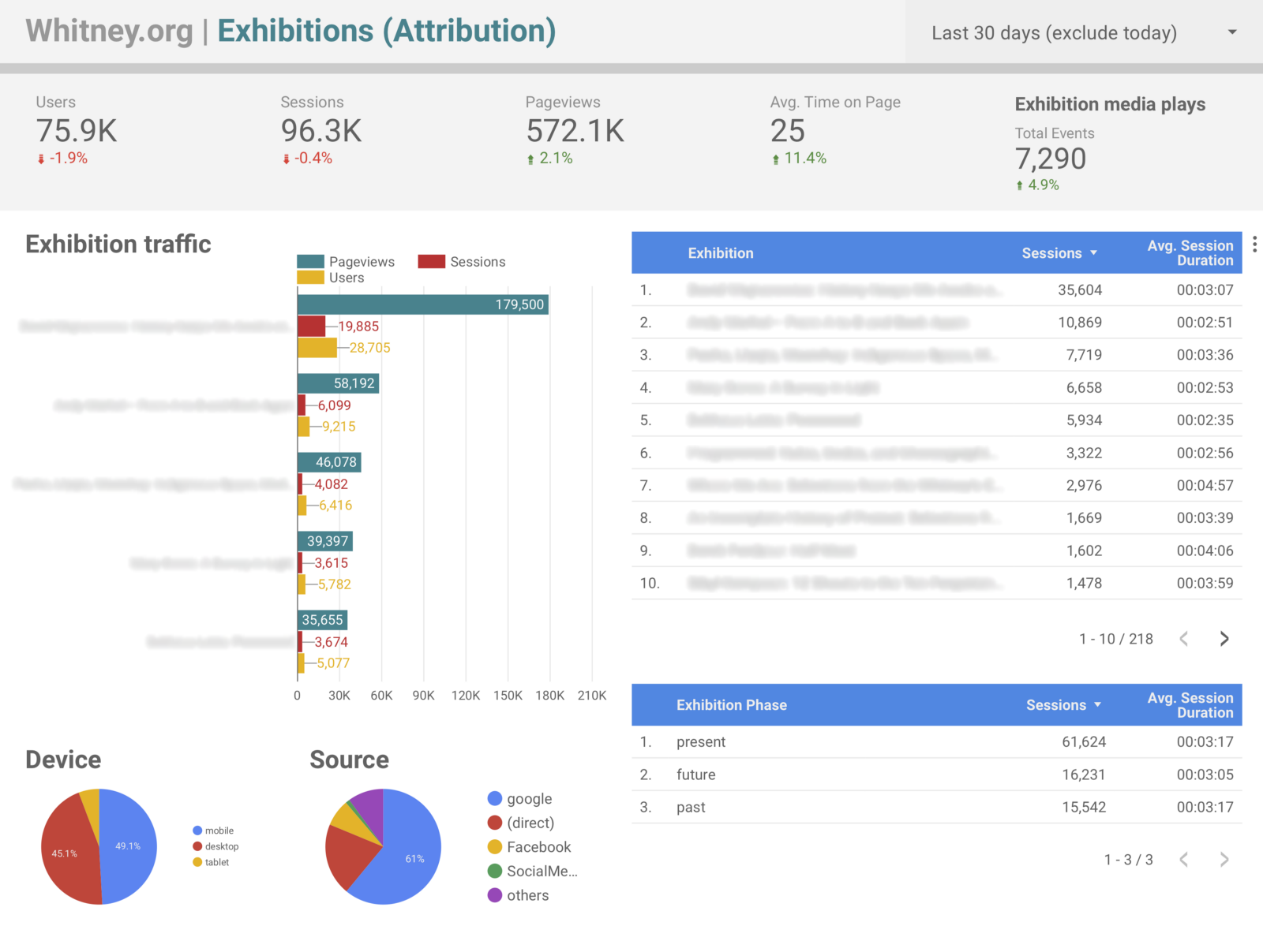
Outside of answering the original question of what performance looks like before and after an exhibition opens, this approach offers up a host of other interesting ways to slice our data. One of the most significant is in being able to easily attribute our ticket and membership sales to specific exhibitions. Prior to these dimensions, it was possible to build segments that filtered based on sessions that included specific exhibition pages, and review ecommerce conversion rates, but with the updated tracking in place it became trivial to setup Data Studio dashboards that labeled transactions by exhibition title rather than by url (which is not a small gain in terms of readability and by extension share-ability), alongside all sorts of other metrics.
Again the benefit is less about enabling technically new data, than offering up easier and more human-friendly ways to view it. Instead of manually checking the dates for a specific exhibition it is now possible for us to create reports framed in ways that cover many. Considering the last 9 months of exhibition data since the start of 2018, some of the points that are now easy to pull include:
- 66% of exhibition traffic has been to exhibitions while they were open, 19% to ones that were closed, and 15% to ones opening in the future.
- Users viewing presently open exhibitions spent 20% longer on the site on average than those looking at past or upcoming ones.
- 83% of exhibition-driven revenue came from shows that were currently open, and 16% from ones opening in the future.
- 76% of exhibition-associated audio guides views came from shows that were currently open, and 20% from ones that have already closed.
So far the top traffic (opening, +58, +1) and top earning days (-98, +60, -97) for our exhibition pages have been a bit a bit all over the place, reflecting specific news events and marketing efforts, which suggests that much of this sort of data will take time to settle into clearer trends. However, much of these kinds of time-based comparisons can be supported through other investigative methods. For example, in the case of audio guide usage, we ran a one question motivation survey on the audio guide section of the site asking users if they had seen the associated exhibition at the Whitney. Of the 964 responses we collected, 69% of those users said they had seen the show, and the remaining 31% that they had not. Combined with the data point above, it is clear that the majority of external-to-the-building audio guide usage occurs post-visit, after seeing the show and while it is still open.
What are the limitations?
All that said, one really critical assumption here is that most users are visiting only one exhibition page, or that the last exhibition they view is the most important one for the purposes of our data (as that last-view will override any earlier exhibition-related values for their session). Given our usage data on whitney.org, this seemed reasonable given the small fraction of users that view multiple exhibition pages during a session, but it is important to keep in mind.
What else can this kind of approach be used for?
Aside from the three exhibition-focused dimensions discussed here, we have 9 others that cover other aspects of the site. Three are used in the same way as exhibitions for events, and the remaining 6 are used for things like tracking audio guide and Mobile Guide usage, language settings, and visitor motivations (look for a future post for a deep dive on that). By re-framing how we could consider our exhibition analytics data, other avenues for improvement quickly presented themselves.
Conclusion
Google Analytics custom dimensions have been a vital part of our journey to be able to consistently and useful report on our exhibition performance. The challenge of answering our original question is still ongoing, in large part because of the need of having to see multiple shows go through our updated data-collecting process, but also because we are still figuring out what metrics are meaningful for our particular content.