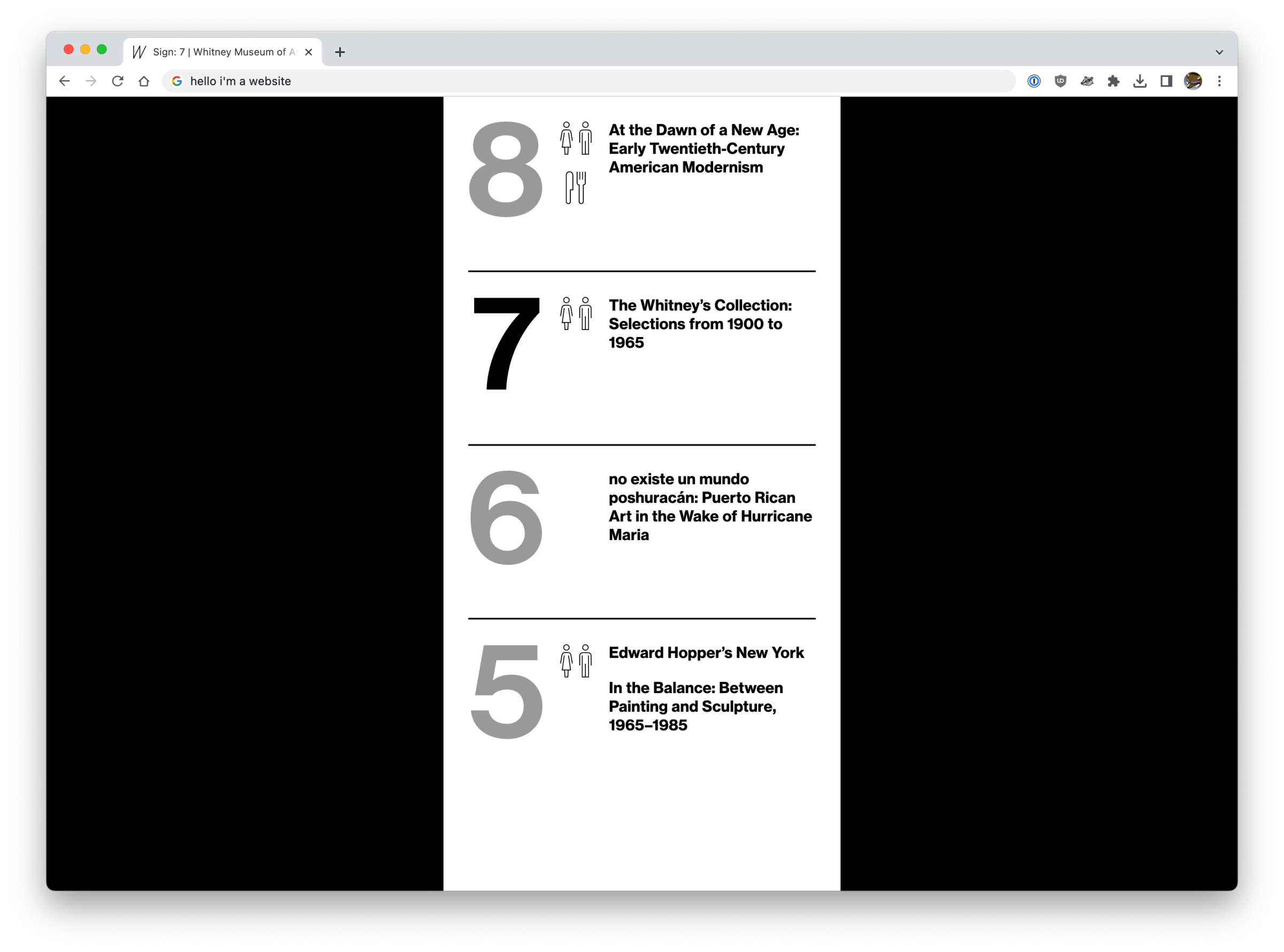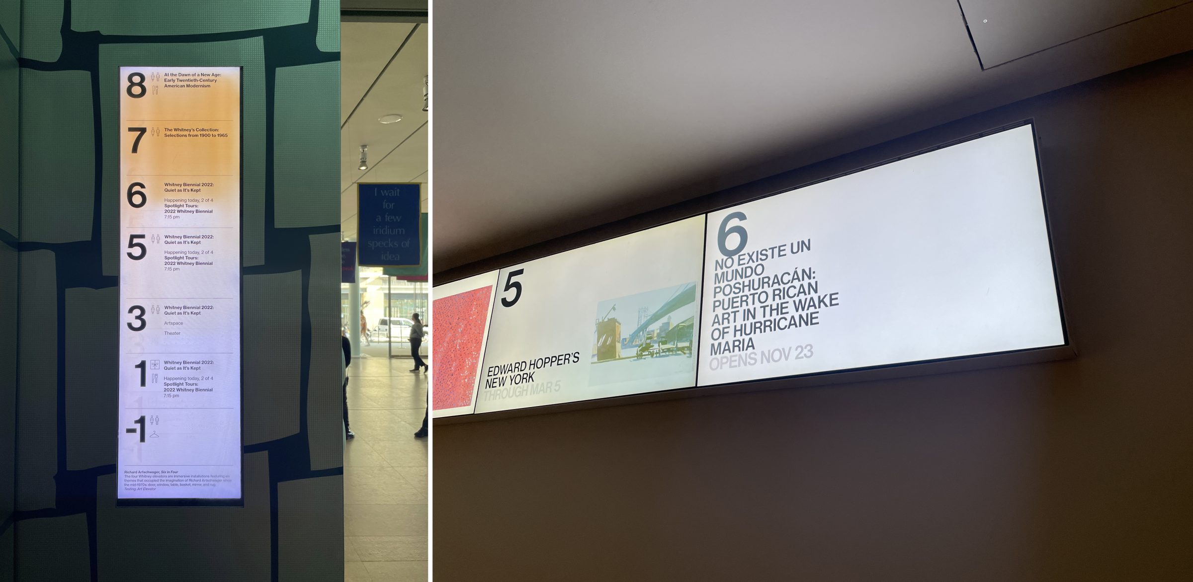
It’s webpages. The museum’s new digital signage system is webpages.
Some background
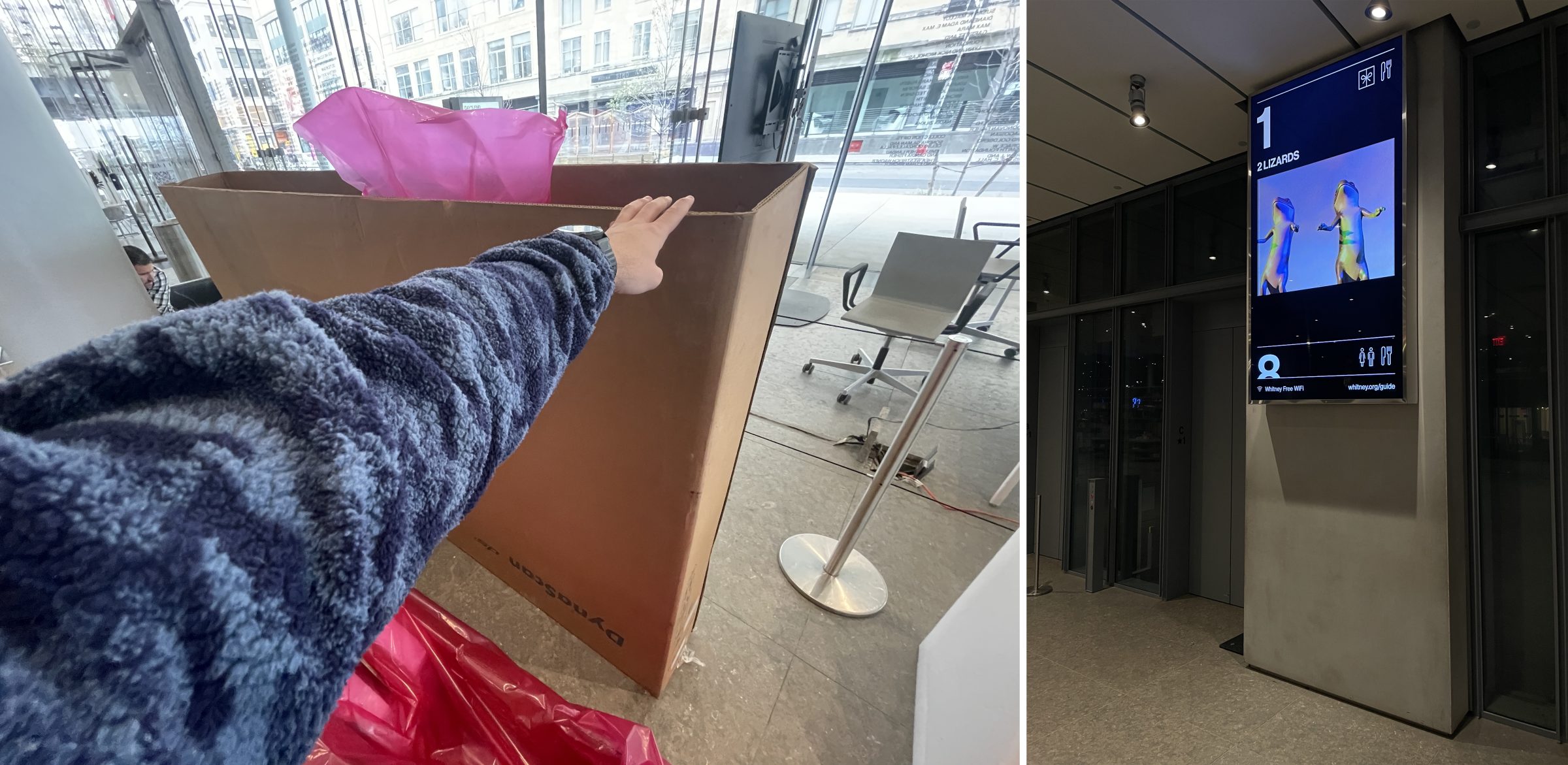
Since opening in 2015, the Whitney’s 99 Gansevoort building has been served by digital signs on every floor plus a pair outside the lobby on the terrace. Each of these approximately 18ish displays of various shapes and sizes have been driven by some fairly complicated software, outputting some manner of template that mostly shows the various exhibitions and events happening around the museum. For the screens outside of the building, this is mostly promotional content, while the interior screens act as tools for wayfinding and determining what’s available to a visitor and on what floor. It’s these interior screens that are most critical to people visiting the Whitney, and also cause the most technical problems.

As the hardware began to age out and fail, the opportunity was there to re-work how these kinds of displays were driven, and build a more modern and supportable software solution. For us that meant turning to the web.
The old way: Flash + XML
The interior screens were basically Flash templates fed by a big XML file that we output regularly from the CMS that powers whitney.org. That XML file was ingested by a separate stack of software, representing multiple pieces of 3rd party solutions, and it was in that ingestion that many of the problems we’ve faced over the last few years came from. Fundamentally the data models between what we input on whitney.org to build out our exhibitions and events online did not match that of the system we were pushing to for signage, and in that gap there have been a lot of bugs. Neither data model was necessarily wrong, but the fact they didn’t match was an issue, and it became more and more of one as we gradually altered the content we were posting.
Similarly, our digital design practices also drifted over the years, while the signage templates stayed static. Part of that was technical limitations, but part of it was also just the fact that nobody wanted to touch anything when the stakes are multi-day screen outages.
The new way: HTML + React
It feels a little goofy to say this, but since 2015 the web has only continued its growth as an actual platform for applications. Whether that’s the popularity of solutions like Electron for app delivery, or React and Vue for building interactive UI’s, or just the fact that CSS has gotten to the point where complex layouts are no longer a pain thanks to Flexbox and Grid. The web is really really good for building out the kind of solution you need for robust digital signage, and it has the advantage of being something that the Museum is already skilled-up to do. It can also be iterated on alongside our primary website, whitney.org, in a way that would never be possible with a more bespoke software solution.
For the new signage software we built out some new endpoints for our CMS’s API, and new single-page React apps for each kind of sign. We are using websockets for some instantaneous controls over the signs, but for the most part they just poll for changes every 30 seconds. Content is pulled (via the API) largely from the same exhibition and events records we enter into the CMS for display on whitney.org, so there’s no double-entry into separate systems.
The biggest obstacle to this approach wasn’t building the web apps (this was somewhat tricky, but we didn’t need to use websockets or have robust animations), or getting buy-in (this was an easy sell, given how messy the alternatives would be). What turned out to be the trickiest piece of the puzzle was figuring out what hardware would be most appropriate to run these webpages.
Enter BrightSigns
Essentially what we needed for hardware would be something that would:
- Be able to display a webpage with a relatively modern browser
- Be relatively easy to setup
- Be very stable
- Be performant enough for smooth animations at high resolution
- Not require constant updates, or hounding about updates, or messages from the OS, or any other kind of interruptions when we least expect it
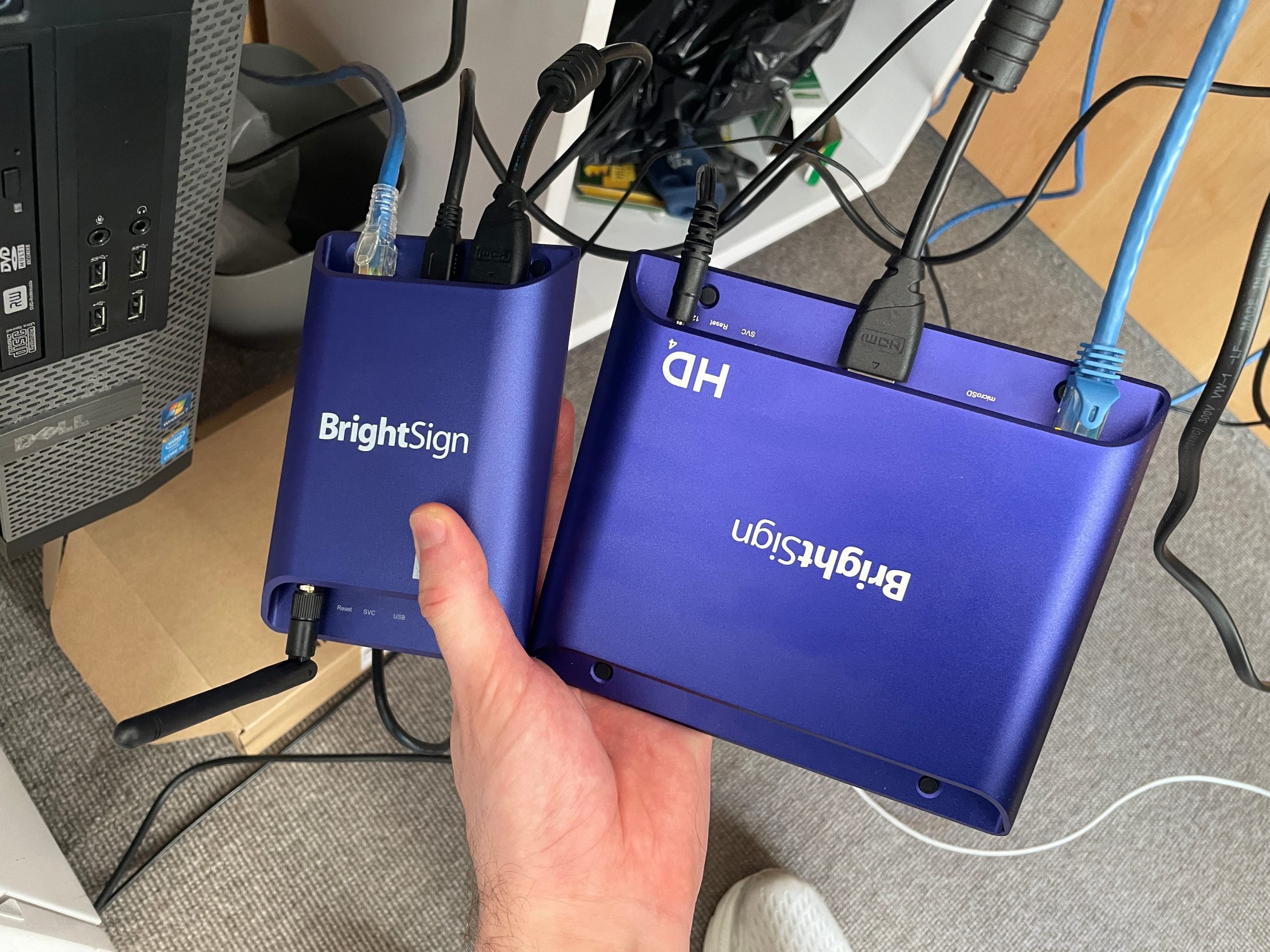
It’s possible to configure PCs, or Macs, or Linux boxes to do everything we needed, but the overhead for that kind of solution would be extremely challenging for our relatively small staff. We’re not in a position where we could be building out robust tooling for management of a fleet of full-on computers, and troubleshoot whatever issues we’d surely run into with OS updates or problems with running a chromeless Chrome. So we needed something more off the shelf, designed to run a webpage fullscreen for long periods of time with minimal upkeep. And thankfully for us BrightSigns are able to do just that.

BrightSigns are basically just small Linux computers running an OS built for digital signage. If you work at a museum that shows video installations, you might already have a whole bunch of them. They’re relatively inexpensive and easy to source, and they form the hardware side of our new web-based approach. They’re not perfect, and BrightAuthor:connected is…not exactly dream software, but it’s good enough.
The results

At the time of writing this, we’ve replaced the majority of the old displays with new hardware, and we’ve swapped out all content inside the building to be running on the new website/BrightSign stack. While there’s been some hiccups as we’ve adjusted, there’s no question this was the right approach for the future. We are in a far better position now to own the experience on these displays, and adapt them as the museum continues to grow and change.
And because they’re webpages, they also play Sunrise/Sunset now 😊.