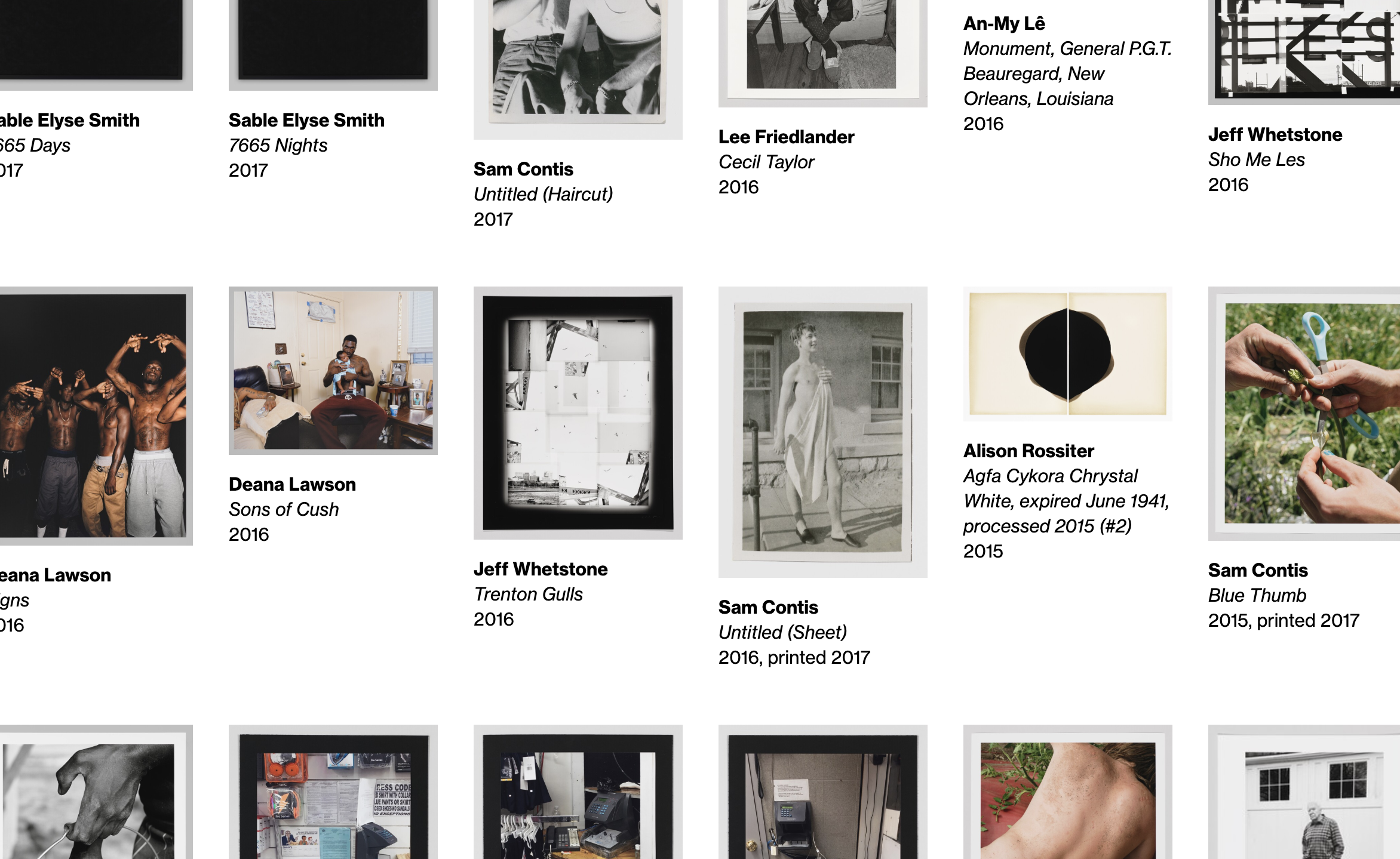
The Whitney’s collection defines and drives much of our mission and our work. It is a unique resource, offering a lens into the historical and contemporary landscape of American art through more than 3,400 artists and 23,000 works of art. With the opening of the Whitney’s new building in 2015, nearly every work in the Museum’s collection was made available online for the first time.
That the initial platform was developed and launched alongside a flurry of other initiatives reflects the challenges, scope, and successes of the release. And while the online collection has been something to celebrate, now coming on five years later we are ready to start making improvements.
Saying goodbye to collection.whitney.org
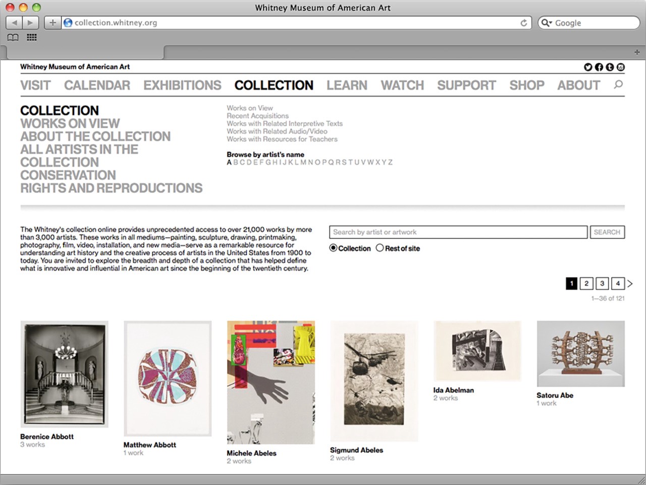
The core challenge of any museum’s online collection work is reflected in how many systems and limitations are in play, at all levels of any technical stack. When we first launched the complete online collection, Cogapp and Whitney staff worked together to build a solution that would push our data out of The Museum System (TMS), our database of record, and into forms usable publicly online. Previously the result of this effort lived at collection.whitney.org, which notably is separate from the primary hub of our content and information that lives at whitney.org. Having separate systems allowed for a simpler initial implementation of the collection, but as both the Museum and ambition has grown, so too has the need to bring these separate platforms together.

After the relaunch of whitney.org gradually (and also quietly) in 2017, we began laying the groundwork for pulling the collection into our new custom in-house-built Content Management System (CMS), biting off bits and pieces as we have been able, to slowly build out a solution behind the scenes. By the end of 2018, the collection was fully imported and integrated into whitney.org, syncing on a regular basis, and had a barebones but functional (and non-public) user interface. In short, we had built the majority of a new collection in quiet, as a non-project.
The reasons why we did things this way are complicated, but the succinct version is that while the online collection is important to everyone it is also rarely a priority. So much of what the Museum does on a day to day basis is tied to exhibition programming, either for current shows or those on the horizon, that carving out time to look back or undertake the difficult infrastructural work inherit to collections can be extremely difficult. In this light, performing the bulk of this project over a long period of time without a hard deadline was one of the only ways we could be sure it would happen. As the Museum’s Digital Media department, it is our responsibility to undertake this kind of work because it ties so closely to our mission to enable greater access to the art and Artists we represent, for anyone and everyone we can.
So that said, why build a new collection at all? What does integrating it into our primary web CMS get us that the separate platform did not? There are three main reasons:
1. Global improvements elsewhere on whitney.org improve the collection
As we’ve improved elements of whitney.org like the site’s navigation, font sizes, spacing, accessible markup, and other global aspects, none of those changes have previously fed back into the online collection due to it living on a separate platform. By integrating the two frontends into the same custom Ruby on Rails CMS, work that we do elsewhere will not need to be duplicated on the collection, and the collection will benefit from nearly two years worth of continual improvements to the main site.
2. Deeper and easier relationships between artists, artworks, and related content
In addition to global improvements, we can leverage Rails’ built-in relationship concepts that we use all across whitney.org, to draw links between the collection records and videos, audio, exhibitions, events, products, Whitney Stories, essays, and other online content. And while the previous platform did a certain level of this (through non-trivial manual efforts), by keeping it all within the same ecosystem it becomes both more expansive and easier to manage.
3. Simplified development going forward
Having two entirely separate stacks to produce visually comparable frontends is complicated, and requires separate development environments and domain expertise. By bringing much of the system into our primary CMS, it will take less time going forward to iterate on new features, and more of our code can be reused.
Beyond those three main reasons, there were a whole host of smaller ones, from improved accessibility, to mobile performance, to fixes for bugs, to new search and sort options. All of which on their own constitute major improvements, and ones that would be recognized as such both by internal stakeholders and the public. It is in that vein that we decided to launch what we had, softly, while also using it as a chance to prime our thoughts for what we could really offer with our online collection in the future.
What we launched
The updated online collection encompasses two main strands: one, an artist-centric approach, and the other an artwork-centric one. This is reflective of our positioning as the “Artists’ Museum”, and also the more standard need to surface what works are in the collection. Both sections are deeply interlinked, and are best thought of as two twinned entry points into the Whitney’s collection, history, and mission.
whitney.org/collection/works
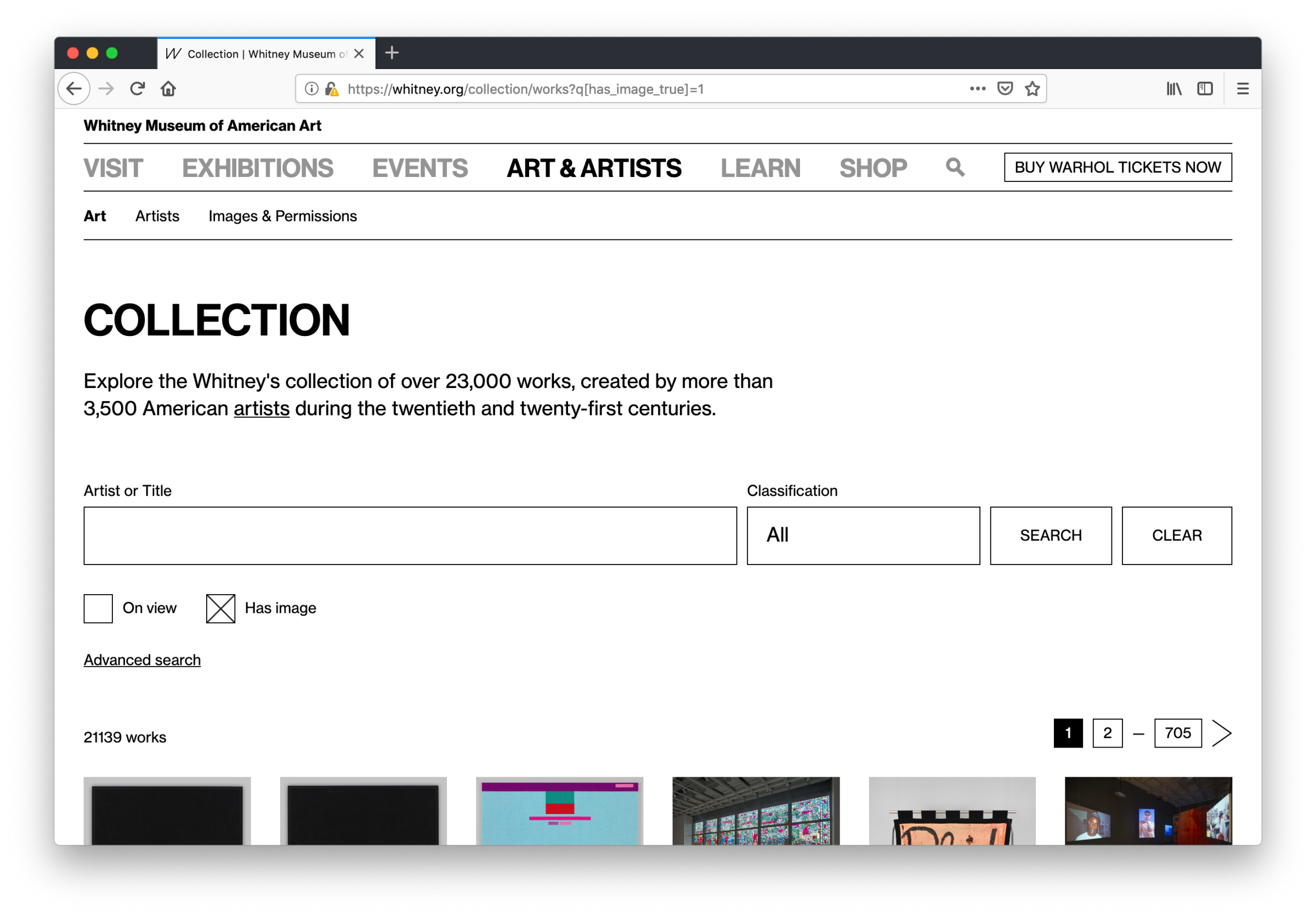
The bread and butter of any online collection is of course the art. Our updated whitney.org/collection/works page is the new hub for exploring what artworks are in the Whitney’s collection.

The biggest change from the old collection.whitney.org is that now all sorts and filters are featured on one page instead of being separated across many, and they can be combined and toggled on or off in concert with one another. Which means no more navigating distinctly between what’s “on view” and “works with audio or video”, or being unable to search within the selection of works that have complete object labels, or are on view, or any other qualification— all fields and properties can be leveraged as needed, from one page, with no limit or restrictions on how many can be active at once.
We’ve also taken the opportunity to start fixing certain features that over time drifted into non-functional states on the previous site, while also adding new ones including the ability to view only works that have images (a critical distinction for many users), and to filter by classification or medium. Most of these features take the form of extra fields (revealed by clicking “advanced search”), rather than a single integrated search box, which is something we will be closely monitoring and user testing.
One of the primary goals was to launch with as many search and sort options as possible so that we could see how each feature gets used in practice. Rather than launch a minimal viable product (MVP) we wanted to launch something closer to a maximum to give us the broadest possible scope of data on real usage. Once the trends start to become clear, we can then begin to pare back and invest development resources as the true needs continue to surface.
whitney.org/artists
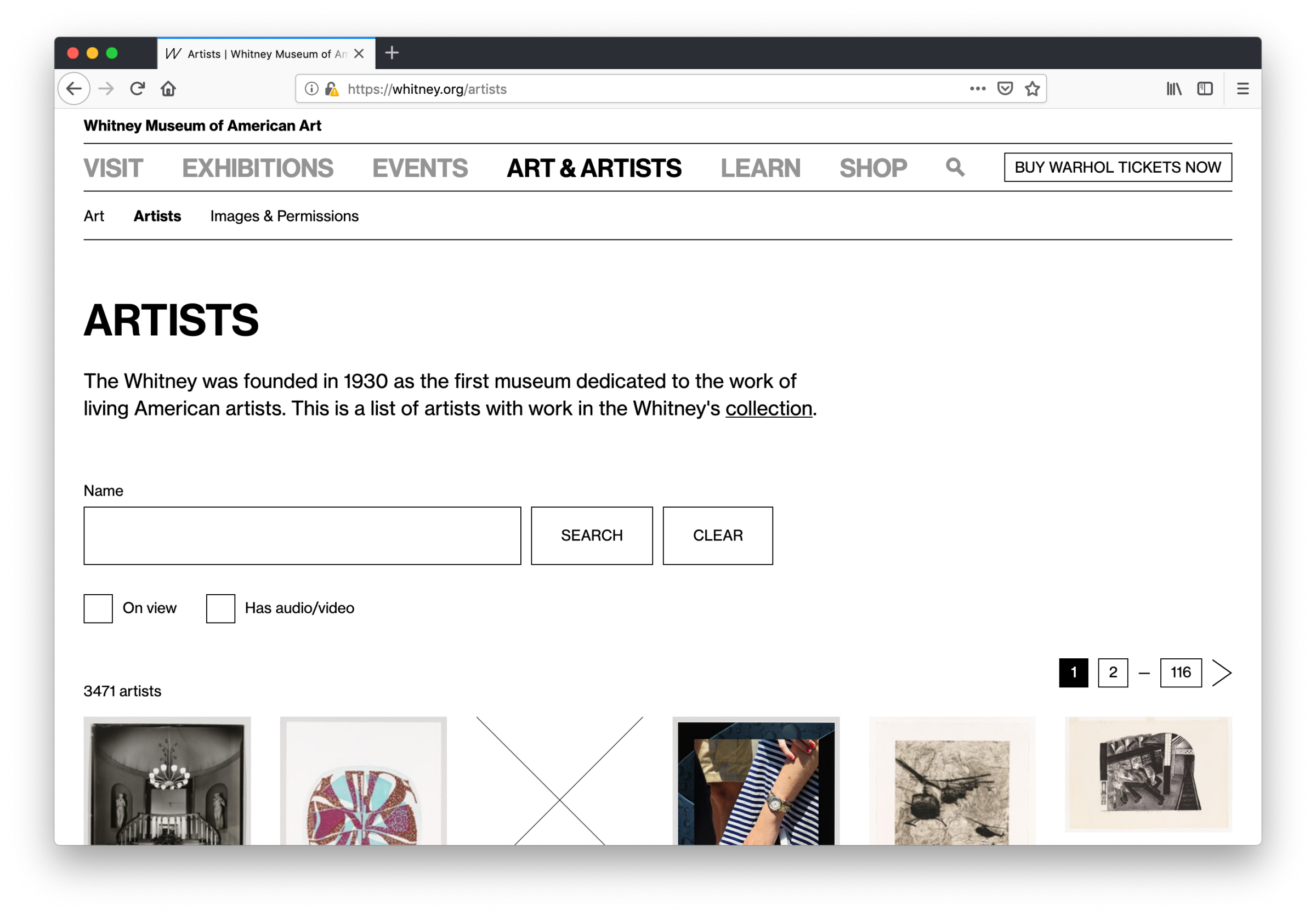
The second of the two sections, whitney.org/artists, did not have a clear equivalent on the old collection.whitney.org, which was limited to showing lists of artists by the first letter of their last name. With all the artist data pulled into our primary CMS, we for the first time had the ability to reorganize and reframe this section into something more respectful of how we think about the Artists in our collection.

Similar to the more standard collection works view, we’ve also added new features here while fixing the intention behind some old ones: artists can be filtered by those that have works on view in current exhibitions, or by those that have audio or video content. Both are options that were not possible on the previous site, and in the case of the latter is a particularly large improvement — we generate a substantial amount of video content around particular artists that might not include any works in our collection, so under a system that only surfaces video if it’s tied to a specific work, much of our video would remain buried. By allowing for more content to be associated and discovered at the artist level, we are aligning better with our overall content strategy.
What comes next?
This is just the first initial step in bringing the collection closer to the rest of what we do online. With our new hubs for collection artists and artworks we can begin to analyze our data, user test with our colleagues and our visitors, and push forward in building an online collection that better reflects the Museum’s mission, and supports the artists within it.