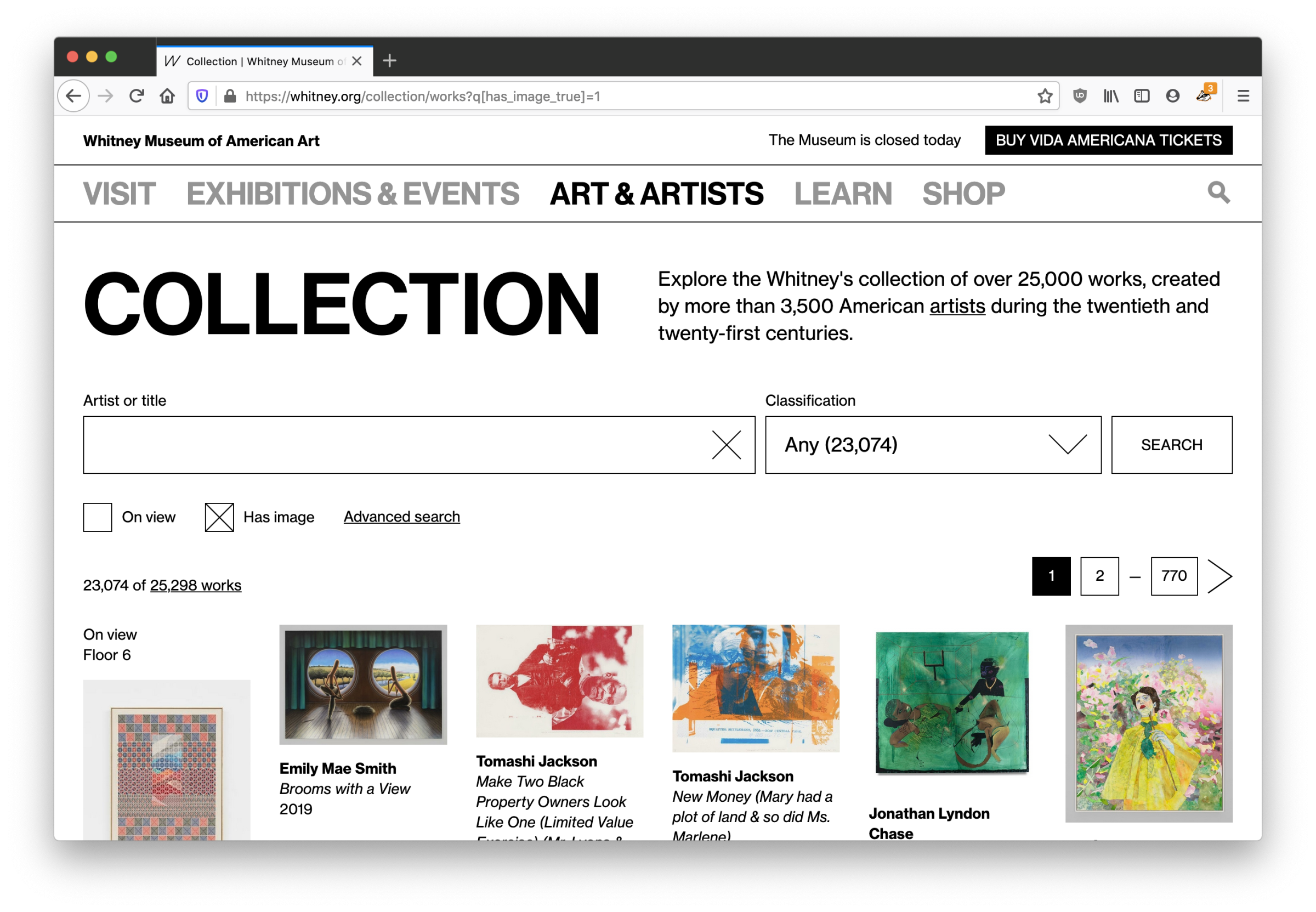
*Author’s note: I’ve been sitting on a half-finished draft of this for too long, and while I know this is a bit of an odd time to share, I have very little else to do. I hope that these kinds of online museum resources can be a positive outlet for boredom and inspiration in the weeks and months ahead.*
Last year we replaced our separate online collection site with a new experience integrated within whitney.org. We made this shift for a number of reasons, but the biggest was that this allowed us to take full control over the UI/UX, and start building out an experience that allowed for more kinds of exploration. What users saw when they came to the online collection changed greatly, but the underlying data and the software delivering it to whitney.org stayed the same. For that reason, that initial work was always going to be part one of an (at least) two part project; we had to tackle the systems that delivered the data as well.
The challenge of magic middleware
To launch the initial version of the full online collection when the new building opened (2015), we worked with an outside agency to build a set of internal tools that would pull data out of our database of record (TMS, or “The Museum System”), an API that would ingest that data, and a public-facing website that would present that data for easy access. When we relaunched the collection last year, we replaced the final stop of that system (the public-facing website), but we left alone the tools and API. The former continued to pull data out of TMS, and the latter simply switched to feeding the new collection experience on whitney.org rather than the old. We’ve since replaced both.
The challenge with our middleware wasn’t that it was buggy or lacking in performance; on the contrary, it did what we needed it to and served us well for 5 years despite being built and launched in an extremely tight timeline. But as the Museum has grown, so too has our expectations of the online collection. We needed a system that could expand with us, while staying supportable.
Moving to more durable infrastructure
One of the challenges of being part of a small dev team at a non-profit cultural organization is making sure we’re not biting off more than we can chew, because we don’t have much capacity for something to go wrong. Supporting a smaller number of apps and stacks is one way to make things more sustainable, and in this case we had an option built and supported by the same company that makes TMS: eMuseum.
eMuseum and its associated parts plugs directly into TMS, and outputs collection data to an intended-to-be-public website, alongside an (optional) API. As I’ve written about before, we want the online collection to be deeply connected to the rest of the whitney.org experience. We’ve done this through importing collection data directly into our primary content management system (CMS), from our previous API. With eMuseum offering a robust and flexible API, supported by a vendor that we are already committed to working with, it seemed a good fit…and a lot less daunting than writing our own solution from scratch.
What eMuseum offers us are small but meaningful improvements over our existing API, and a much larger increase in peace of mind over being able to maintain the software, and make adjustments to how it works. It also slotted into our existing cms-to-collection-syncs without a huge amount of work, given the work we had already done.
What else is new?
Despite being an infrastructure-focused project, our move to a new API ended up coming with a number of noticeable improvements to the online collection…on top of changes we’ve already been making quietly over the last year. Some of those improvements:
1. Larger images
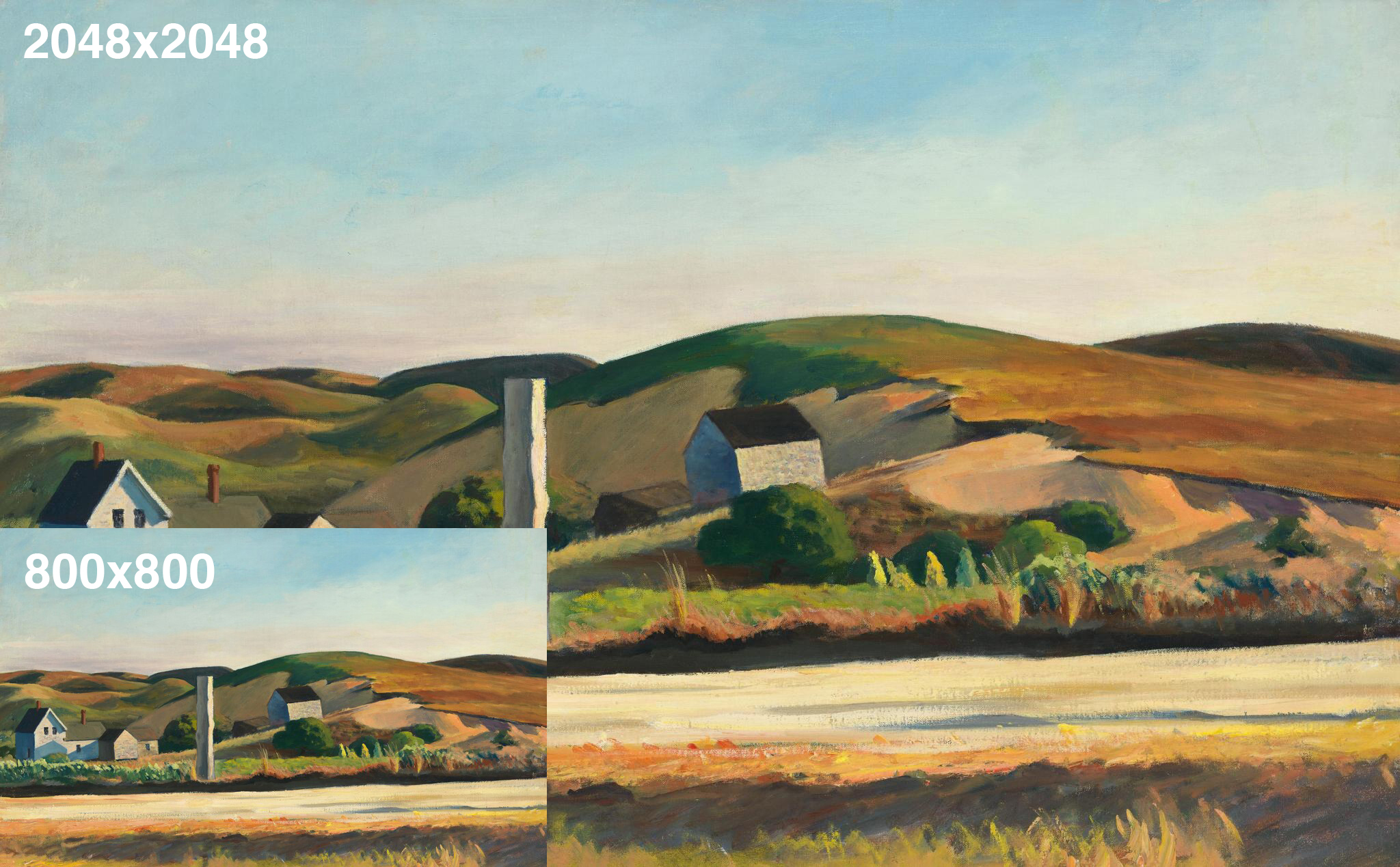
Now that we’re able to make meaningful changes to our collection middleware, we’ve updated all of our various image sizes to be substantially larger (currently up to 2048×2048)…based on more modern interpretations of fair-use, and updated licensing agreements.
2. Temporary images
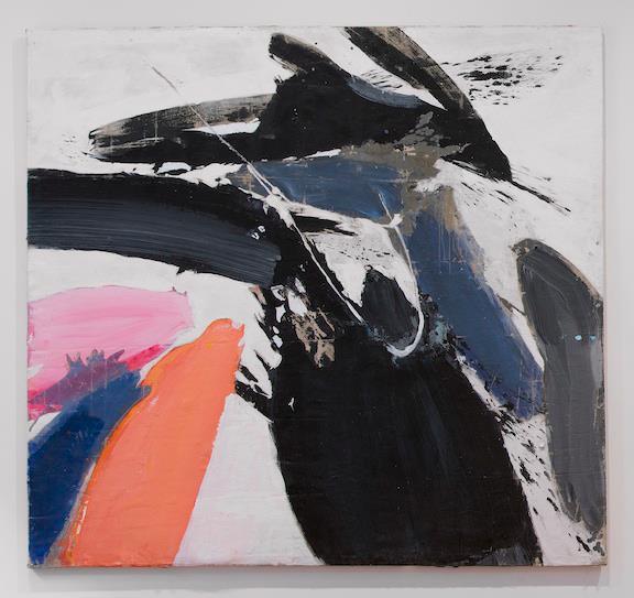
Previously, for images to be pulled into the online collection they had to be present in a specific folder structure that corresponded to our collection documentation initiative. That did not allow for temporary images, supplied by the artist, gallery, or ourselves, to be used since they wouldn’t be stored in those set folders. With that limitation removed, we are able to start posting images of objects sooner after they’re acquired and before they are fully documented.
3. Linkable portfolios
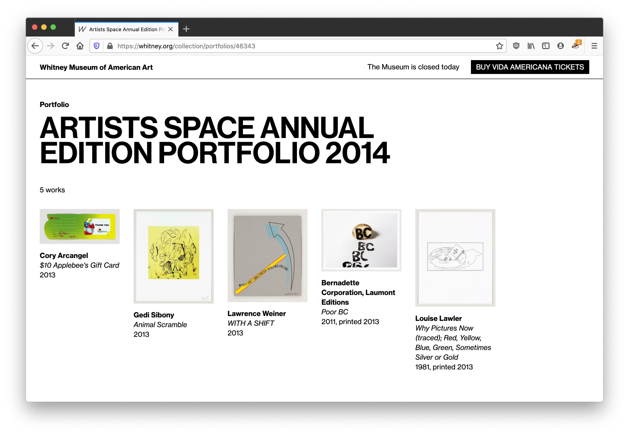
Previously, the most we would do for objects in a portfolio or series would be to add a label like “1 of 5 in Portfolio Name”, with no way to link to either a view of that portfolio, or even show what the other objects were. With our more feature-rich API in place, we are now able to link to a new view within the online collection that will show all objects in a given portfolio, from each object page.
4. Simpler workflows
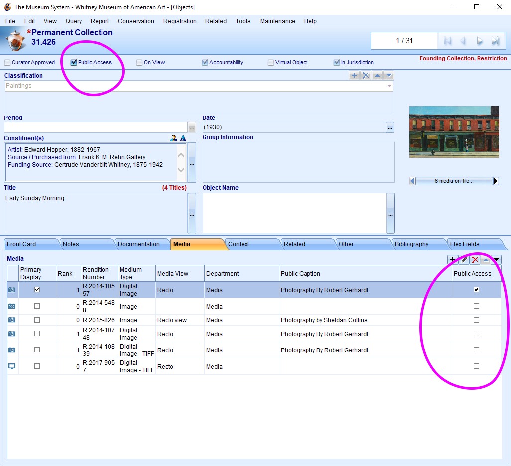
On the administration side, previously what objects would show up in the online collection was based on a variety of settings and TMS “object packages” that made it difficult to quickly diagnose why a particular image or object might not be visible online. With our ability to now configure the API more deeply, we’ve altered our import rules to be based on simple “Public Access” checkboxes in TMS, so it is much more transparent what will appear online.
What’s next?
With both the frontend and backend of the online collection now relaunched, one of the biggest items on our whitney.org wishlist is now complete, roughly 3 years after we launched our new CMS. Going forward, we are in a better position to iterate on the online collection, rather than fully rebuilding major pieces of it. We should be able to push forward new public-facing experiences, whether that’s open access (*crosses fingers*), new kinds of interpretive resources, or something else entirely.