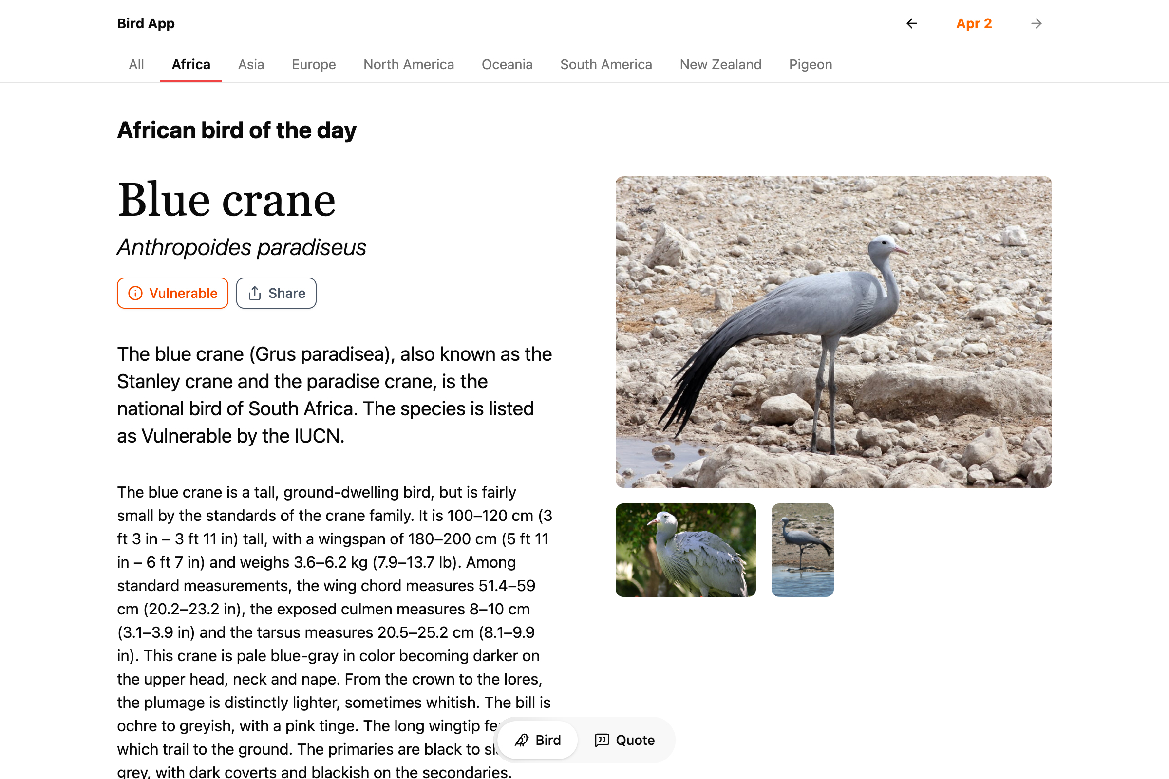
Recently I added more types to Bird App, so there’s more birds every day to swipe through. In addition to New Zealand endemic birds and pigeons, there are now categories for: Africa, Asia, Europe, North America, Oceania, and South America.
Author: colinbooks
Birthdays and popularity
Two of the last small things I’ve added to the Whitney’s online collection are a page for birthdays, and filter options for sorting by most or least recent views (in the last 30 days, updated nightly). I keep finding myself coming back to these features even though it’s all data I could access before. I think it matters (a lot) that they’re in the regular UI for the site, and I hope it’s not just me and the bots that are using them. The birthdays page in particular looks to be quite popular, but our traffic figures seem increasingly unreliable given the number of scrapers out there.
If you’re curious:
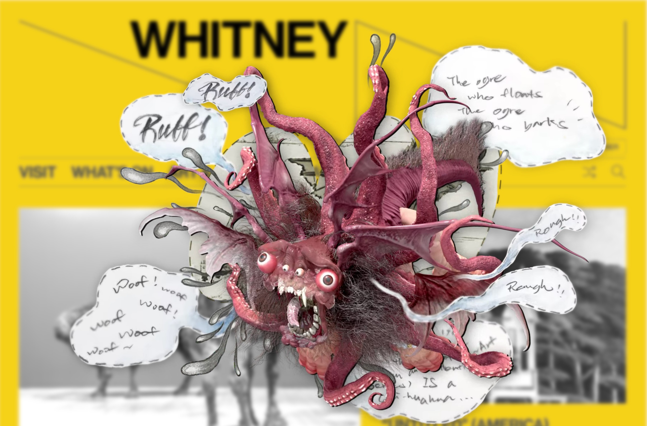
Leo Castañeda: Camoflux Recall Grotto
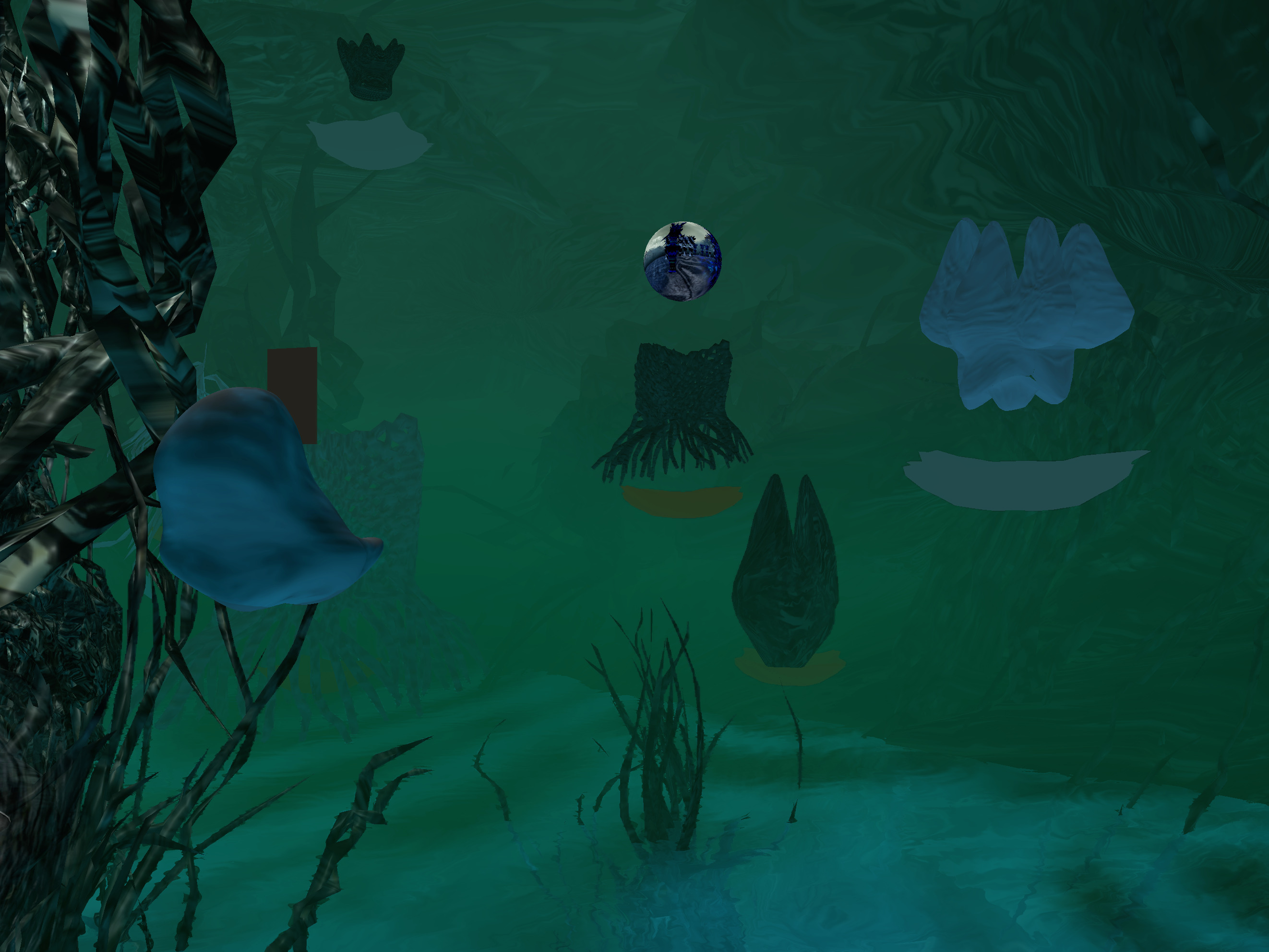
Most of what I did here was make our web server properly handle all the different types of compressed Unity assets, which is not the most glamorous work. But the piece (and the show) are worth seeing if you can. Be a little drone, grow some plants.
Memo Akten & Katie Hofstadter: The Thinking Ocean
“I’m currently on an oceanographic research vessel somewhere in the Pacific, and may be slower than usual to reply.”
—Memo and Katie’s out of office, while working on this project.
Dumping complex infrastructure for scripts and a(nother) new online collection


I feel doomed (complimentary) to write these posts every few years about rebuilding an online collection. Maybe that’s because they’re always glued together, always better than what came before but simultaneously still a messy bridge between systems. This is by my count the 3rd major new online collection I’ve worked on for the Whitney, on top of an untold number of smaller tweaks and rewrites. Sometimes there’s big new features this enables (see: portfolios, high resolution images, exhibition relationships), and sometimes, like this time, it’s quieter (see: better colors in images, verso titles). I think it’s important to acknowledge this work while also understanding that it is the kind of non-flashy, incremental improvements that are difficult to grab attention for, and despite the evidence hard to always write about.
What we replaced
The last online collection for the Whitney was based on syncing with the eMuseum API, which was connected through a tool called Prism to TMS (The Museum System), our collection database of record. While this was a boon at the time as it allowed us to skip having to figure out the tricky step of how to export data out of TMS and get it online, it was also a drag in that data syncing was brittle and slow. Propagating changes meant syncing each of potentially hundreds or thousands of records over REST APIs each night, and deletions required a long tail of checking whether records not seen in a while had disappeared and should therefore be removed. Getting the difference of “what changed” existed on a spectrum of possible-but-buggy to impossible. At the same time every asset and field had to go through transformations between TMS > Prism > eMuseum > whitney.org, which meant all manner of formatting errors for text or compression issues for images could crop up between each step. It worked, but it had too much middle management.
What we use now
Rather than run multiple entire applications to export data out of TMS, we’ve moved to a small collection of Python scripts that export data as JSON files and images from our shared drives to a private AWS S3 bucket. This choice follows the example of the Menil Collection’s new online collection (thank you Chad Weinard and Michelle Gude for being so willing to share), who recently did something very similar. This approach has the benefit of letting us adjust the scripts ourselves, and made it possible to have both full and differential outputs. This increased the speed and lowered the complexity of the syncing mechanisms for whitney.org. Updates, additions, and removals are easily recorded in nightly JSON exports, and the whitney.org CMS can quickly check for only the changes it needs to make. And dumping everything in a private S3 bucket is ultimately more secure and easier to manage than more web servers running [often] outdated software.
For me the unlock here was realizing that we had basically already written most of the SQL export logic as part of onboarding eMuseum in the first place, and that parsing what I thought of as gigantic JSON files is actually very performant and practically a non-issue. Maybe this is from some threshold of compute improvements over the last few years, or from faster or more prevalent flash storage, or maybe this was just always possible and I needed the suggestion to do it.
The vibe coding of it all
Whatever the enabler, writing Python scripts to export some nicely formatted JSON files is vastly simpler and more controllable than orchestrating multiple 3rd party applications. It’s also easier than ever: navigating complex SQL selections and parsing strange formatting issues are borderline trivial problems to solve with modern LLMs. Outside of the initial direction and some [thankfully still valuable] domain knowledge about TMS and our collections, Claude could nearly write this on its own. Constrained coding problems like this are so effectively handled by AI that it’s almost dismaying to think about how I would have done this 5 years ago.
Unanticipated improvements
While we started this work due to internal server issues there have been some public-facing improvements I didn’t necessarily expect. For images, removing at least one step of compression in the middle (and potentially an issue with color spaces I never figured out) has led to much better color representation across our collection photography. I didn’t even realize this was an issue until seeing how much richer something like Liza Lou’s Kitchen or Dyani Whitehawk’s Wopila|Lineage looked. In terms of data, in conversations with colleagues it became clear we have hundreds of artworks with reverse sides that weren’t reflected at all on the online collection: neither verso titles, nor images of the verso side, were published. With full control of the data exports it was relatively simple to add these titles to the exports, figure out an appropriate public display, and programmatically add their images. The results can be very cool.
Beyond these changes, there are a number of smaller improvements including:
- “See also” relationships for curator-selected related works, which makes it easier to discover things like studies for final paintings.
- Precise birthdays for many artists, now available on a birthdays page.
- Thousands of new artists online thanks to additional exhibition relationships surfaced through better scripting.
What next?
I’d like to do something with location-level data for exhibitions and illustrate the history of all the Whitney buildings more effectively. Or build some kind of timeline with all the kinds of content we can “date” now. Or set up something with a public MCP server. Whatever it is I hope it’s not another collection rewrite for a while.
Bird App hits the web
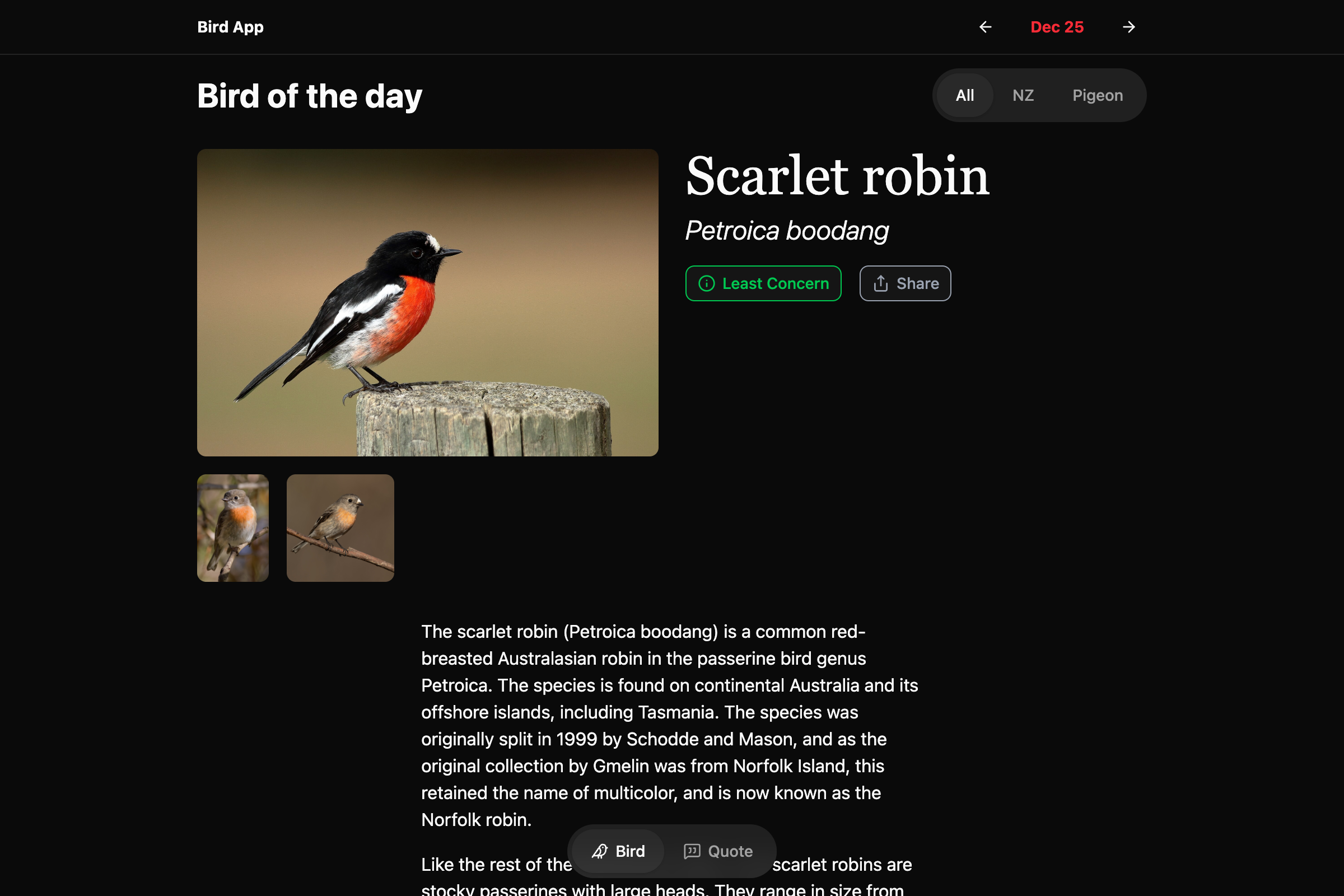
The original Daily Bird app was architected with no back end: each instance of the app would call Wikipedia and Wikidata on its own and save that data locally on the device. I did that because I didn’t want to set up a bunch of infrastructure or sign up with some SaaS option that might be gone in a year. It never really made sense if I wanted to expand things to the web or Android, where it would be extremely helpful to be able to point to a single source of [bird] truth.
It took a while to do, and even longer to post, but I’ve re-architected and renamed Daily Bird to just Bird App (which is what I was calling it anyway), and launched it on web at https://dailybird.app in addition to the existing iOS app.
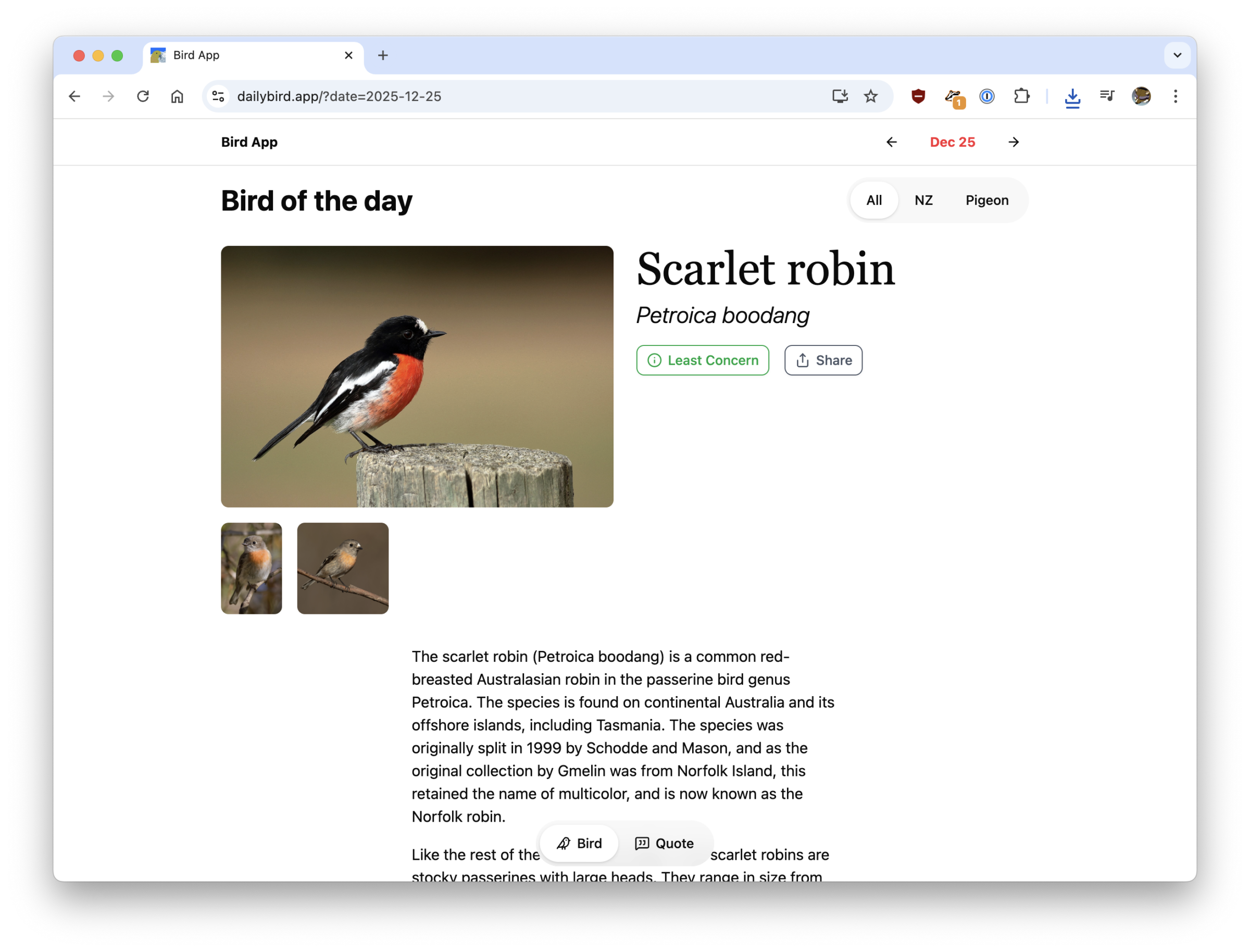
On the backend this is now a Next.js app with Payload as the content management system. Both of those decisions have already bitten me, with Next.js and React having a nasty CVE in December, and Payload being bought by Figma, but I’m pretending things are fine. With the new web-based Bird App data is simpler to keep consistent between all the instances of the app out there, and I can edit bird entries and add new info much easier. I’ve also added support for multiple images per bird, scientific names, among other small improvements.
Still on the todo list is favorites support on web and a login system to keep track across devices, and new regional categories to filter birds by.
As always, enjoy the birds.
🦆🐦⬛🪿🦩🐓
12 Years in Azeroth
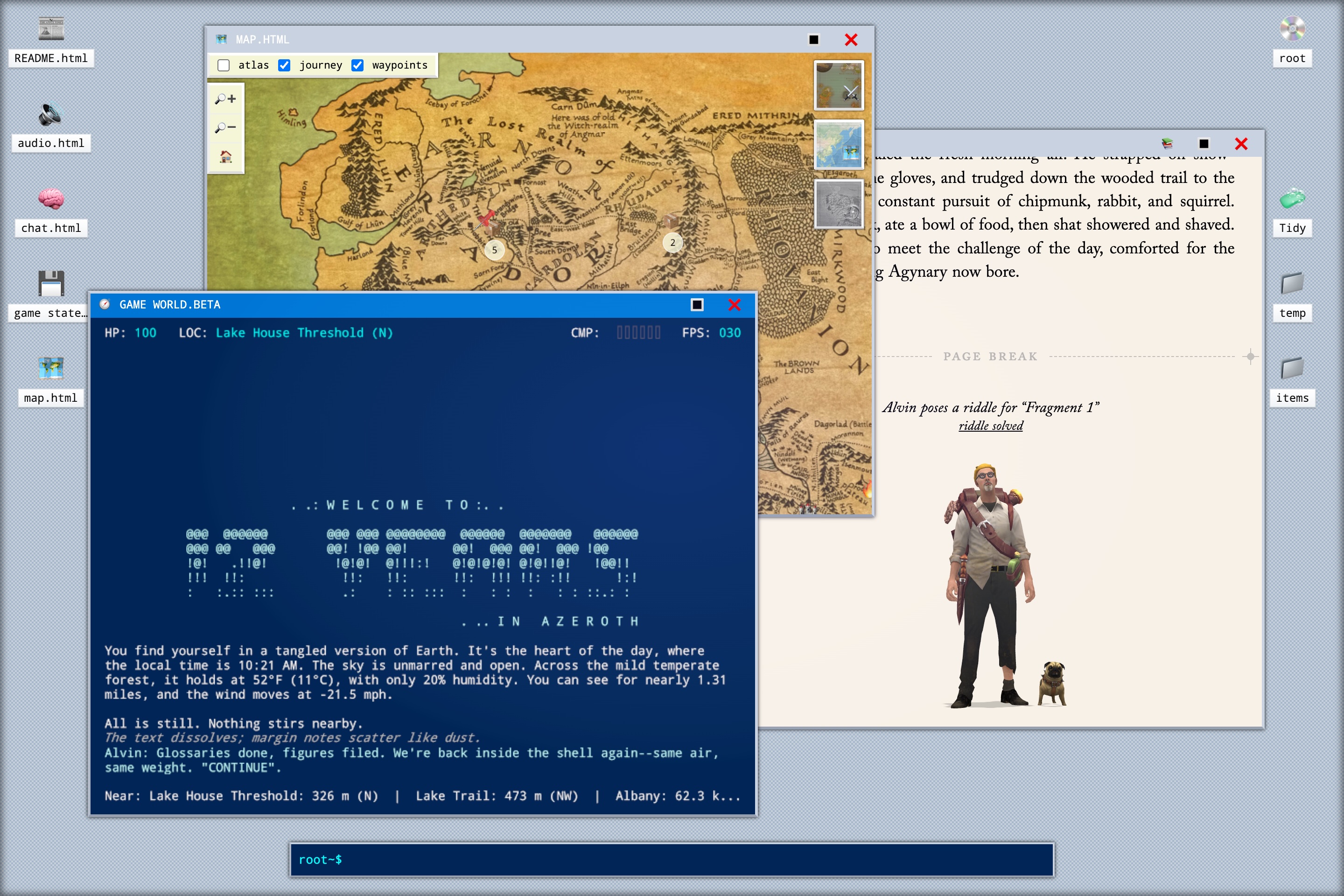
I never played WoW, but I’ve played this so I’ve kind of played a person playing WoW. It’s a work of interactive nonfiction and fiction, with a full computer desktop, some light gameplay, and a healthy amount of reading.
The Levitating Perils #2
Video with alpha channels still has very weird support in 2025, which I would categorize as a “bad” surprise. Don’t think about that when you’re watching the newest On the Hour commission though because it’s good, especially the 🐉.
I made an API and now it gets 200k+ requests a month
Having an API always made sense for the museum. An API provides structured, always up to date, machine-readable access to our public data that complements our existing flat file Open Access datasets. The challenge was always a) how feature rich does that API need to be and b) can we include enough material to make it useful.
For a long time we’ve had what could probably be considered a semi-complete and semi-useful API for artists, artworks, exhibitions, and events, but I hesitated to do anything to make it very discoverable outside allowing people to stumble upon it if they happened to check whitney.org/api. It always felt like a chicken and egg problem where the API needed documentation to be useful, but I couldn’t write documentation until it had enough features and consistency to be useful, and that never felt pressing because no one was using the API because there was no documentation.
After sitting with this dilemma I decided to try and start making what seemed like the most accessible parts of the API more discoverable, in the hopes of gradually juicing usage to the point where it would be more justifiable to spend more time improving it. Given the number of other museums with APIs focused around their collection, I thought that adding visible callouts for API permalinks (taking inspiration from the Getty in this case) for artist and artwork pages on the site could start to get people who tend to notice and utilize these kinds of tools interested in what we might have to offer.
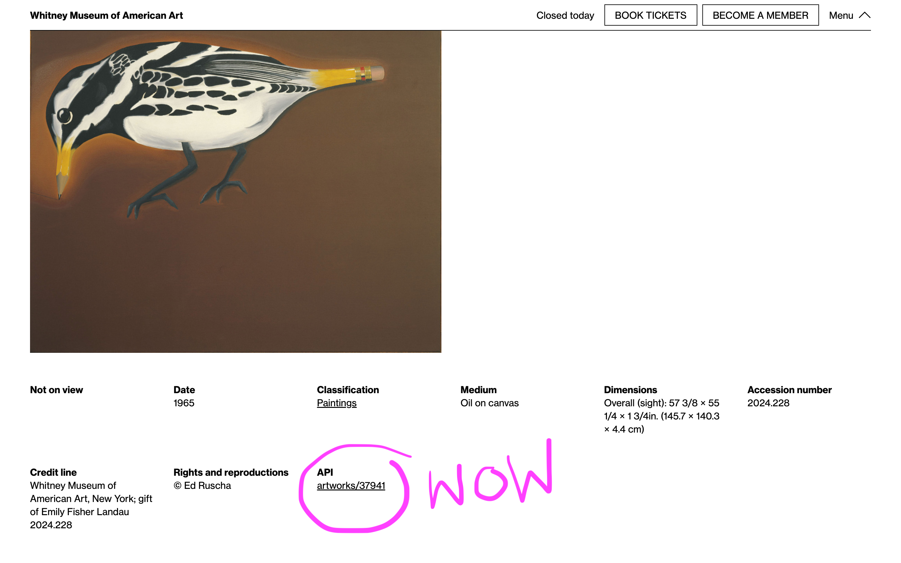
Around the same time I added some basic internal analytics to usage of the API, to keep tabs on monthly usage. Partly for curiosity and partly because we have no API key requirements or rate limits at the moment and it seemed responsible.
Over the last couple of years we’ve gradually added more links, and recently some actual documentation combined with improvements to how the API works and what’s included in different endpoints. During that period public usage (whether by people or bots) has gradually grown from a few thousand requests a month to 200–300k. It’s also moved from being 1 or 2 requests on every individual record, to more varied distribution across artists and artworks, better reflecting their popularity.
Usage of the API continues to trend upward, and I hope that as we have more uses for it internally and see increasing use externally we’ll continue to refine and expand its functionality.
If you’ve used the Whitney API at all or have thoughts about things we could add or change, please reach out, I’d love to know what you’re doing with it.
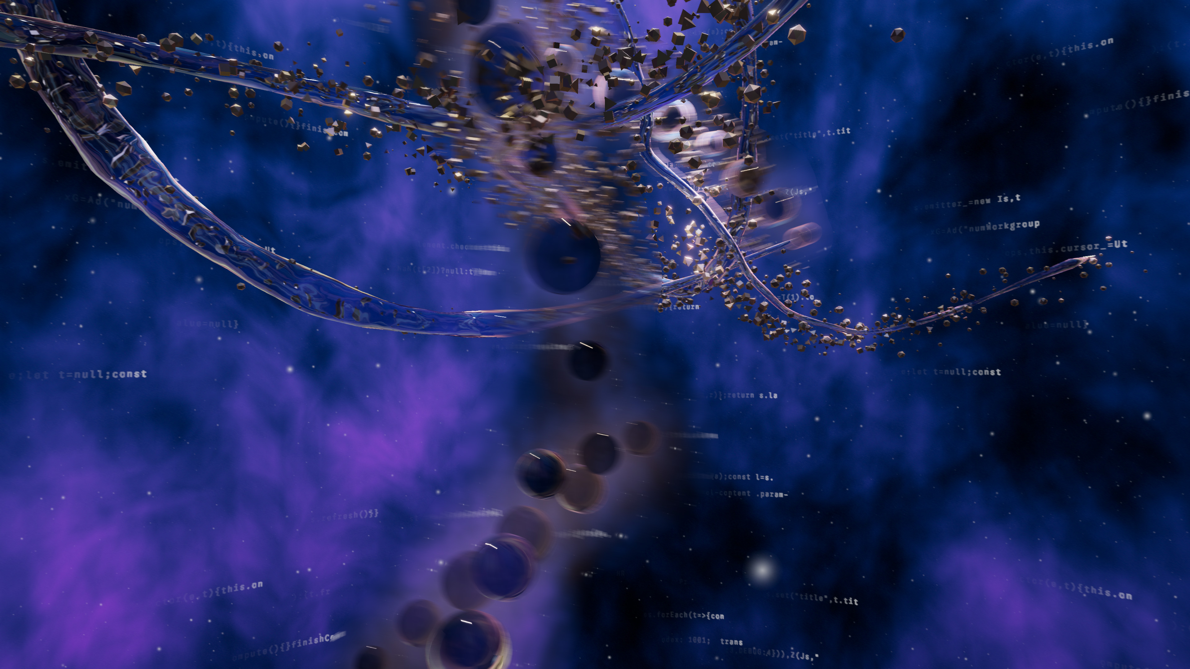
Twin Quasar
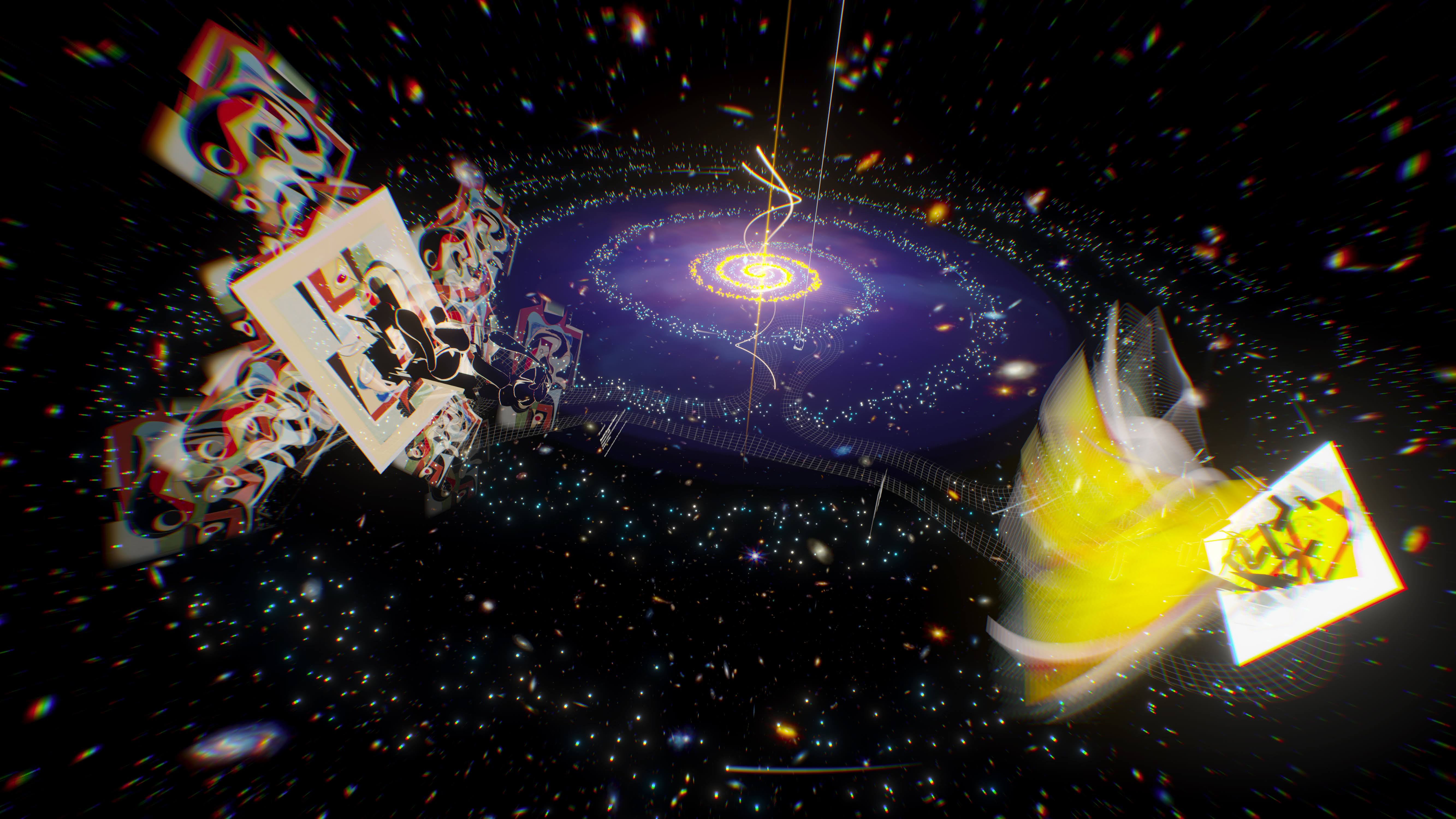
Between Sapponckanikan and this project with Ashley Zelinskie I do Unity now, sort of. Twin Quasar explores gravitational lensing and two works in the museum’s collection, and can be viewed on MONA, whitney.org, and an app on Apple Vision Pro. I mostly worked on prepping the archival version.