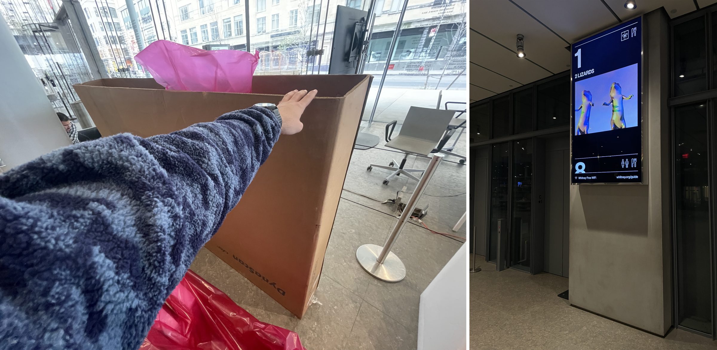
A couple months ago I had the pleasure or burden of releasing either the first apps ever, or the first apps in the last decade for the Whitney Museum. Working with Steven Fragale we revived Sapponckanikan, an app he and Alan Michelson released and first showed at the Whitney in 2019 as part of Wolf Nation.
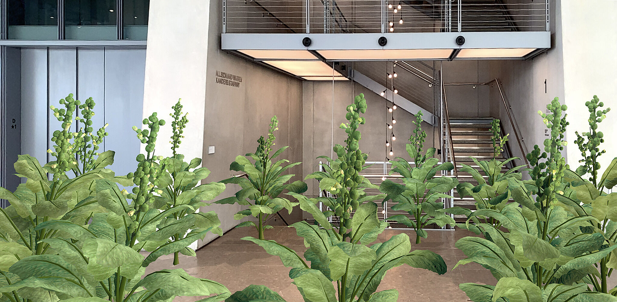
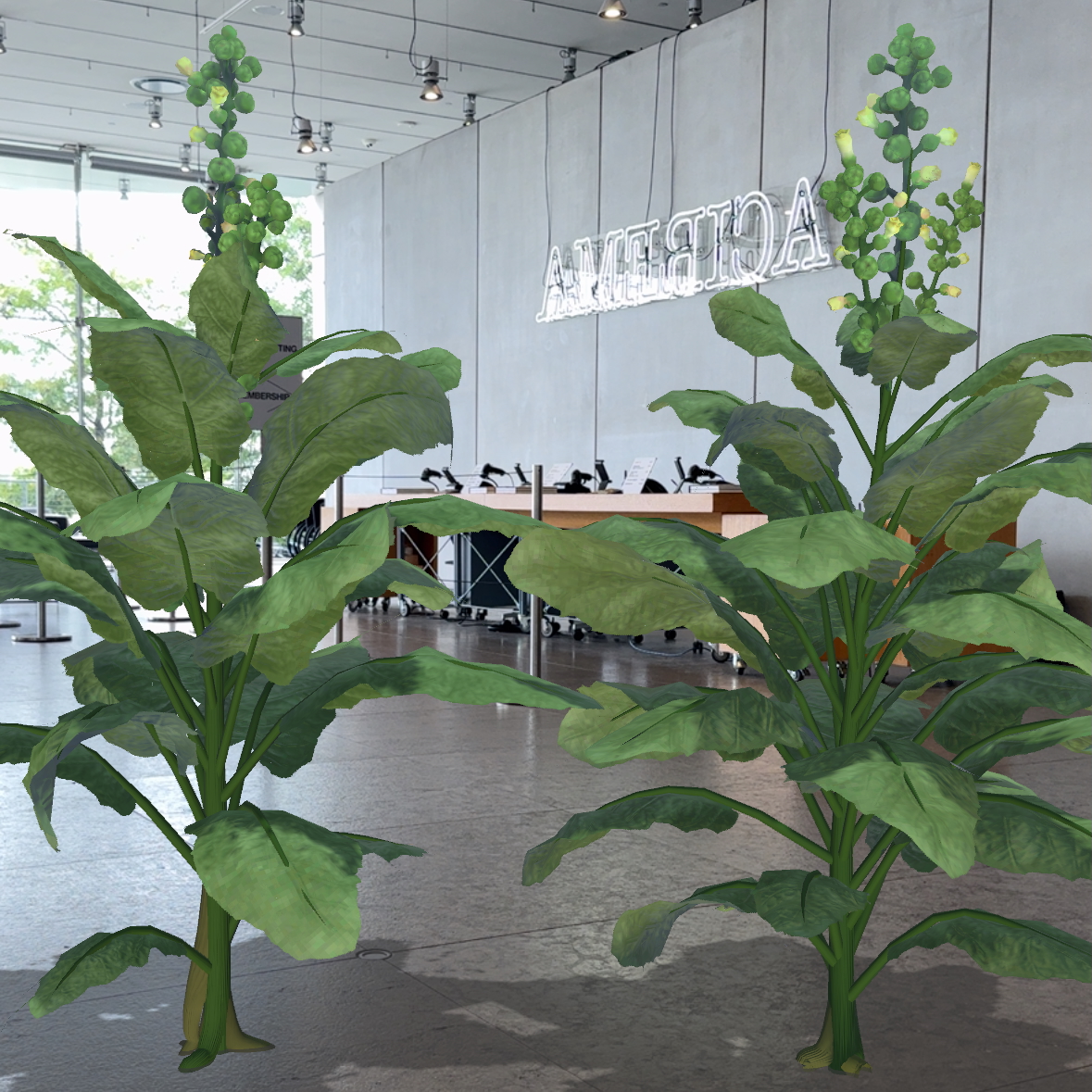
Sapponckanikan is an augmented reality (AR) work that overlays the native strain of tobacco plants that the Lenape originally planted on the island that would become Manhattan on top of the viewer’s camera feed in the Museum lobby. The app was built with Unity, and the plants modeled after references from Alan’s sister’s garden.
By 2024 the version of the app from 2019, built from Unity and submitted to the Apple and Android app stores from Steven’s own accounts, was no longer publicly available. Privately, locally, the app would not build for current phone operating systems (OS’s) at all, and Steven had to rewrite the app multiple times—at least once for all the changes to ARKit, ARCore, and Vuforia (a common SDK for AR experiences), and at least once more again for the transition from Intel to Apple Silicon breaking shadow rendering.
That an app released for a show that ended in 2020 was already off the app stores and unbuildable by early 2024 was a bit shocking, even to someone (me) who already thought native apps decay incredibly quickly. I was expecting there to be some amount of platform drift like, we’d have to re-sign some accounts or app files, and maybe tweak a few settings for deprecated bits of iOS and Android, not having to effectively re-code the app twice and even then still run into new roadblocks.
One of the things that still feels the strangest to me about this entire process was that even when we got the app working on both iOS and Android, both app stores denied our initial submissions for release, for reasons that lie somewhere on the spectrum from perplexing to infuriating. For Google the issues were relatively straightforward, requiring extra safety language built in for warning children that they should have an adult present and pay attention to their surroundings. That seems slightly overbearing to me, but fine, sure, though I’ll point out that those sorts of changes required creating new assets in Unity and laying out new elements which is not nothing.
On the other hand Apple just was not having it.
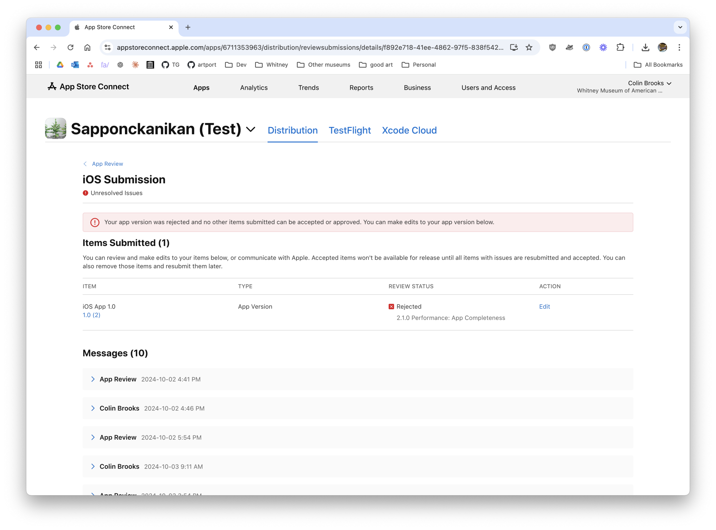
Initially apple blocked submission of the app on the grounds that it had “Minimum functionality” (Guideline 4.2.1). Most of the 10 back and forth messages I had with my app reviewer was over this, though helpfully they later added Guideline 2.1 Information Needed, asking for a video that demonstrates the app on actual hardware, before rescinding that additional requirement during appeal.
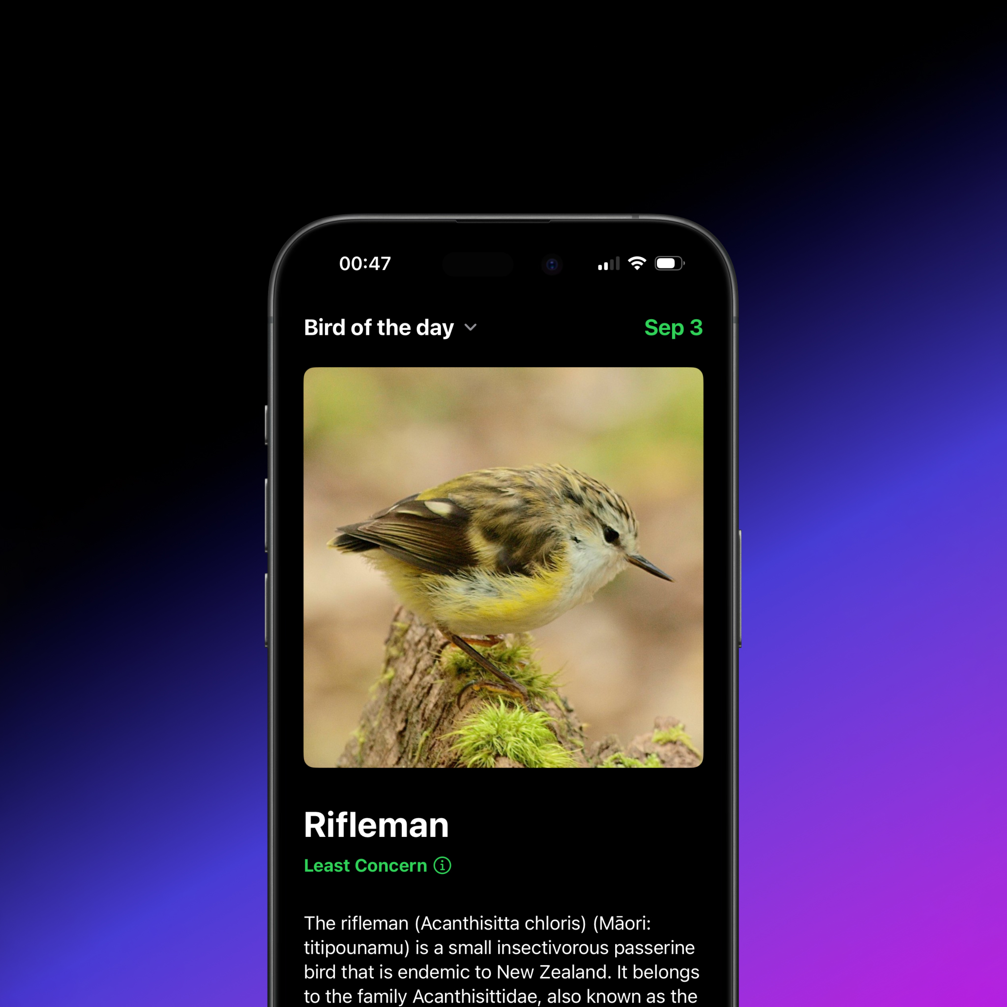
If this was something like a todo list or budgeting app I could understand the need to make sure there’s enough basic functionality in the app to make it reasonable for it to be an app in the first place (though my bird app was also caught by this), but at the risk of stating the obvious this one is art, and I can confidently say I don’t know what the “minimum functionality” should be for an artwork. I attempted to plead this case through 10 messages without any luck, and honestly figured this just wasn’t going to be releasable on iOS as an app, and would have to wait for whatever far off day mobile Safari will gain meaningful WebXR support.
![A possum with it's mouth open with the caption, Your art does not meet Guideline 4.2.1 Minimum Functionality, followed by [Screaming beings].](https://colinbrooks.com/wp-content/uploads/2025/01/possum_rejection.jpg)
Thanks to Reddit I had run across the suggestion that sometimes it’s worth just renaming the project and resubmitting to get a new app reviewer, a strategy that makes me slightly nervous even typing out but one that also in our case worked. After submitting a new project Apple promptly approved Sapponckanikan, and it entered the world anew.
It’s worth noting that this process took a few weeks, every day of which brought us closer to the opening of the show that the app was supposed to be in and available for the public to download, and increased my own anxiety about the project. I’m sympathetic to how much garbage must be submitted to the app stores every day that Apple and Google must have to wade through, but at the same time it’s pretty disheartening that artist’s experimentation with new technologies like AR are so limited by what’s able to get approved in the app stores. And that doesn’t touch on the barriers like having developer accounts (not seen, our original Apple account getting banned for reasons I still don’t understand), paying any developer fees, validating who you are (I got to see the Whitney’s water bill for the first time, our official documentation for our organization), learning how to archive and sign the apps, posting privacy policies online, etc etc etc.. There’s a lot in a public release of a project even if only a few hundred people might ultimately use it. Next to all this is the web, a platform that for all its faults, basically lets you post anything you want and if you don’t need to touch it again run forever in many cases.
Sapponckanikan was a good learning experience for me, I’m sure Steven and Alan, and I imagine others throughout the museum as we figured out the process to have a more institutional presence on the app stores. At the same time and more surprising than not, it reinforced my own belief that the web is a really great place for artists in a way that the more locked down app stores are not, even if technically they can offer bleeding edge features that the web only comes to later. For $5 you can have a VPS or for mostly no dollars Github Pages or Cloudflare Pages or any number of other free static hosts, and if you lean on well supported native web technologies like HTML, CSS, JS, or even PHP or Flash if this was 10 years ago (thanks Ruffle), then you’ll almost without question outlast any native app. Everything decays eventually, but the time horizon on web apps that don’t do anything too outlandish or depend on content management systems or big external dependencies looks a lot farther off than anything I’ve written in Xcode.
Check out Sapponckanikan on iOS or Android, and hopefully eventually the web.