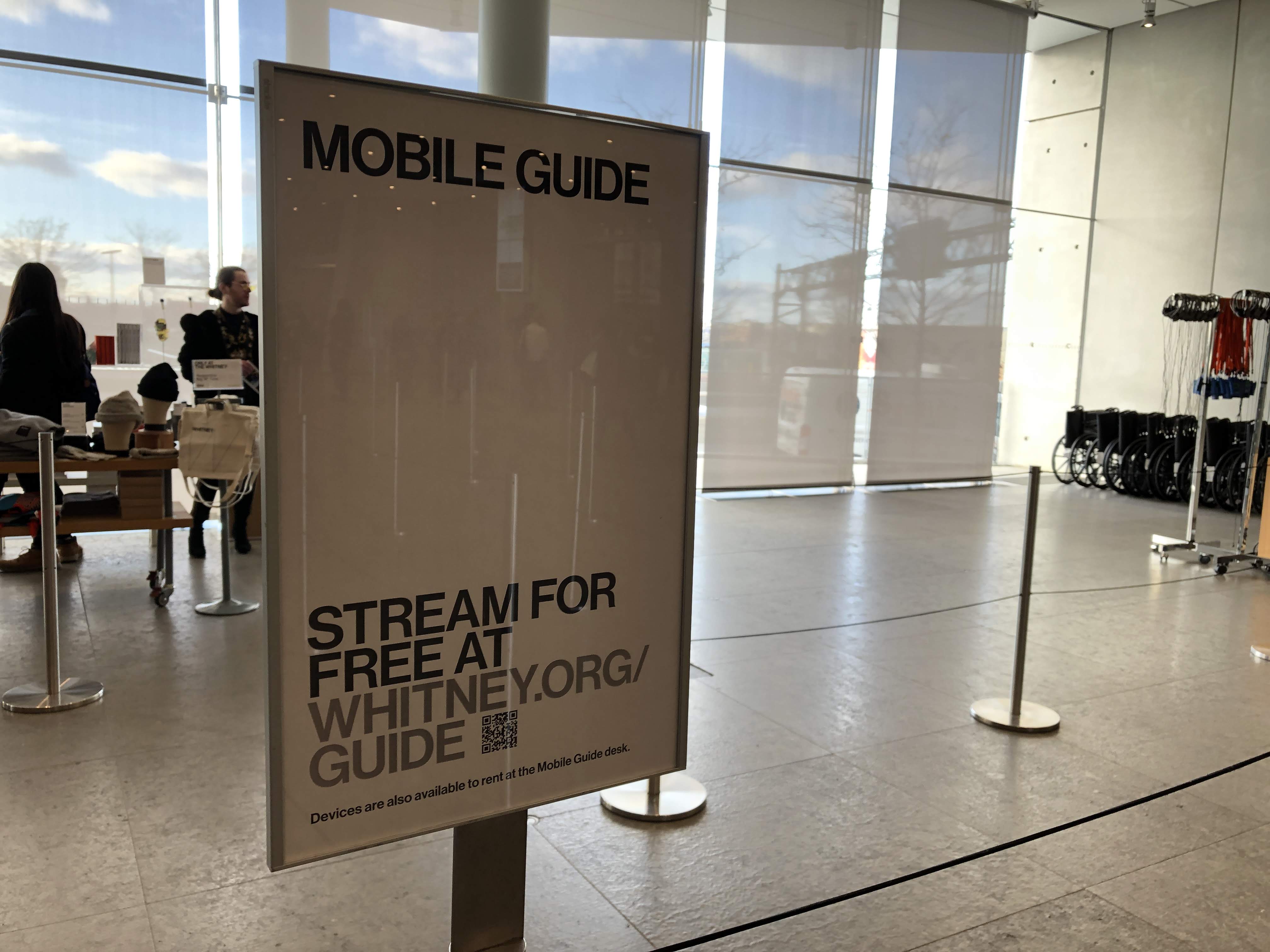
I can’t tell you if QR codes are dead, undead, or if they never died in the first place, but I can tell you we’ve been trialing them at the Whitney Museum of American Art over the last year. Anecdotally, everybody familiar with what QR codes are seems to have an anecdote about them, but we wanted to determine more systematically whether or not they might be a useful tool for driving visitors into digital content while at the Museum, with any meaningful levels of utilization. And as it turns out, for us, QR codes are alive and well.
Connecting to the Mobile Guide
With our recently launched Mobile Guide one of our goals has been to get more people engaging with the experience on their own devices. To achieve that goal, we have to get visitors to open up a URL on their phone. That may sound small, but even little barriers can seriously affect take-up rates, as evidenced by the increasingly widespread death of the museum app (see: The Met, Tate, Guggenheim, etc.), in no small part due to the need to download what will for most visitors be a one-off experience. And while we can shorten the URL to something generally easy to read and type (whitney.org/guide), not all visitors are adept screen-typers, and this might be just enough to put them off if they didn’t already consider themselves “audio guide people”. Enter QR codes.
iOS 11 and a better QR experience
Historically, one of the biggest annoyances of QR codes has been the need to download an app just to read the codes, which could then open other apps or websites. Many Android phones have built in readers, but with our visitors skewing heavily towards the iPhone and the difficulties of messaging around different models of devices, that wasn’t particularly useful for us. With the release of iOS 11 in 2017 however, iPhones gained native QR scanning abilities in the camera app, opening up the viability of QR as a part of our digital strategy.
The benefit to being built-in to the native camera meant that nearly all of our visitors with smartphones would have a device that could seamlessly scan and open a URL to our Mobile Guide experience, without having to type anything in. For less tech-savvy visitors in particular, this is extremely useful, because even if they don’t know they have a reader in their camera, staff can reliably direct them to it faster than they can type in a URL, which can be subject to typos or other mistakes.
Starting the trial
Knowing that a significant portion of the museum’s visitors would at least technically be able to scan QR codes, we started placing the codes in a number of places throughout the building. Every QR code we placed led into our Mobile Guide, but the URLs were built slightly differently in each case so we could track a) the number of total QR scans and b) know which placements were the most effective. We did this by adding a unique query parameter to each QR code URL that would be picked up by our Google Analytics after the code was accessed.
Gradually we rolled out QR codes in a number of locations across the museum. Those locations and their numbers of respective scans between Nov 2018 and May 2019 are listed below.
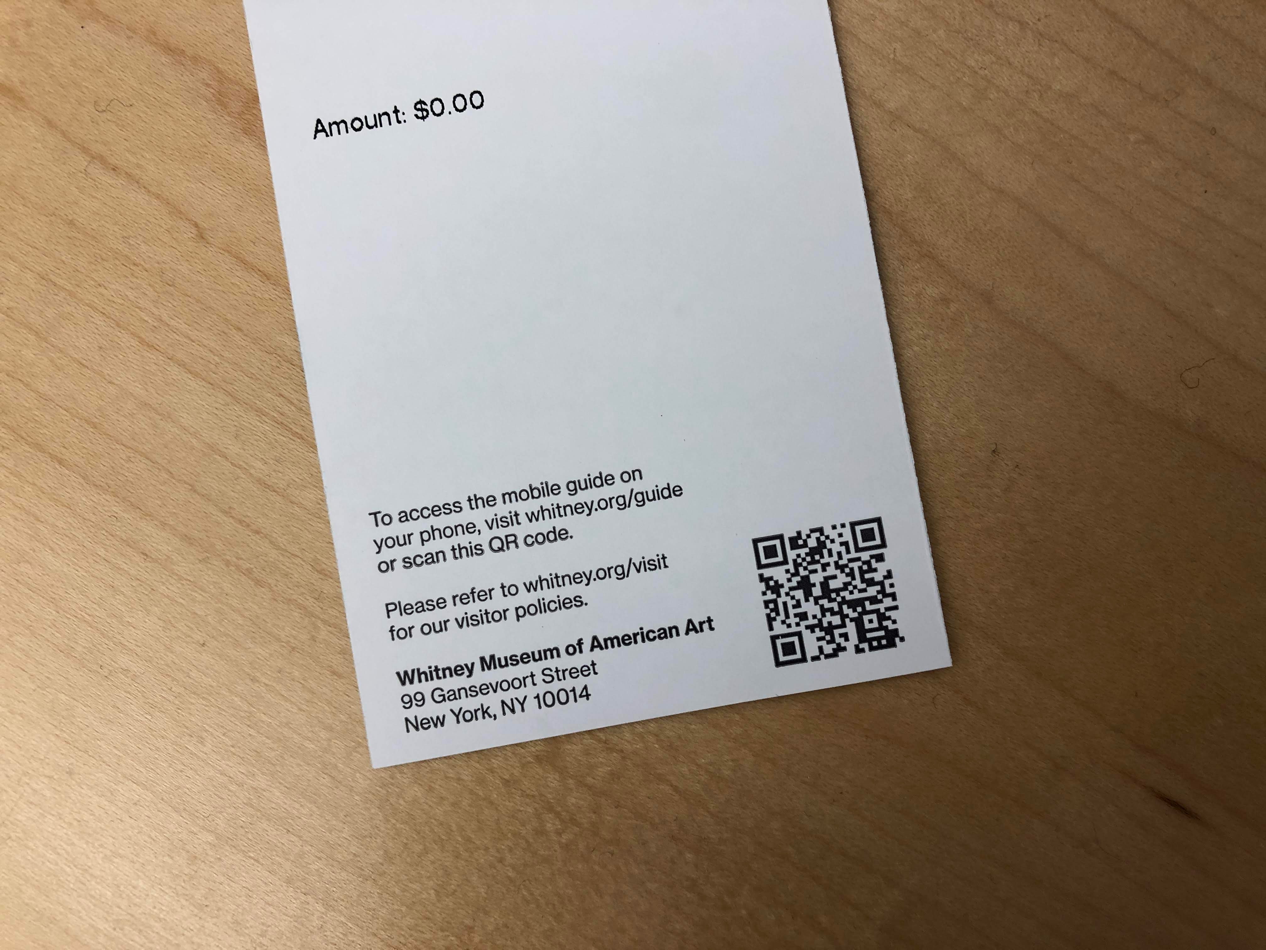
The backside of a standard Whitney Museum ticket.
Tickets 4,169 scans
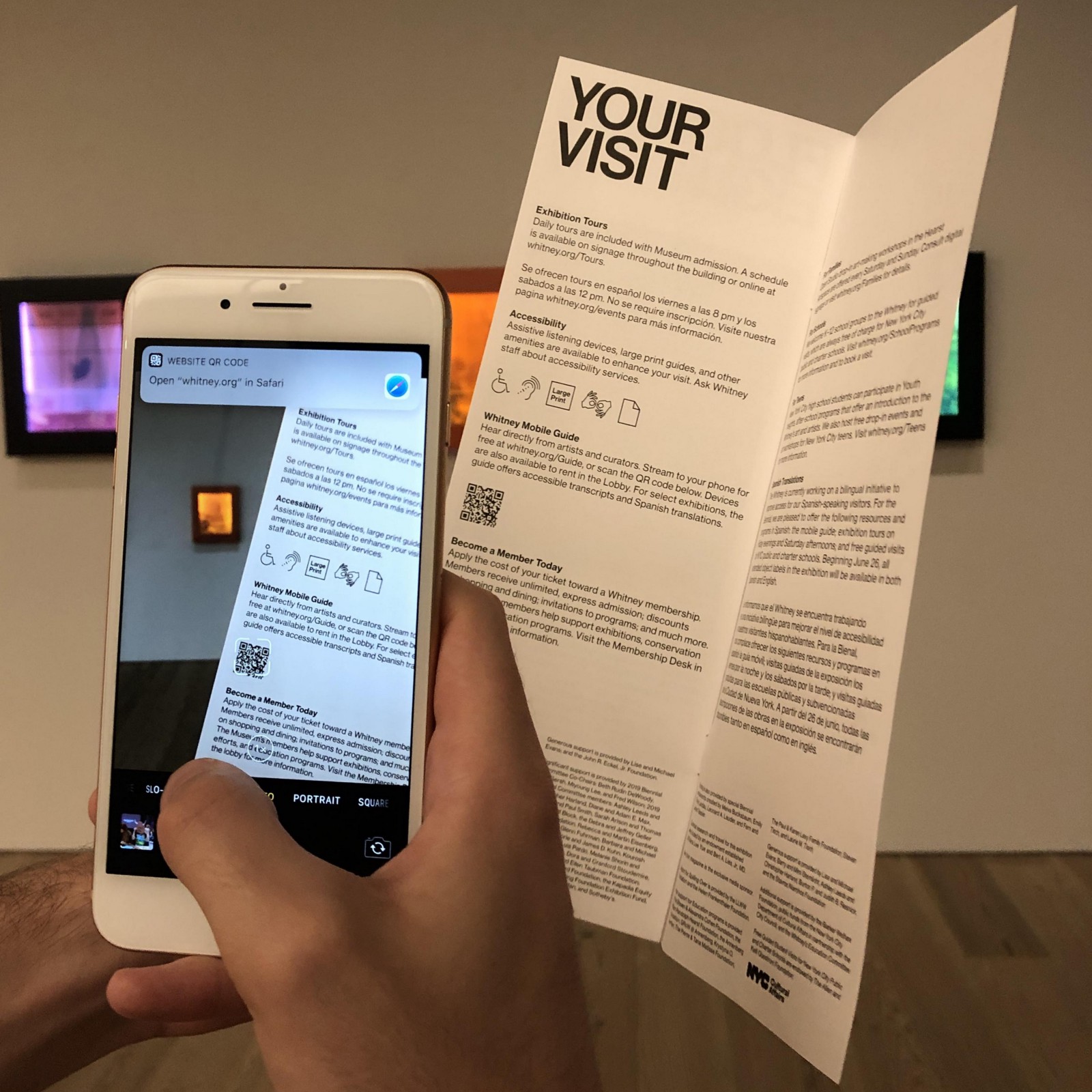
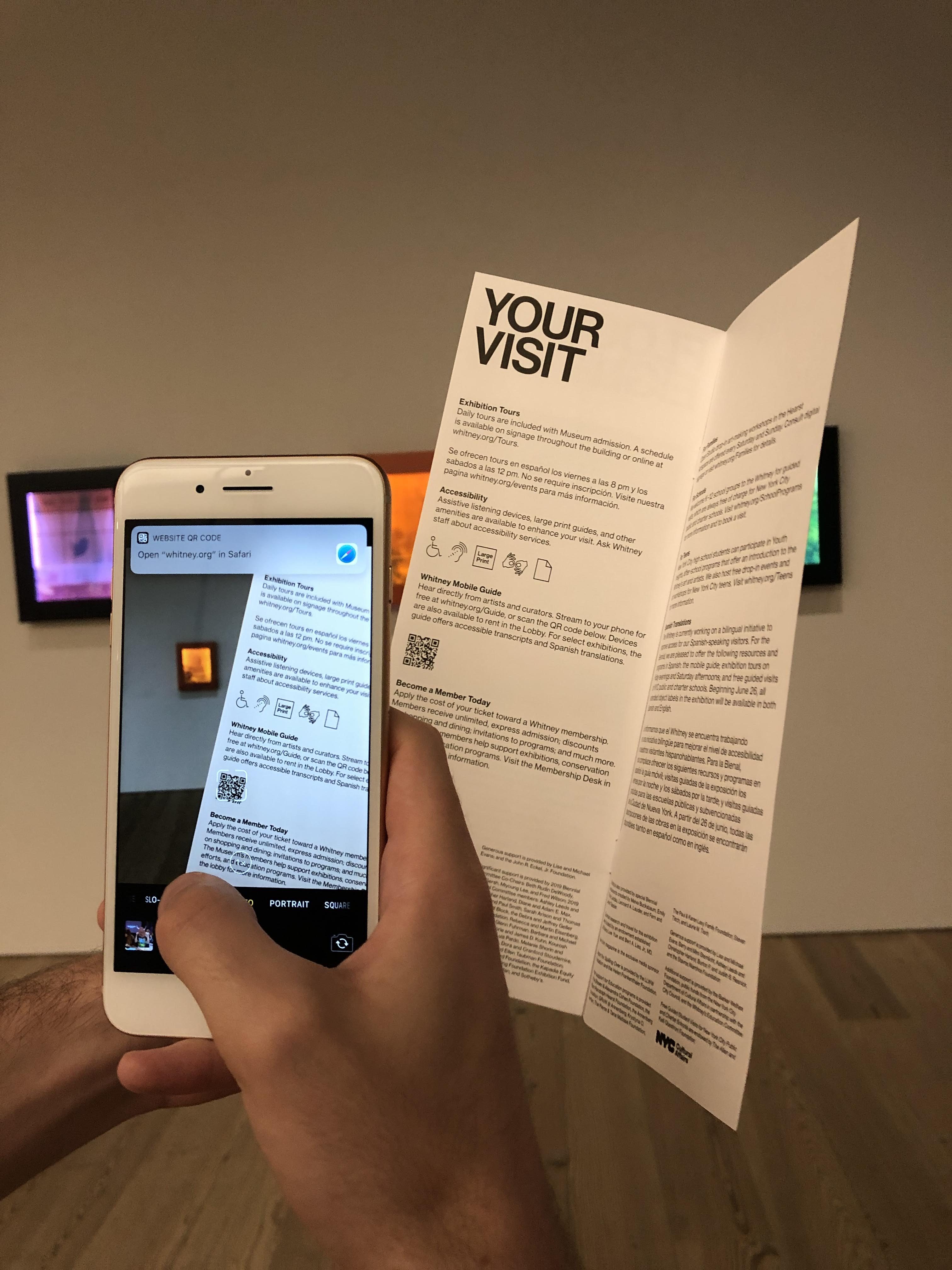
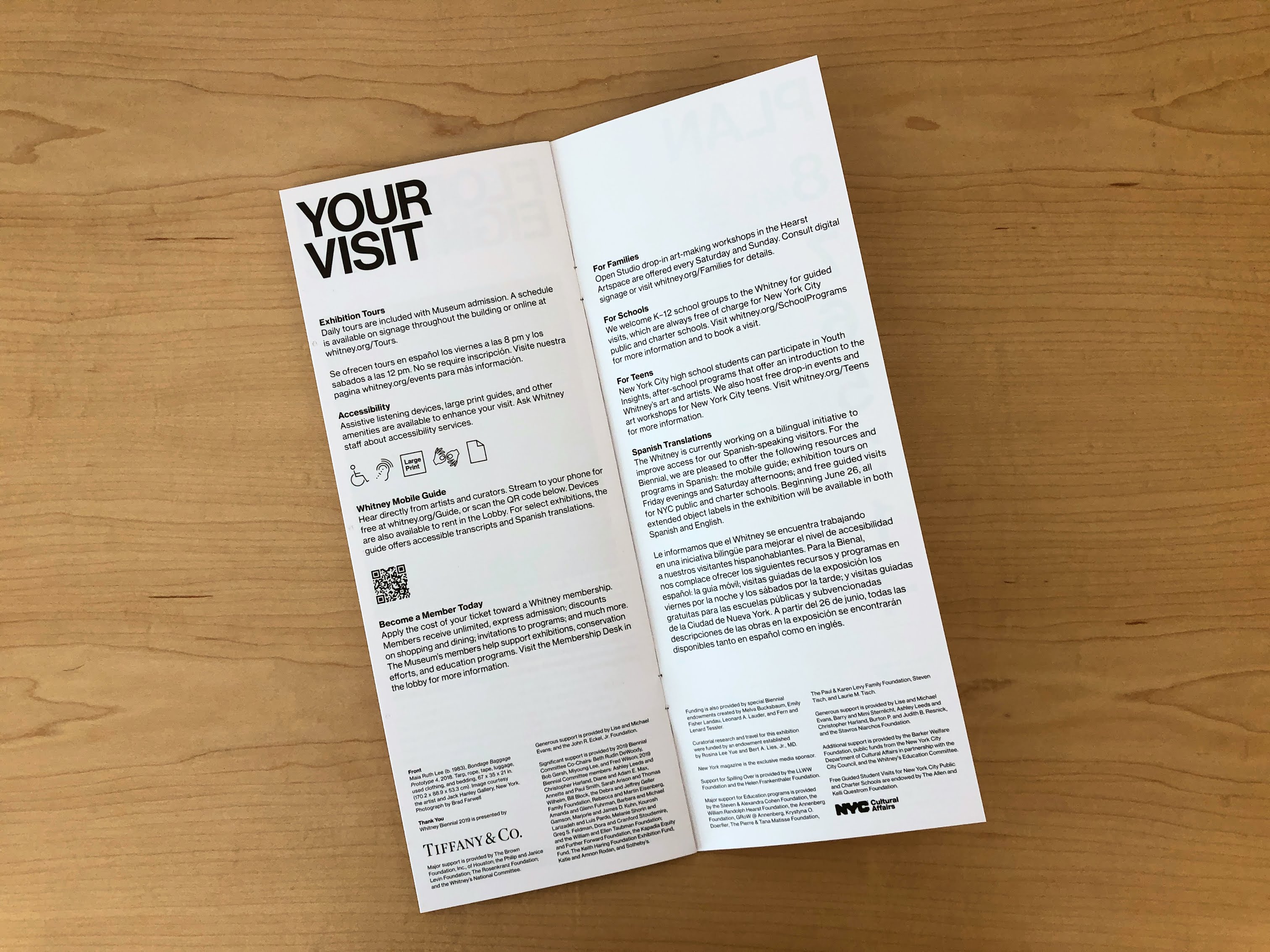
An inside page of the Whitney’s museum guide containing a callout for the Mobile Guide and a QR code.
Museum guides 4,110 scans
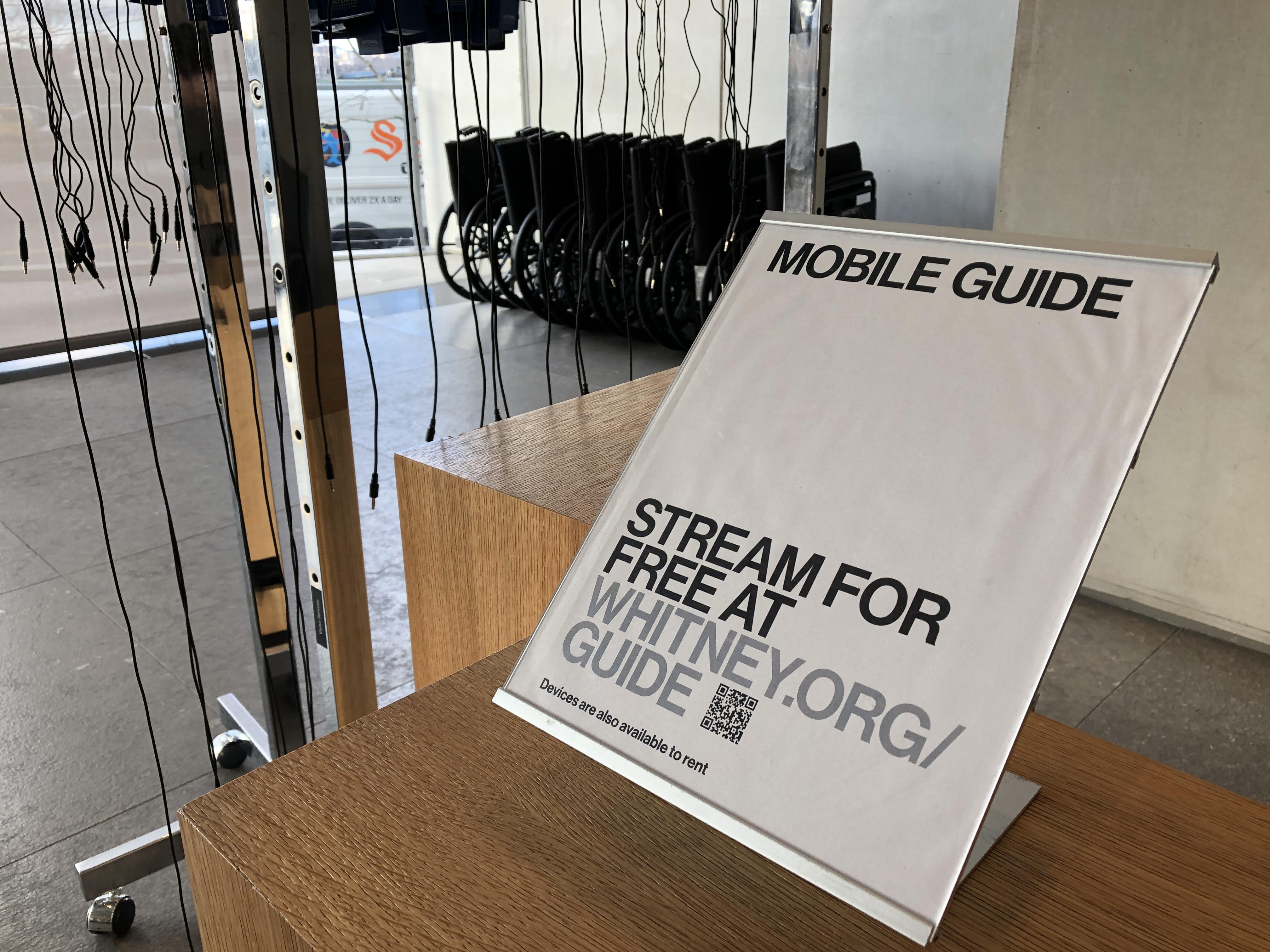
Two stanchions in the Museum’s lobby directing visitors to the Mobile Guide options. BYOD (Bring Your Own Device) messaging is prominently featured next to the QR code.
Lobby stanchions 2,289 scans
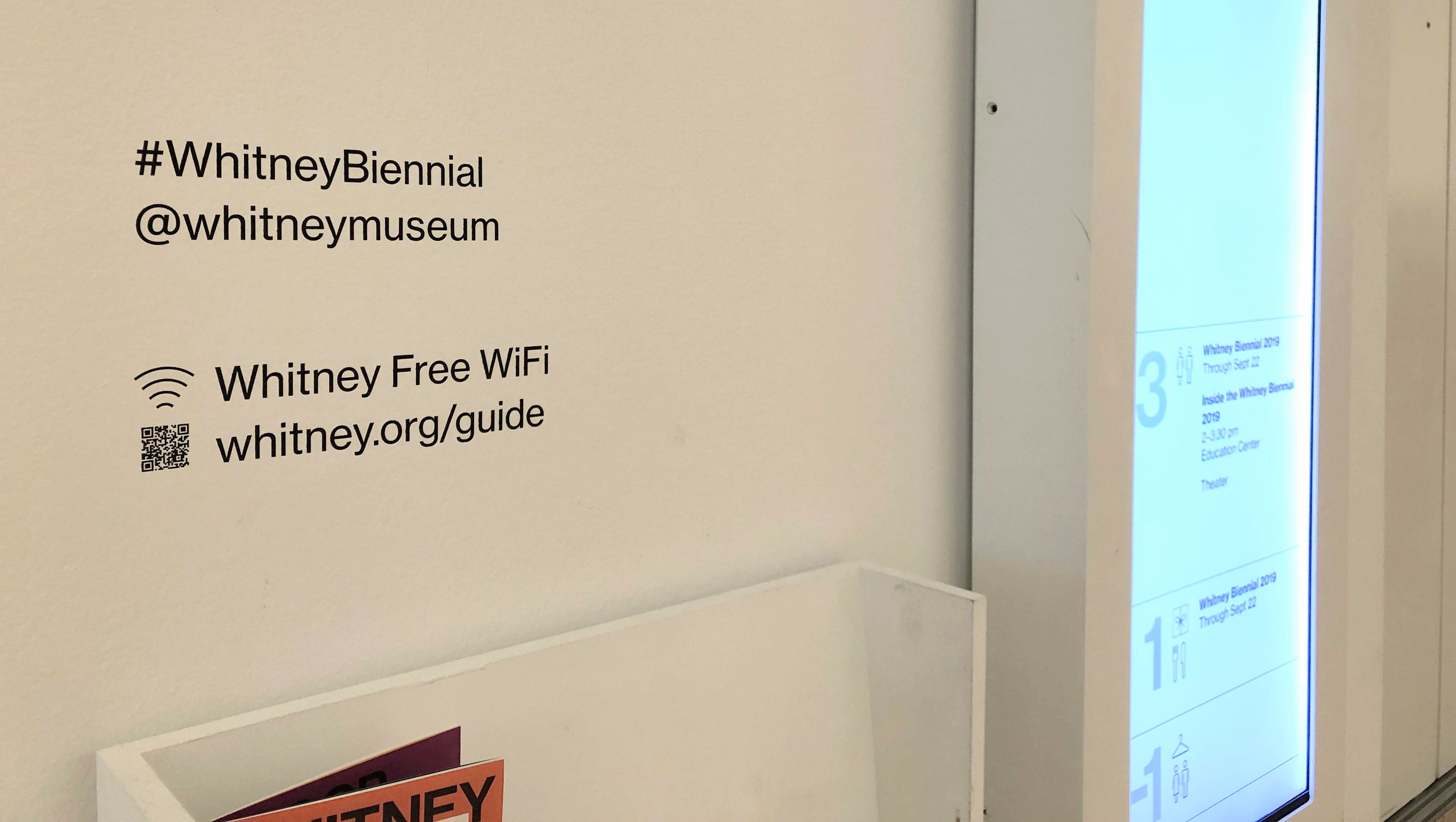
Vinyl text calling out the Museum’s general hashtag, online handle, free WiFi network, and the Mobile Guide (including QR code).
Elevator wall labels 745 scans
I couldn’t find an example of the tour stanchion I’m pretty sure it exists.
Tour stanchions 562 scans
Contextualizing the results
In total, we saw a total of 11,875 sessions from QR code scans (based on unique pageviews) from Nov 2018 to May 2019. Those sessions were initiated by approximately 7,100 users, out of a total Mobile Guide user base of nearly 34,000. And while the ratio of QR-begun sessions to total usage has shifted as certain wall vinyls have changed and ticket stock has rotated, overall QR scanning has been responsible for a significant portion of the Mobile Guide pick-up since we began rolling it out. That more than 1/5 visitors access the guide through a QR code is huge, and at certain points during the Warhol run of show it was responsible for more than 1/4.
Where we go from here
When we began talking about alternative ways to get visitors into the Mobile Guide, one of the most interesting options was just out of reach—NFC tags, which could be placed on signs, walls, counters, and anywhere else. Unfortunately, while most Android phones allow for URLs to be opened from a tap on an NFC tag, iPhones (at the time) did not outside of native NFC-reading apps. However, with the iPhone XS and XR, it appears that this is changing, which should eventually open up this option as consumers gradually replace their older devices. The clear benefit of NFC over QR in this case, is that with NFC visitors would not need to open even their camera, and could instead simply tap their devices at the counter as they enter and be on their way.
In the mean time, we are continuing to place QR codes throughout the museum, and adjusting our standard ticket to permanently include a code on the reverse.
The Whitney’s collection defines and drives much of our mission and our work. It is a unique resource, offering a lens into the historical and contemporary landscape of American art through more than 3,400 artists and 23,000 works of art. With the opening of the Whitney’s new building in 2015, nearly every work in the Museum’s collection was made available online for the first time.
That the initial platform was developed and launched alongside a flurry of other initiatives reflects the challenges, scope, and successes of the release. And while the online collection has been something to celebrate, now coming on five years later we are ready to start making improvements.
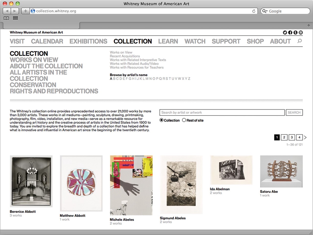
Saying goodbye to collection.whitney.org
The core challenge of any museum’s online collection work is reflected in how many systems and limitations are in play, at all levels of any technical stack. When we first launched the complete online collection, Cogapp and Whitney staff worked together to build a solution that would push our data out of The Museum System (TMS), our database of record, and into forms usable publicly online. Previously the result of this effort lived at collection.whitney.org, which notably is separate from the primary hub of our content and information that lives at whitney.org. Having separate systems allowed for a simpler initial implementation of the collection, but as both the Museum and ambition has grown, so too has the need to bring these separate platforms together.
The original design for collection.whitney.org. Somehow the live version evaded capture by the Wayback Machine, but while the layout is slightly different the functionality represented is the same. Lesson learned — always take your screenshots before shutting a site down.
After the relaunch of whitney.org gradually (and also quietly) in 2017, we began laying the groundwork for pulling the collection into our new custom in-house-built Content Management System (CMS), biting off bits and pieces as we have been able, to slowly build out a solution behind the scenes. By the end of 2018, the collection was fully imported and integrated into whitney.org, syncing on a regular basis, and had a barebones but functional (and non-public) user interface. In short, we had built the majority of a new collection in quiet, as a non-project.
The reasons why we did things this way are complicated, but the succinct version is that while the online collection is important to everyone it is also rarely a priority. So much of what the Museum does on a day to day basis is tied to exhibition programming, either for current shows or those on the horizon, that carving out time to look back or undertake the difficult infrastructural work inherit to collections can be extremely difficult. In this light, performing the bulk of this project over a long period of time without a hard deadline was one of the only ways we could be sure it would happen. As the Museum’s Digital Media department, it is our responsibility to undertake this kind of work because it ties so closely to our mission to enable greater access to the art and Artists we represent, for anyone and everyone we can.
So that said, why build a new collection at all? What does integrating it into our primary web CMS get us that the separate platform did not? There are three main reasons:
1. Global improvements elsewhere on whitney.org improve the collection
As we’ve improved elements of whitney.org like the site’s navigation, font sizes, spacing, accessible markup, and other global aspects, none of those changes have previously fed back into the online collection due to it living on a separate platform. By integrating the two frontends into the same custom Ruby on Rails CMS, work that we do elsewhere will not need to be duplicated on the collection, and the collection will benefit from nearly two years worth of continual improvements to the main site.
2. Deeper and easier relationships between artists, artworks, and related content
In addition to global improvements, we can leverage Rails’ built-in relationship concepts that we use all across whitney.org, to draw links between the collection records and videos, audio, exhibitions, events, products, Whitney Stories, essays, and other online content. And while the previous platform did a certain level of this (through non-trivial manual efforts), by keeping it all within the same ecosystem it becomes both more expansive and easier to manage.
3. Simplified development going forward
Having two entirely separate stacks to produce visually comparable frontends is complicated, and requires separate development environments and domain expertise. By bringing much of the system into our primary CMS, it will take less time going forward to iterate on new features, and more of our code can be reused.
Beyond those three main reasons, there were a whole host of smaller ones, from improved accessibility, to mobile performance, to fixes for bugs, to new search and sort options. All of which on their own constitute major improvements, and ones that would be recognized as such both by internal stakeholders and the public. It is in that vein that we decided to launch what we had, softly, while also using it as a chance to prime our thoughts for what we could really offer with our online collection in the future.
What we launched
The updated online collection encompasses two main strands: one, an artist-centric approach, and the other an artwork-centric one. This is reflective of our positioning as the “Artists’ Museum”, and also the more standard need to surface what works are in the collection. Both sections are deeply interlinked, and are best thought of as two twinned entry points into the Whitney’s collection, history, and mission.
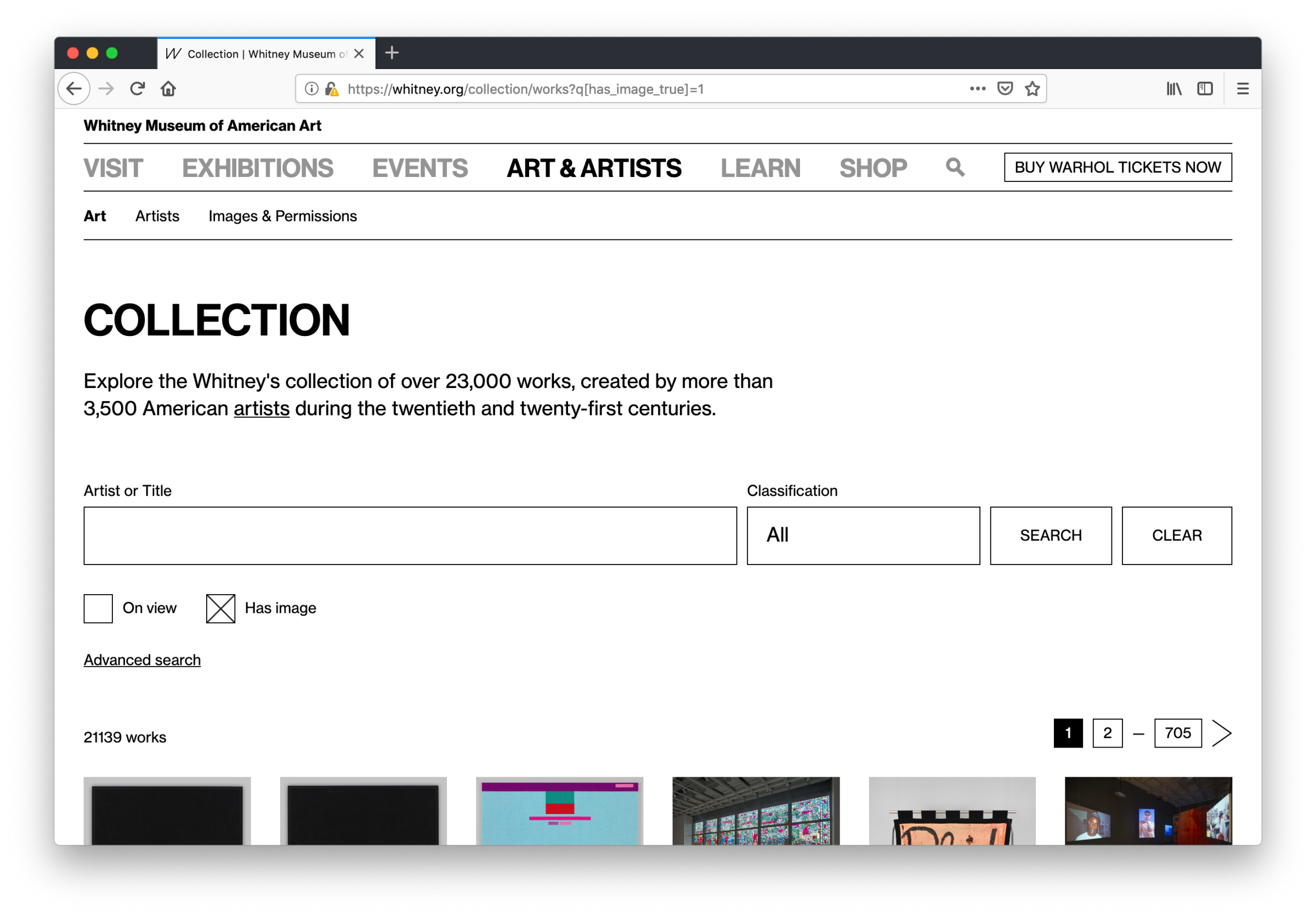
whitney.org/collection/works
The bread and butter of any online collection is of course the art. Our updated whitney.org/collection/works page is the new hub for exploring what artworks are in the Whitney’s collection.
The new primary hub of the whitney.org online collection.
The biggest change from the old collection.whitney.org is that now all sorts and filters are featured on one page instead of being separated across many, and they can be combined and toggled on or off in concert with one another. Which means no more navigating distinctly between what’s “on view” and “works with audio or video”, or being unable to search within the selection of works that have complete object labels, or are on view, or any other qualification— all fields and properties can be leveraged as needed, from one page, with no limit or restrictions on how many can be active at once.
We’ve also taken the opportunity to start fixing certain features that over time drifted into non-functional states on the previous site, while also adding new ones including the ability to view only works that have images (a critical distinction for many users), and to filter by classification or medium. Most of these features take the form of extra fields (revealed by clicking “advanced search”), rather than a single integrated search box, which is something we will be closely monitoring and user testing.
One of the primary goals was to launch with as many search and sort options as possible so that we could see how each feature gets used in practice. Rather than launch a minimal viable product (MVP) we wanted to launch something closer to a maximum to give us the broadest possible scope of data on real usage. Once the trends start to become clear, we can then begin to pare back and invest development resources as the true needs continue to surface.
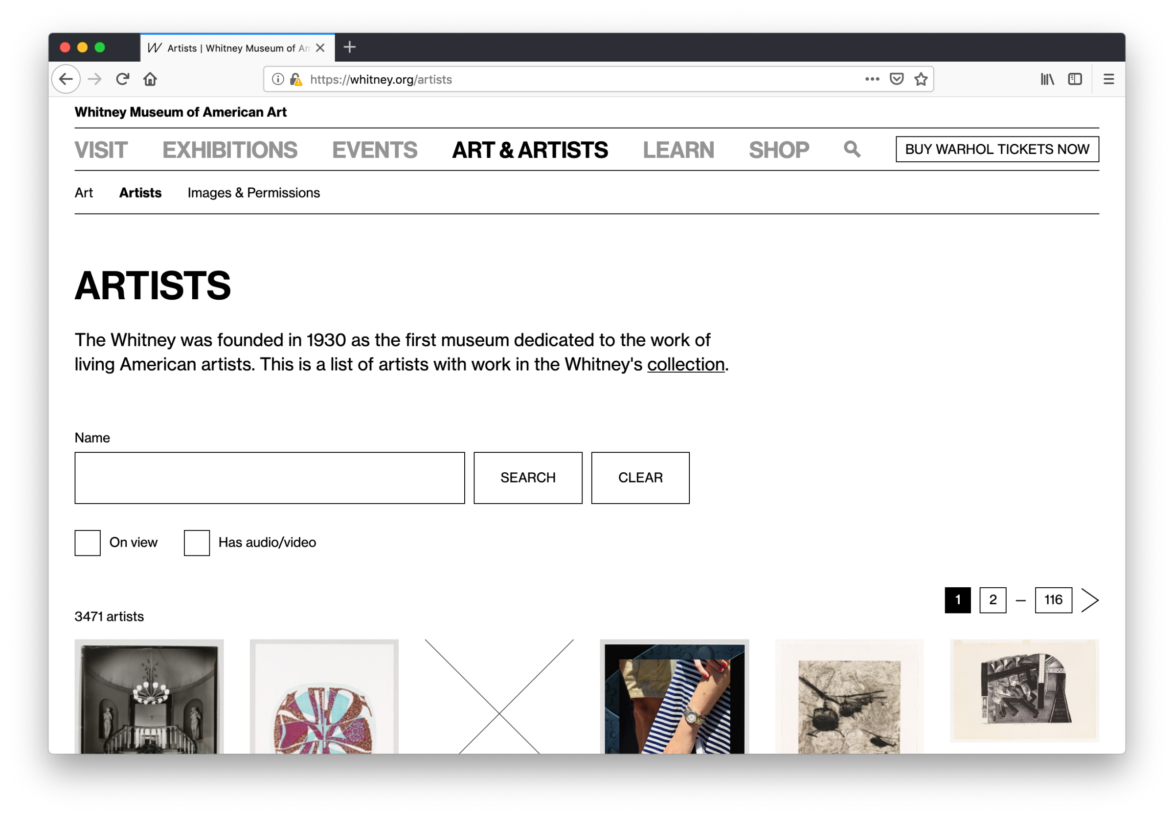
whitney.org/artists
The second of the two sections, whitney.org/artists, did not have a clear equivalent on the old collection.whitney.org, which was limited to showing lists of artists by the first letter of their last name. With all the artist data pulled into our primary CMS, we for the first time had the ability to reorganize and reframe this section into something more respectful of how we think about the Artists in our collection.
The new artists hub of the whitney.org online collection.
Similar to the more standard collection works view, we’ve also added new features here while fixing the intention behind some old ones: artists can be filtered by those that have works on view in current exhibitions, or by those that have audio or video content. Both are options that were not possible on the previous site, and in the case of the latter is a particularly large improvement — we generate a substantial amount of video content around particular artists that might not include any works in our collection, so under a system that only surfaces video if it’s tied to a specific work, much of our video would remain buried. By allowing for more content to be associated and discovered at the artist level, we are aligning better with our overall content strategy.
What comes next?
This is just the first initial step in bringing the collection closer to the rest of what we do online. With our new hubs for collection artists and artworks we can begin to analyze our data, user test with our colleagues and our visitors, and push forward in building an online collection that better reflects the Museum’s mission, and supports the artists within it.
Google analytics was not built for the arts. Most of the time that’s fine: as a museum we still care about all kinds of standard metrics. Pageviews still matter, session behavior matters, referrals matter, ecommerce matters, and when we need something specific to our platform or its extensions we can usually cover it with custom event tracking or find another tool that can give us what we need. But as we’ve tried to more cohesively analyze data around our exhibitions, it’s become more and more labor intensive to identify the throughlines between content spread across different aspects of our online presence. There are a number of ways we’re working to answer this challenge, and one is through better utilizing custom dimensions.
What are custom dimensions?
Custom dimensions are a feature of Google analytics that allows you to create your own organizing principles for your data. For the Whitney, this means we could associate behavior by internally important concepts like exhibitions, events, artists, or visitor motivations. Dimensions can slice across all the metrics we already track, but allow for different ways to frame investigations of our content. They are effectively a label, following rules of our choosing, to brand existing data in ways that are meaningful for an art museum.
Isn’t there [x] [y] or [z] platform that could do this?
Adding more tags and the burden (both human and technical) of more platforms fragments our ability to cohesively analyze our data, and impacts our ability to answer basic questions about the things we do and the exhibitions and artists we support. What we need are faster ways to look at our data in the proper contexts, and as a relatively small organization we simply don’t have the time to be endlessly checking and supporting a large number of reporting platforms.
So how are custom dimensions useful in practice?
The original question that instigated much of our work with custom dimensions was, on the surface, a straightforward one:
“How can we measure of the performance of online exhibition content before, and after it opens?”
Fundamentally that’s a question with two primary components: 1) Time, and 2) Performance relative to that time. And both aspects are theoretically available with all of our existing web analytics data: we know when shows are open and when they’re closed, and we have all manner of metrics to track the videos and features that we could review during those windows. But what becomes immediately apparent after any attempt to start collecting that data for review is just how much labor would be involved in comparing across exhibitions.
Exhibitions do not all open at the same time, and they don’t close at the same time. Shows are almost always operating under their own schedules, so something as basic as choosing the time range in Google Analytics becomes horrendously tedious as it means doing separate reporting for each and every show, since Google Analytics has no concept of an exhibition opening date. And even if that were feasible for a small team, the second ruining factor for this approach is that not all of our exhibition focused content lives on a single page — important media like essays, or audio guides, or Whitney Stories live outside the traditional exhibition pages we put together, so any review centered only on say whitney.org/exhibitions/programmed, won’t cover everything we need it to. And that isn’t even starting to cover related behavior that is absolutely tied to exhibition performance like selling tickets or memberships online, or diving into other related resources like the collection or events.
In short, exhibition performance depends on multiple aspects of whitney.org, and a concept of time that is not natively accessible within Google Analytics.
Solving the problem
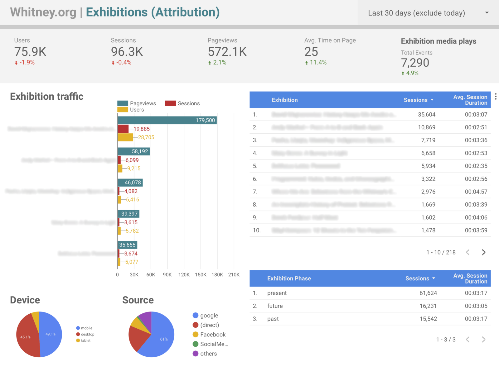
Starting with the assumption that someone interested in an exhibition will visit the exhibition page on whitney.org, we built out a number of custom dimensions to assist us in tracking exhibition performance across the site. The dimensions we added for exhibitions all depend on a user first visiting an exhibition page. Once they’ve done that, their session is tagged with three dimensions:
Exhibition. The title of the exhibition.
Exhibition phase. “Present,” “future,” or “past” depending on if the exhibition is currently open, yet to open, or closed.
Exhibition relative date. A numerical value representing the number of days from the opening date (4 days before would be “-4”, 10 days after would be “10”, and opening day would be “0”).
With these three dimensions in place it becomes possible to build segments or reports based only on a single exhibition, but review data from everything they did across the site during that session, from watching videos to diving into the collection after reading about a show to purchasing tickets. It also becomes possible to build reports for all exhibitions, but limit it to a specific phase (e.g., pre-opening), or an exact range of days (e.g., the week before opening). All of that data was possible to gather before, but by building the attribution into the Google Analytics structure it becomes far less labor intensive.
One of our [in progress] exhibition overview Data Studio dashboards. Others drill down into more specific data, like ticketing and membership sales broken down by show.
Outside of answering the original question of what performance looks like before and after an exhibition opens, this approach offers up a host of other interesting ways to slice our data. One of the most significant is in being able to easily attribute our ticket and membership sales to specific exhibitions. Prior to these dimensions, it was possible to build segments that filtered based on sessions that included specific exhibition pages, and review ecommerce conversion rates, but with the updated tracking in place it became trivial to setup Data Studio dashboards that labeled transactions by exhibition title rather than by url (which is not a small gain in terms of readability and by extension share-ability), alongside all sorts of other metrics.
Again the benefit is less about enabling technically new data, than offering up easier and more human-friendly ways to view it. Instead of manually checking the dates for a specific exhibition it is now possible for us to create reports framed in ways that cover many. Considering the last 9 months of exhibition data since the start of 2018, some of the points that are now easy to pull include:
66% of exhibition traffic has been to exhibitions while they were open, 19% to ones that were closed, and 15% to ones opening in the future.
Users viewing presently open exhibitions spent 20% longer on the site on average than those looking at past or upcoming ones.
83% of exhibition-driven revenue came from shows that were currently open, and 16% from ones opening in the future.
76% of exhibition-associated audio guides views came from shows that were currently open, and 20% from ones that have already closed.
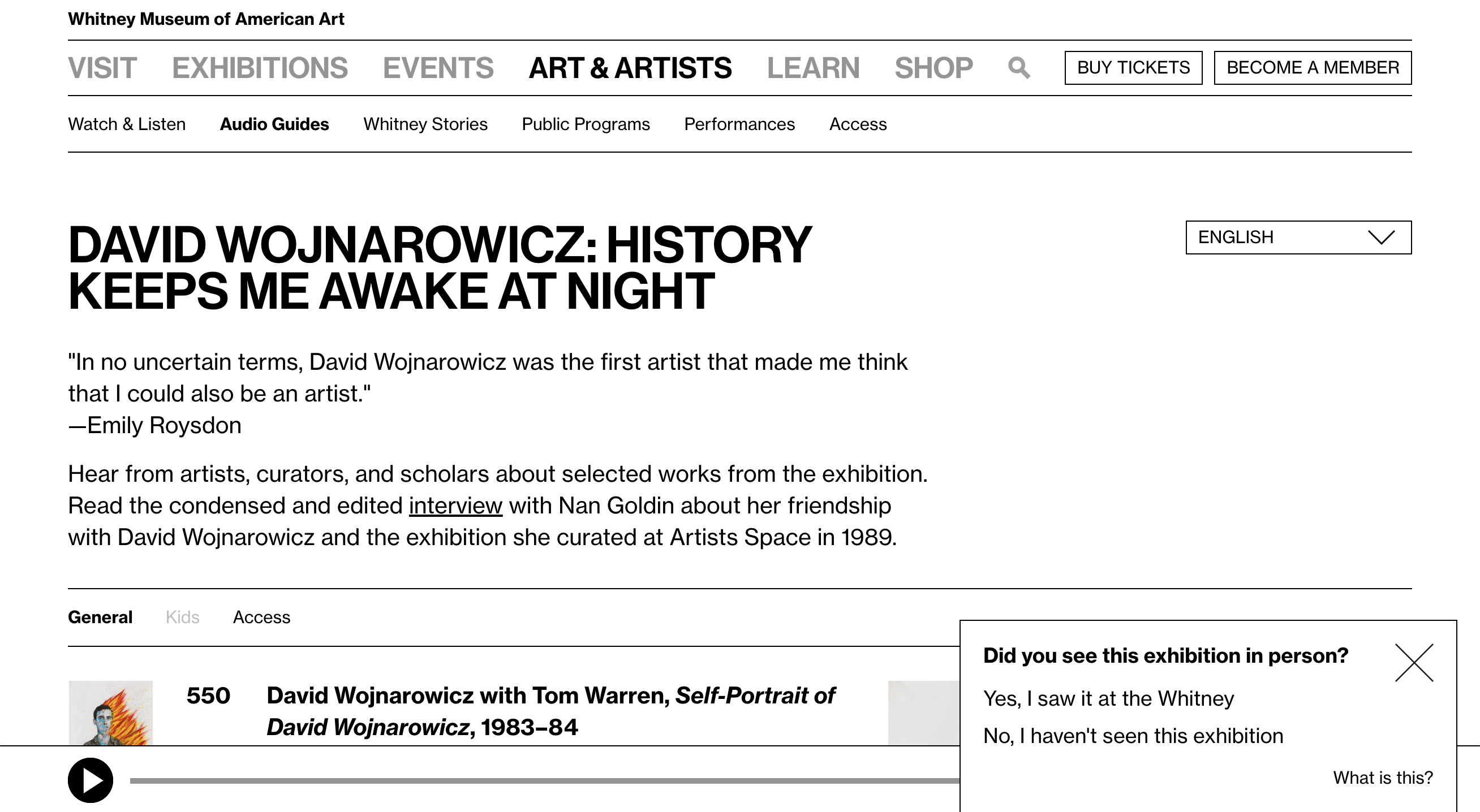
So far the top traffic (opening, +58, +1) and top earning days (-98, +60, -97) for our exhibition pages have been a bit a bit all over the place, reflecting specific news events and marketing efforts, which suggests that much of this sort of data will take time to settle into clearer trends. However, much of these kinds of time-based comparisons can be supported through other investigative methods. For example, in the case of audio guide usage, we ran a one question motivation survey on the audio guide section of the site asking users if they had seen the associated exhibition at the Whitney. Of the 964 responses we collected, 69% of those users said they had seen the show, and the remaining 31% that they had not. Combined with the data point above, it is clear that the majority of external-to-the-building audio guide usage occurs post-visit, after seeing the show and while it is still open.
A one question survey we ran on the audio guides section of whitney.org to help determine when users were utilizing the guides. The popup both created Google Analytics events with the answers, and set a custom dimension for broader session tracking.
What are the limitations?
All that said, one really critical assumption here is that most users are visiting only one exhibition page, or that the last exhibition they view is the most important one for the purposes of our data (as that last-view will override any earlier exhibition-related values for their session). Given our usage data on whitney.org, this seemed reasonable given the small fraction of users that view multiple exhibition pages during a session, but it is important to keep in mind.
What else can this kind of approach be used for?
Aside from the three exhibition-focused dimensions discussed here, we have 9 others that cover other aspects of the site. Three are used in the same way as exhibitions for events, and the remaining 6 are used for things like tracking audio guide and Mobile Guide usage, language settings, and visitor motivations (look for a future post for a deep dive on that). By re-framing how we could consider our exhibition analytics data, other avenues for improvement quickly presented themselves.
Conclusion
Google Analytics custom dimensions have been a vital part of our journey to be able to consistently and useful report on our exhibition performance. The challenge of answering our original question is still ongoing, in large part because of the need of having to see multiple shows go through our updated data-collecting process, but also because we are still figuring out what metrics are meaningful for our particular content.
I was part of a presentation at MCN 2018 on a visitor motivation survey (VMS) we ran on whitney.org. As a group we covered the context of motivation-based surveys at museums and some key learnings for the Whitney, both in results and in strategy.
A few months ago we launched a new visit planning feature on whitney.org. Varyingly referred to internally as “Today at the Whitney” or “What’s on Today”, this feature came about after a conversation with a number of our colleagues in Visitor Services around our Plan Your Visit and Events calendar pages. They brought up how difficult it can be for visitors to get a good view “at a glance” of what all is happening at the Whitney on a given day, and wondered if there was a way we could better serve this need on whitney.org. To anyone who’s visited museums and their websites, this is likely a familiar problem.
Ultimately the solution we came up with did three important things:
Drove more people to our event pages
Increased traffic to our ticketing platform
Noticeably boosted our overall ecommerce conversion rate, despite including zero ecommerce focused features or calls to action.
At the same time we also discovered a new and interesting method for messaging upcoming events, and revamped a portion of our public WiFi login process. We set out to improve the visit planning experience on single page of whitney.org, and ended up supporting the broader goals of getting more visitors committed to visiting the museum, and orienting them once they’re here.
Considering the problem
The core challenge for us was, how do you show both numerous long running exhibitions AND brief special events that only happen at certain times on certain days, without overwhelming the viewer with information? A traditional calendar might work well for daily events, but with exhibitions that run for months, how do you best mix the two and still have it make sense “at a glance”? Especially when the distinction between a special exhibition and an event, meaningful in terms of museum programming, might often be unimportant to the average visitor who is simply interested in anything that’s available for them to do.
There are a number of examples of other museums that have attempted to solve this very real problem, but given our own particular blend of programming and distinctive design style, we thought we’d need to break a bit from our peers and generate our own solution.
The questions we really needed to answer were 1) what’s the minimum amount of information that a future visitor needs while still providing context, and 2) what sort of layout and functionality supports a simple path to discovery? Keeping the amount of content to a minimum was incredibly important, as the whole concept would still live in parallel with the existing fleshed-out exhibitions and events sections of whitney.org. And ultimately, those sections would likely better serve someone with a more specific idea of what they were looking for. What we were after was a starting point for someone to think about what they would do during their visit.
With that in mind, what we kept coming back to was: what would someone physically hand you if we could design and produce a museum guide for the exact day you were planning to visit, or even while at the museum? The paper guide experience is an extremely familiar one, and seemed to offer the closest equivalent to the experience we were aiming for: not a deep dive, but something to guide you as you moved (or planned to move) through the museum.
Using paper as inspiration
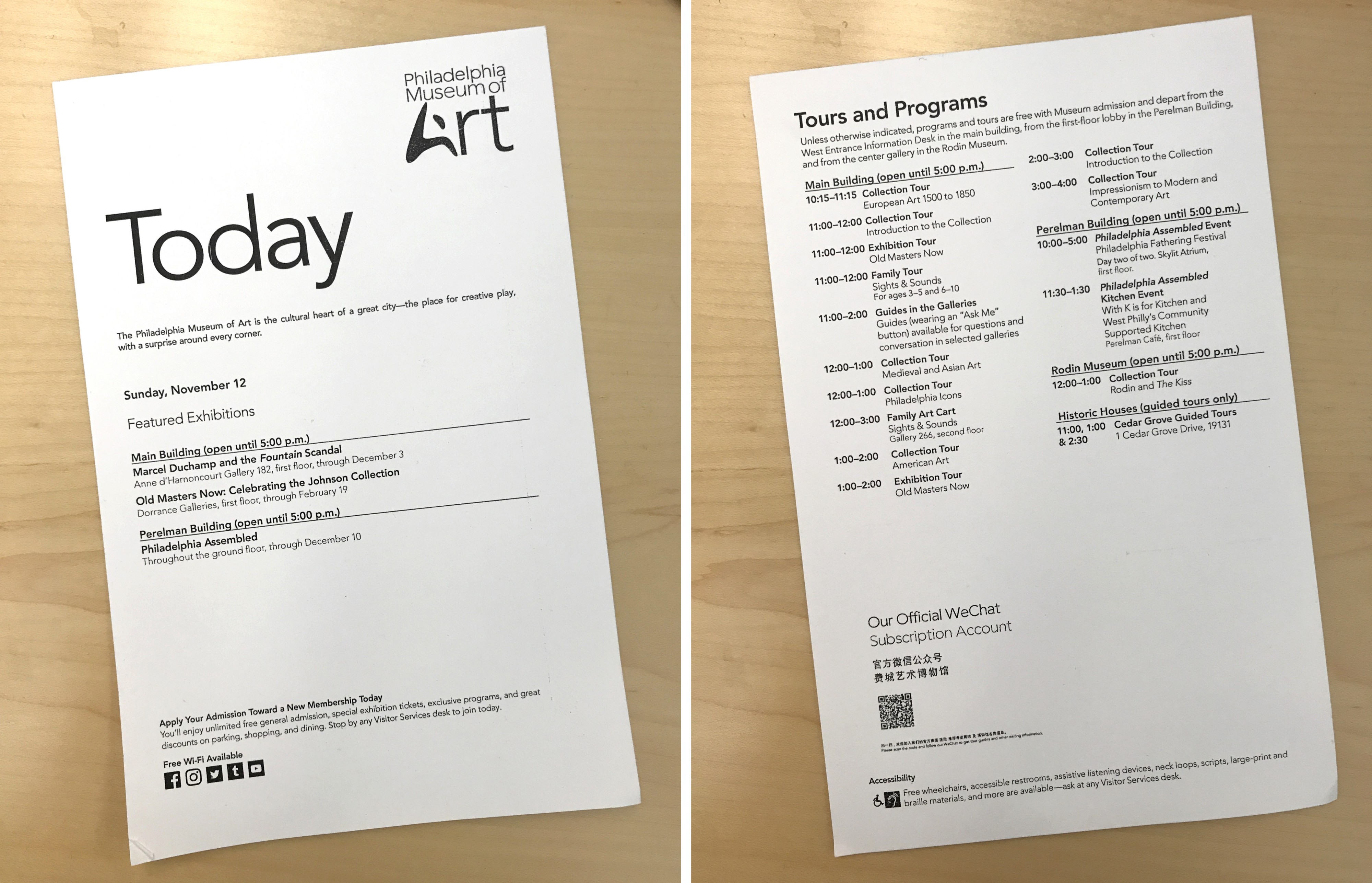
Right around when we started this project, I happened to visit the Philadelphia Museum of Art, where I ran across this handout:
“Today” at the Philadelphia Museum of Art handout.
While it only covered the day’s events and a small selection of the exhibitions on view, this was by far the most helpful piece of messaging around events I can recall encountering at a museum. It’s incredibly straightforward, clearly organized chronologically, and gives someone (like me) who does not tend to seek out information about events a solid impression of options I wouldn’t otherwise have considered. Printing physical paper drags along all kinds of complications, but the idea, translated to digital, felt very close to something that could work for the Whitney.
Putting it together with exhibitions
Armed with the understanding that a chronological list (not surprisingly) is very helpful for parsing events at a glance, the remaining challenge was how to mix it with a presentation of our current exhibitions and any other potential content. Focusing on this feature as a visit planning tool, we decided to limit our display of exhibitions to those that had a physical presence at the museum. This meant stripping out our online-only content, our then-current billboard, and any other exhibitions that did not strictly have a presence on a floor within the building that a visitor could expect to see. This limited the content we would need to showcase, lessening the risk of the feature becoming overwhelming.
At the same time, through rough experimentations to more polished explorations with our colleagues in Graphic Design, we jettisoned earlier thoughts of also including hours and dining information. Exhibitions and events offered enough of an organizational challenge, and adding anything else pushed us into territory where it seemed like we would have to hide some amount of the content behind user interactions…defeating the original goal of having everything “at a glance.”
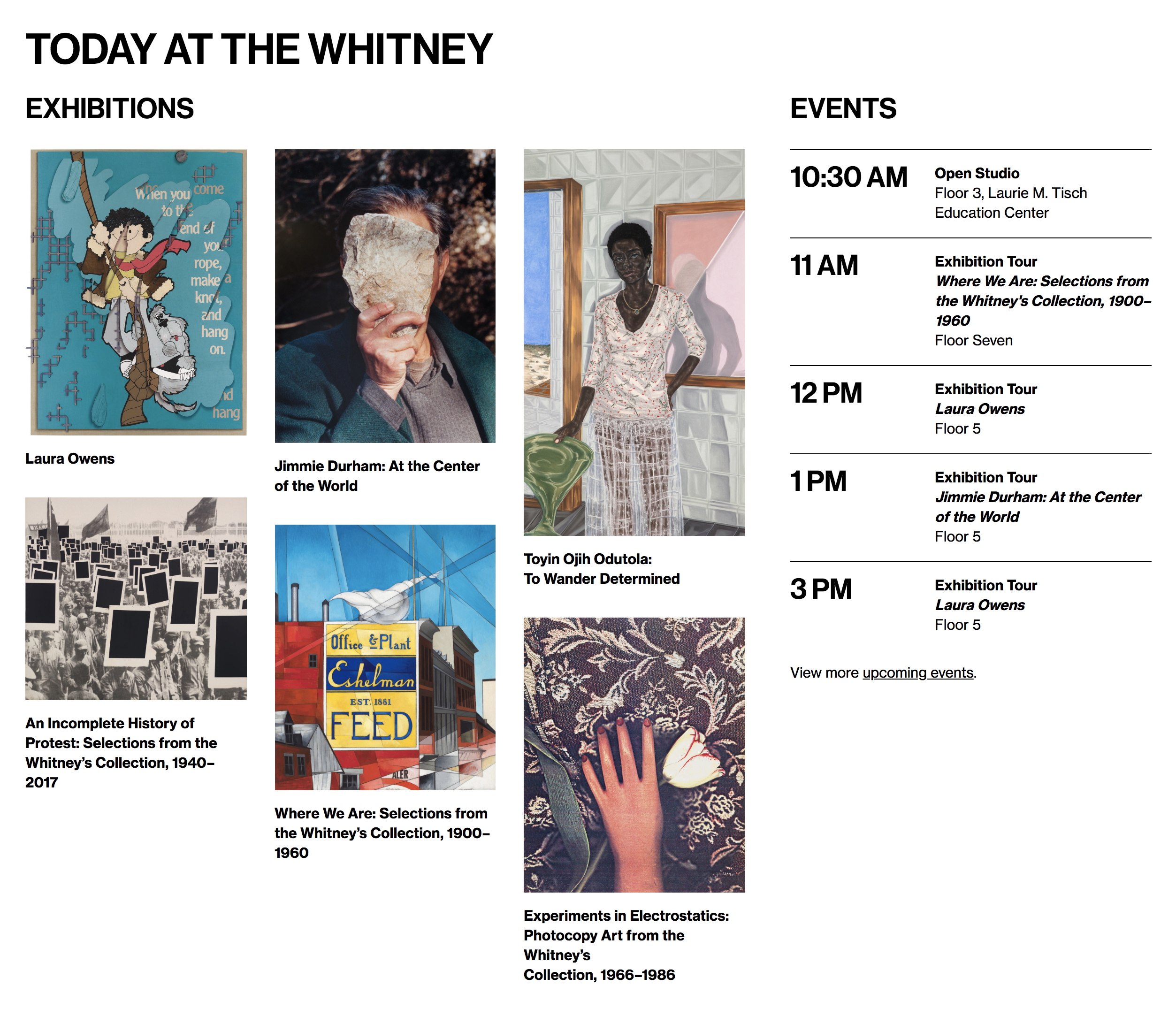
With our content scope settled, we determined how much information to include about both kinds of programming, and put it all together. What we ended up with was a sort of side-by-side presentation of exhibitions and events, with the former arranged in an image-centric masonry grid, and the latter in a vertical list that allowed for the clear display of times. This solution felt appropriate because it addressed the critical pieces of what each content type needed to get across: events happen a specific time, and exhibition images are helpful (even if not perfectly representative) in terms of grabbing someone’s attention, and giving them at least a slight sense of what a show might entail.
Benchmarking right from launch
In a first for whitney.org and our team, we did not launch a major feature for 100% of our audience: “Today at the Whitney” went out with a hard soft-launch for 90% of our web visitors, with 10% receiving the previous version of the Visit page, sans new planning tool. We did this purely so we would have a benchmark to compare against, and see what effects the new feature might have.
While this might sound reminiscent of our approach to A/B testing, it’s different in the critical fact that “Today at the Whitney” was always going to ship. This was not a comparison between two competing options: the feature was going out, and we would iterate it on it going forward. But by releasing it to just the majority of our audience rather than all of it (via Google Optimize), we allowed ourselves the chance to better understand the product we had built.
Measuring success
With “Today at the Whitney” released through Google Optimize, we had 3 metrics chosen to observe:
Traffic to exhibition pages
Traffic to event pages
Traffic to our ticketing site
One of the more interesting questions raised by a feature like this, is whether success should be reflected in an increase or a decrease to the expanded views of the represented content. Is “Today at the Whitney” more successful if it sends fewer people to our exhibition pages, because they no longer need to navigate to the richer views to get a sense of what’s on, or is it less successful because they neglected to take a deeper dive? I think you can make an argument for both options, which is a huge part of why it felt so important to measure any changes to these metrics post-launch. Both reflected strategies might have their positives and negatives, but we ought to know which one we’re shifting towards.
Changing behavior through supportive content
We ran our Google Optimize experiment for 3 weeks after “Today at the Whitney” was launched for 90% of our audience, and covered approximately 25,000 user visits to our Visit page. In terms of user traffic to exhibition and event pages, “Today at the Whitney” decreased the conversion rate by ~3.5% to exhibitions, and increased it by ~17% to events. It also increased the conversion rate toour ticketing site by ~8.3%, and our overall ecommerce ($$$) conversion rate by ~3.5% over the period.
The slight drop in traffic to our exhibition pages seemed reasonable in light of our speculation about certain users only wanting a “glance” of what was on instead of a deeper dive. The huge increase in the traffic to our event pages on the other hand was a more delightful surprise, and suggests that this feature is serving a need that wasn’t previously being met elsewhere in the user journey. Perhaps most intriguing however was the bump in traffic to our ticketing site, and the subsequent purchase rate. “Today at the Whitney” has no callout to ticketing, so any change in these numbers isn’t due to some new button or link: it’s due to users simply being more interested in purchasing tickets.
Moving the needle on ecommerce while trying to provide a better visit planning experience is an ideal outcome for a feature like this. Through building a display of content to support the user experience on our site, we ultimately impacted our broader goal of trying to get more visitors into the museum.
A surprise second product and what’s next
At the same time we were working on “Today at the Whitney”, we were (at first) unrelatedly updating our public WiFi login flow. After enough time staring at both projects, and given some particularly tight technical constraints around WiFi login, there was a bit of a light bulb moment where we decided to try incorporating a simple listing of the days upcoming events into the screen a user would see immediately after connecting. And as it turned out, this felt quite natural, and in many ways turned into the sleeper success of this project.
Additionally, since the initial launch we’ve made a number of improvements to “Today at the Whitney”, including turning it into a “Tomorrow at the Whitney” feature once the museum has closed for the day. Going forward we may want to expand it again to include some concept of weekend planning, or draw on stronger links to our general events calendar. The challenge will continue to be how much can we include, while keeping the “at a glance” view understandable and readable for the average user.
The strategy of launching a major feature, even one limited to a certain section of a single page, to a portion of our audience and benchmarking the remainder, was vital to understanding “Today at the Whitney.” That strategy will not always be appropriate or viable for all of our releases, but when possible, and in conjunction with user testing, A/B testing, and Google Analytics, it’s something we’ll continue to do in the future.
A lot has changed about whitney.org over the last year. This includes the entire platform underpinning the site, and a number of major usability and user interface improvements, from reworked navigation, to new mobile experiences for audio and video, to the incorporation of outside voices in our exhibition content. And with growing distance from the complexities of launching a new website, our data-related work has been picking up steam as we’ve been able to devote more time and mindshare to it, which in turn has begun to more deeply impact our design thinking and decision making processes. A major aspect of that impact is in an increasing ability to reevaluate our assumptions, and to better understand how visitors are actually interacting with us…rather than just how we might think they are.
In the beginning…
With whitney.org being rebuilt from the ground up, there was the opportunity (and requirement) to reconsider what data we ought to be collecting and analyzing through Google Analytics (GA) and similar tools. I joined the Whitney Digital Media team part way through this project, and so initially my primary goal was simply to get a handle on what was being tracked, and where we had major gaps.
Previously I had interned with the Museum of Modern Art on a data analytics and ingestion project and I hoped to build on that effort at the Whitney. Google Analytics can give you a lot just from incorporating the tag on your website, but to really understand our audience we needed to make sure we were also tracking important interactions, like use of our navigation, audio and video plays, and various call-to-action (CTA) clicks that wouldn’t necessarily be visible in the default pool of data. Without that tracking, we wouldn’t have a baseline to compare to when we were ready to start considering more major design and structural changes. Looking forward meant getting our house in order, today.
In addition to putting together the pieces for an interaction-baseline in Google Analytics, I was also interested in reviewing how accurate our GA-reported ecommerce numbers were compared to the organization’s internal accounting. This necessitated reaching out to colleagues in other departments. And while those conversations were brief, they have been incredibly important in framing our work. Seeing how our numbers compare to their numbers gives context to the fuzzy reporting of Google Analytics, and helps us to know what of level of confidence to ascribe to our figures…which is vital to separating the signal from the noise.
From passive data to A/B testing
The next stage in the Whitney’s digital data lifecycle has been to start investigating why our numbers are what they are. It’s one thing to know that we got 100 clicks on a button last week, it’s another to tease apart why it was 100 and not 50, or 200, or 10,000. To that end, we’ve begun to evaluate more and more of our core digital content through A/B testing. Altering certain elements of pages and considering those changes in relation to basic metrics like session duration, pageviews, and ecommerce transactions has been hugely helpful in terms of figuring out what aspects of our design and layout are effective at achieving their intended purpose. It has also been a gradual process, characterized by a growing willingness to experiment.
We began by making small changes to individual elements using Google Optimize: experimenting with the color of a few CTA elements, shifting the placement of a few links (and adding others), all in the hope of driving more conversions. As we became more familiar with the process of building and running tests, we started experimenting with larger aspects of the site, including a wholesale replacement of the footer, and a number of tests designed to start teasing out the effects of utilizing different kinds of content to promote exhibitions (or broadly, the institution) on our homepage. In the case of the latter, we’ve varyingly given users videos of artworks, images of artworks, experiential videos of exhibition installations, and images of people in those exhibitions.
The question of what content works is incredibly important to us as the museum’s Digital Media department. It’s our job to determine how to best reach new and returning audiences, and a major driver of our ability to do that is the media we choose to forefront. A/B testing is one more tool we can use to help make those decisions.
The conventional web wisdom tends to be that video will result in higher user engagement than still images. Video is also inherently more expensive than images, so the choice to go with one over the other doesn’t come without a few tradeoffs. In the effort to set a baseline for our both our data and any data-driven strategy, we wanted to test the conventional wisdom against our specific circumstances as a mission-driven arts institution. Given the added cost, we wanted to be sure that we understood the implications of each approach, and the metrics they affect.
And while it’s still too early to say what the definitive value difference may or may not be for us, the initial results have been interesting, and continue to warrant further investigation, and suggest new avenues to explore for homepage content.
Incorporating user feedback
Closely connected with our push into A/B testing, we’ve been working to get more qualitative feedback on various aspects of our platforms. This has included both quick in-person terminology surveys, and an incredibly rigorous two-part in-depth usability study of whitney.org run by an outside consulting firm. Both kinds of testing have been extremely useful, while also demonstrating why it can be worth it ($$$) to work with experts in the field. In-house user testing has made a lot of sense for us as small and focused endeavors, while the external usability study brought a level of expertise and specialized tooling we would never otherwise have had access to. There’s much more to say on both, but that deserves its own post.
It’s worth mentioning that all of our user testing efforts at some level remind us of what we aren’t doing as well as we’d like. And while it would be easy to discouraged by that, I think it’s important not to be. There is no end state in usability work. There is no point at which everyone will convert, everyone will understand our UI, and everyone will have a positive experience the first time, and every time after. Rather our goal is the constant evolution of our products, reflecting the changing needs and expectations of our audience.
T H E F U T U R E, and moving to product development in tandem with evaluation
So what comes next for our data efforts? Likely, it’s wrapping together all the helpful experiences we’ve had over the last year into a more consistent, repeatable process. In effect, moving to something akin to user–test driven development, where new features are planned alongside user-focused evaluatory measures. Whether that means A/B testing aspects of design or functionality, or small scale in-house user surveys, or even larger external evaluation, our actions should depend on the nature of the feature and be determined in advance, rather than only as a post-launch reactionary measure.
TL;DR
Just because we measured something doesn’t mean we measured what we thought we did.
An animated mapping exploration of the Washington Post’s fatal police shooting dataset. Locations are geocoded through the Google Maps API, and build up a familiar image of the United States.
Interning with MoMA’s Digital Media department is great. Building a dashboard to track metrics across the museum is really complicated. Both of these statements are true, which is the kind of authoritative certainty I strive for in data analytics. This summer my job has been to create a dynamic dashboard that pulls in data from sources all over MoMA, that ideally updates automatically.
On its face, building a dashboard might sound like a straightforward task, composed of a) collecting the data, and b) visualizing it. But in practice it’s been much more complicated, requiring a significant amount of both human and technical collaboration. Figuring out where various metrics are coming from, if they are what they should be, and how to wrangle them into a dashboard requires answering a lot of questions with often imperfect solutions.
Part 1: Data audit — “What’s out there?”
Being new and legitimately having no idea how MoMA kept track of anything, there was no reasonable way to start this project without first talking to the people who knew their data best. MoMA had already identified the types of metrics it wanted to track, but the nitty gritty of how to generate them accurately and efficiently was something I needed to sort out. I began by sitting down with individuals from different departments and asking about what metrics they were interested in, what services they used, what their workflow looked like, what things worked well, and what things they’d like to do differently.
Having these conversations with people from retail, social media, email marketing, membership, management information, IT, collections technology, and others, was vital to the project for two primary reasons:
There would be no technical way to create the metrics I needed without knowing where they had to come from.
Without these conversations I wouldn’t be able to even start to answer the sorts of questions that have come up constantly throughout this project, and I’d be sending a dozen emails a day asking how numbers were calculated.
What those early conversations allowed me to do was be more efficient when I did have to bother people. They also meant that I had a better idea of what was possible to track, and critically at what point in the data-flow I should try to track from.
By the way, when you think you’re done you’re with this you’re not: something else will always come up.
Phase 2: Get the data — or SaaS (Spreadsheets as a Solution)
Of course the obvious question for all of this is how do you get data into the dashboard in the first place? How do you marshal it all together in a consistent and interoperable enough form where that’s possible? It’s a lot easier said than done when you start reaching dozens of separate services, and feel your brain start to melt thinking about how to combine your Instagram, Tumblr, Twitter, Facebook, YouTube, Periscope, and email subscriber engagements segmented by month, post, impression, or number of followers.
“Data” is great, but the practice of getting it cleanly, consistently, and quickly for multiple people can be a real headache when it’s spread so widely. This is part of the impetus for MoMA to build a unified data-dashboard. To create a single place where KPIs and other important metrics can be observed by multiple people, over time. Where there is enough information to be useful at a high level even if it isn’t necessarily the absolute truth, and the reasons for any inaccuracies are clearly documented.
It’s important to point out that this has been by far the longest step in the process. The state of data on the web in 2016 is one of APIs and a gauntlet of new vendor-specific dashboards you need to login to once a month, remind yourself where they hid the export button and date selection, and dump the data to a spreadsheet. For a place like MoMA this presents a kind of sweet spot of organizational difficulty: enough data and the savvy to utilize it within its channel, but enough distinct data sources that it becomes a monumental task to assemble everything into a bigger aggregated picture of what’s going on.
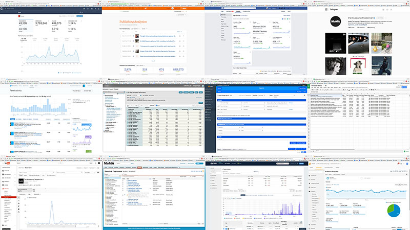
A small smattering of MoMA data sources. There are dozens more.
It’s great that (in a vacuum) so many of the museum’s data sources provide access to their content or analytics online. But as the number of services MoMA and other similar institutions use continues to creep upwards, these sorts of silo’ed check-each-service solutions start becoming really unwieldy.
I think it can be tempting, having reached this point, to do one of the following:
Buy a service that sells itself on integrating all your other services. This will inevitably pose its own complications, and will require yet another service in the future to better integrate the integrating services.
Develop something in-house that will require highly technical (and expensive) maintenance for the duration of its existence.
Say screw it to the whole thing and stick with your current inefficient workflow.
What I’ve tried to do with MoMA is split the difference between those choices, hopefully taking some of the benefits of each.
In my mind the core problem in sharing data across any like-minded medium-sized institution is making the data available at a level that is accessible from a range of technical perspectives. And I mean that both with respect to the technologies themselves and the expertise of the people utilizing them. It might be great to break your social media data out in a SQL database, or to say hey, here’s the API keys, have at it. But that doesn’t work for everyone’s level of technical know-how, even if it might work with your Tableau or Qlik integration. Building something that will last requires building something that can evolve alongside needs and expectations. So rather than focus on creating the perfect dashboard, I’ve worked to get MoMA’s data feeding into spreadsheets.
That may sound a little antiquated, but the reality is that spreadsheets are already in just about everyone’s workflow who deals with data. Getting data into Google Sheets means that nearly anyone can do something with it, from charting within the sheet, to pivot tabling it somewhere else, to importing it into just about any other data-dealing software imaginable (including in MoMA’s case, Tableau). However, what makes Google Sheets in particular an appropriate tool for building consistency across sources, is Google Apps Script.
Google Apps Script allows you with minimal fuss to write JavaScript that interacts with a corresponding Google Sheet. In turn that allows for the possibility of connecting to the APIs of the various data sources you’re trying to do something with. For MoMA that means things like our ticketing system, email service, social media channels, and our app downloads tracking service among others can all be setup such that each night a Google Apps Script goes out to each API, requests data from the previous day, and then inserts that back into a Google Sheet. And with Google Apps Script triggers, that happens entirely automatically with no human input. From there it can be brought in to visualization software like Tableau or Google Data Studio, or simply shared to someone else and they can do whatever they in turn want to do with it.
Admittedly, “here’s the solution, just write some JavaScript and couple it all to a dashboard in Tableau” is itself fairly technical, but on the scale of what it could be I think this is reasonable. Google provides sample code for a variety of services that without too much trouble that can be massaged into connections to others. And on a personal level, I think the reality is that as more of the systems we interact with shift to RESTful APIs this kind of institutional knowledge will have to grow.
What this sort of middle ground of technical automation and integration allows for is an easy source of consistent data. With proper documentation, this opens up metrics to more people without having to deal with access to the specific services themselves, and allows for them to answer more of their own data questions. The technical cost is in setting up the API connections in Google Apps Script, but once that’s done there should be much less upkeep necessary than for a more end-to-end from-source-to-viz solution.
TL;DR
The vast majority of the work in building a dashboard for MoMA’s digital properties has been in figuring out why the numbers are what they are, and how to get them into a consistent and useable format. Updating them automatically on a schedule has been icing on the cake. This is a project that has taken me across the museum and a good chunk of the internet. And it’s become abundantly clear that there is no substitute for personal conversations.
I’ll end with a few top tips for anyone undertaking a similar journey through data:
Talk to people.
Don’t assume you’ll remember what someone patiently explained to you; please write it down.
Accept imperfection. Lots of it.
And if I could give those tips a second time, I would do that too.