After [too long] all 57 artport “Gate Pages” are properly archived and mostly working again. This series ran from 2001 to 2006, and it’s an interesting time capsule of an experimental era, filled with Perl, Flash, and Java applets.
Category: Uncategorized
Keyword tagging artworks with GPT4 and Google Vision
I have no data to back this up (a great way to start a blog about data), but I think when people visit a museum’s online collection there are two kinds of things they’re likely to type in a search box if you give them the chance 1) something specific and relevant to that collection 2) an animal they like. For somewhere like the Whitney the former is largely solvable with existing metadata, but the latter presents a real problem. How do you tag a constantly growing collection of tens of thousands of objects with terms that may also shift and change over time? The answer might ideally be “carefully” and “with actual people”, but this is Museums and everyone is already busy.
For a few years we’ve been using Google’s Vision API to automatically keyword tag artworks in our collection, after a brief flirtation with AWS’ Rekognition. This has always been an internal staff-only feature, as it’s never felt particularly accurate and has a huge amount of noise with bad tags. But in limited use it can be really helpful—if there’s a big storm in NYC and we want to post something like an image of lightning, the Google Vision API has been fairly good at that kind of labeling, making up for the fact that not every artwork with lightning in it would neccessarily have it in the title. It’s also been alright if you want like, cats (though it’s oddly less good at birds or whales). But considering we’re a museum with a huge amount of contemporary art, with people and their bodies and complex social contexts…it’s just been too much to feel comfortable making these tags public without some kind of serious review, and the tags spit out by Google Vision are often quite basic and unhelpful anyways.
ENTER GPT4
Of course the story with AI over the last year has been dominated by OpenAI and GPT4, and with the public launch of GPT4 with Vision the opportunity for testing it at image tagging became available. This is something I’ve been quite excited about, because as best as I can tell Google Vision has stayed pretty unchanging in the years we’ve used it, and my hope has been that GPT4 with Vision might offer a generational leap forward.
The methodology
To compare GPT4 with Vision and Google Vision, I coded the output from running both over 50 random works in the Whitney’s collection that have public images. For Google Vision I used the Google Vision API’s label detection functionality, and for GPT4 I gave it the following prompt:
Create a comma separated list of keywords for the image
From there I coded the resulting keywords into 3 categories: “good”, “okay”, and “bad”. “Good” means the keyword is accurate and useful, “okay” means it’s technically true but not very useful, and “bad” means it’s straight up wrong.
There’s a lot of caveats and considerations here including:
- What’s good/okay/bad is still quite subjective.
- Because it’s a random 50 works, it doesn’t cover all the kinds of artworks in the collection (i.e. we have way more prints and drawings than we do installations or films).
- The GPT4 completions were not limited to a specific number of keywords, while Google almost always gave back exactly 10 (the default).
- GPT4 is less deterministic than the Google model, so output can vary more widely each time it’s run.
- I’m ignoring Google’s confidence scoring on labels.
- I’m sure someone else can write a better GPT4 prompt.
But something is better than nothing.
The results
After a few hours coding all of the keywords for 50 artwork images (on top of more anecdotal investigation), it’s clear that GPT4 is returning much better results than Google Vision. On a basic level the results are:
OpenAI GPT4 with Vision keywords
Good: 576
Okay: 86
Bad: 69
Total: 730
Google Vision label detection keywords
Good: 177
Okay: 131
Bad: 189
Total: 496
Overall GPT4 returned keywords that were 79% “good” compared to Google Vision’s 36%. And Google dwarfed GPT4 in terms of bad keywords, with fully 38% being “bad” compared to only 9.5% of GPT4’s. But this doesn’t even tell the full story.
Quality AND quantity
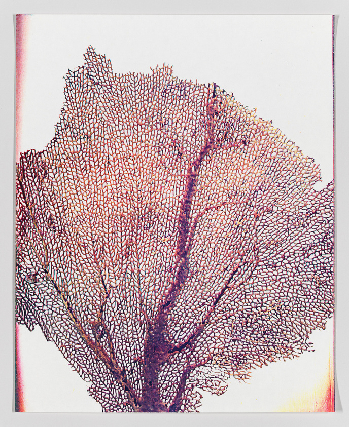
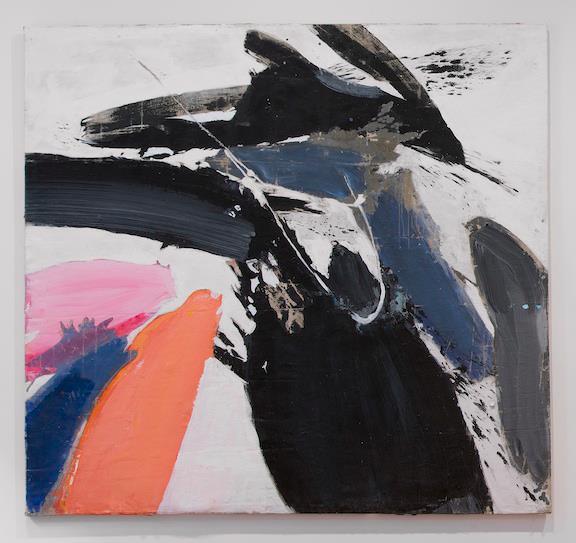
The quality of GPT4’s keywords more often than not put Google Vision’s to shame. For the above work, Lesley Schiff’s Sea Fan, here are the two sets of tags:
GPT4
sea fan, coral, marine life, red, intricate, natural pattern, underwater organism, fan-shaped, marine biology, texture, ocean, delicate structure
Google Vision
Gesture, Art, Font, Pattern, Rectangle, Visual arts, Drawing, Illustration, Printmaking, Painting
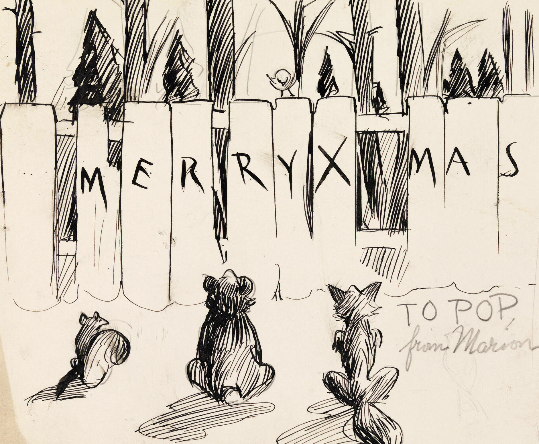
…or how about for the below work, Edward Hopper’s Merry Xmas:
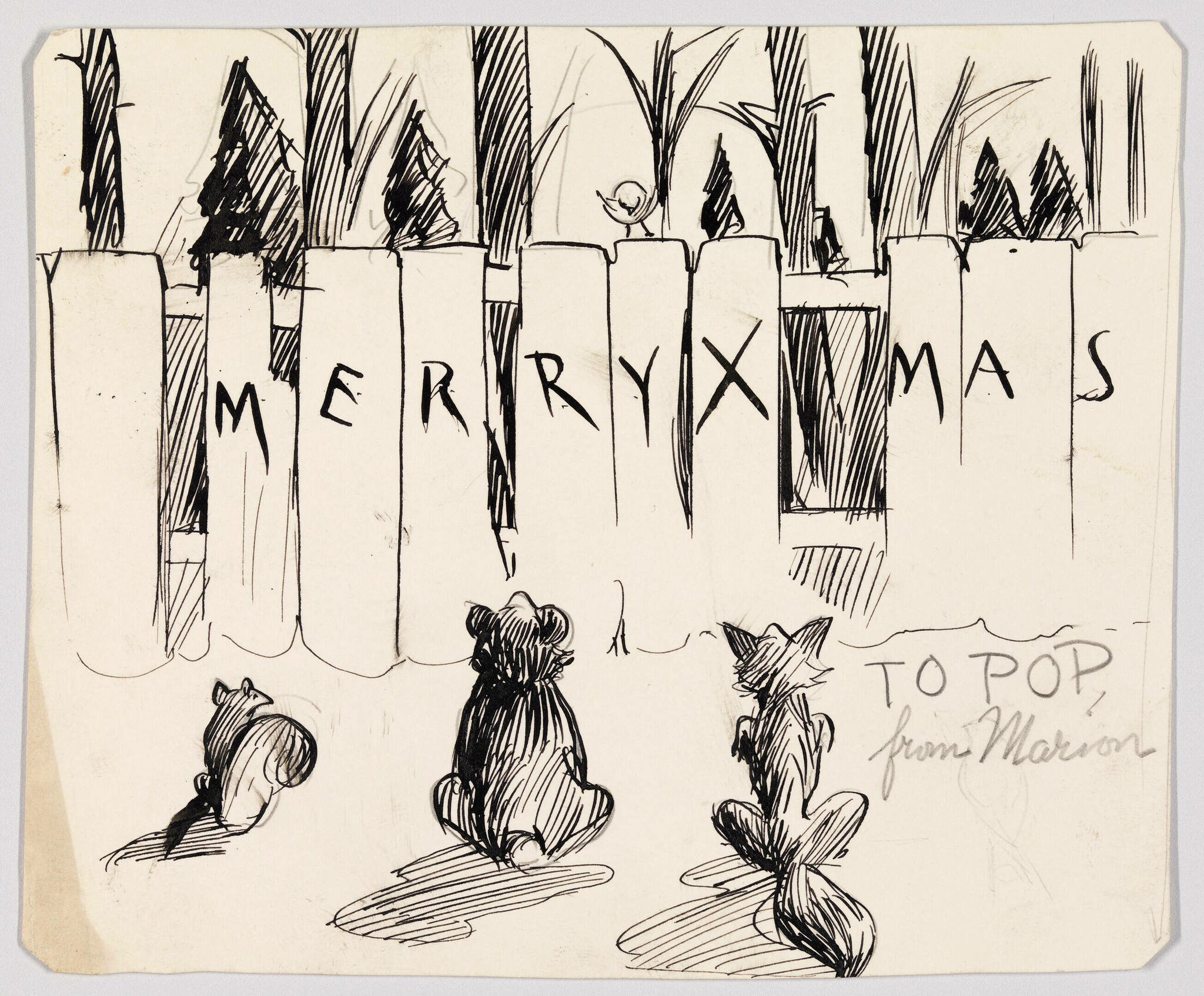
GPT4
sketch, Christmas, greeting card, Merry Xmas, cats, piano keys, musical theme, black and white, ink drawing, whimsical, holiday message, to Pop, from Marion
Google Vision
Organism, Font, Art, Pattern, Drawing, Illustration, Visual arts, Rectangle, Line art, Artwork
GPT4 is able to be specific in its keywords in a way that Google is not. Tags like “sea fan” and “delicate structure” are up against “art” and “pattern” in the case of Sea Fan. In Merry Xmas, it’s tags like “Christmas” and “ink drawing” versus “Organism” and “drawing”. Individually none of these provide a slam dunk winner (especially given the errors GPT4 made with Merry Xmas) but over a sequence of 50 images this trend of greater specificity broadly holds true.
A large number of both the “good” and “okay” Google Vision keywords are things like “art” or “rectangle”, and anytime there’s a person it often just names different parts of their body that while technically visible are not the focus. GPT4 by contrast tends to only use those keywords when they’re particularly prominent. GPT4 will label a Guerilla Girls poster with “feminism” and “gender inequality” while Google Vision will only say “poster” and “handwriting”. GPT4 also shows a greater understanding of context. Consider this work by Rodney Graham:
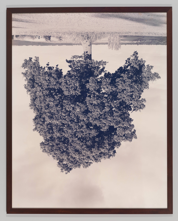
GPT4
inverted, tree, snow, framed, photograph, winter, landscape, surreal, nature, upside-down
Google Vision
Rectangle, Branch, Plant, Art, Twig, Tints and shades, Tree, Font, Painting, Visual arts
Visually by far the most defining aspects of this photograph are that it is a) of a tree and b) upside down. Google gets the “tree” just like GPT4, but it does not give anything indicating the inversion. Google also adds maybe technically true tags like “twig” and “tints and shades”, but how useful are those?
GPT4 not only does better on the details, but when it misses you can often tend to see how it got confused. It’s far more understandable to interpret what appears to be regular grass as potentially snow-covered than it is to categorize this whole image as a painting like Google.
Conclusions
Without claiming that this is in any way an exhaustive comparison, it is still abundantly clear that for many of the kinds of works in the Whitney’s collection GPT4 with Vision is much better at keyword tagging than Google Vision. Annecdotally and through this (limited) analysis, the two are far enough apart that there really isn’t any question on what’s more useful for us. If anything, this raises the much thornier question on if this is good enough to incorporate into the public interface of the collection.
Full disclosure, it’s at this point I was planning to use Henry Taylor’s THE TIMES THAY AINT A CHANGING, FAST ENOUGH! as an example of where GPT4 could make the kind of mistake that would throw some ice water on that consideration.
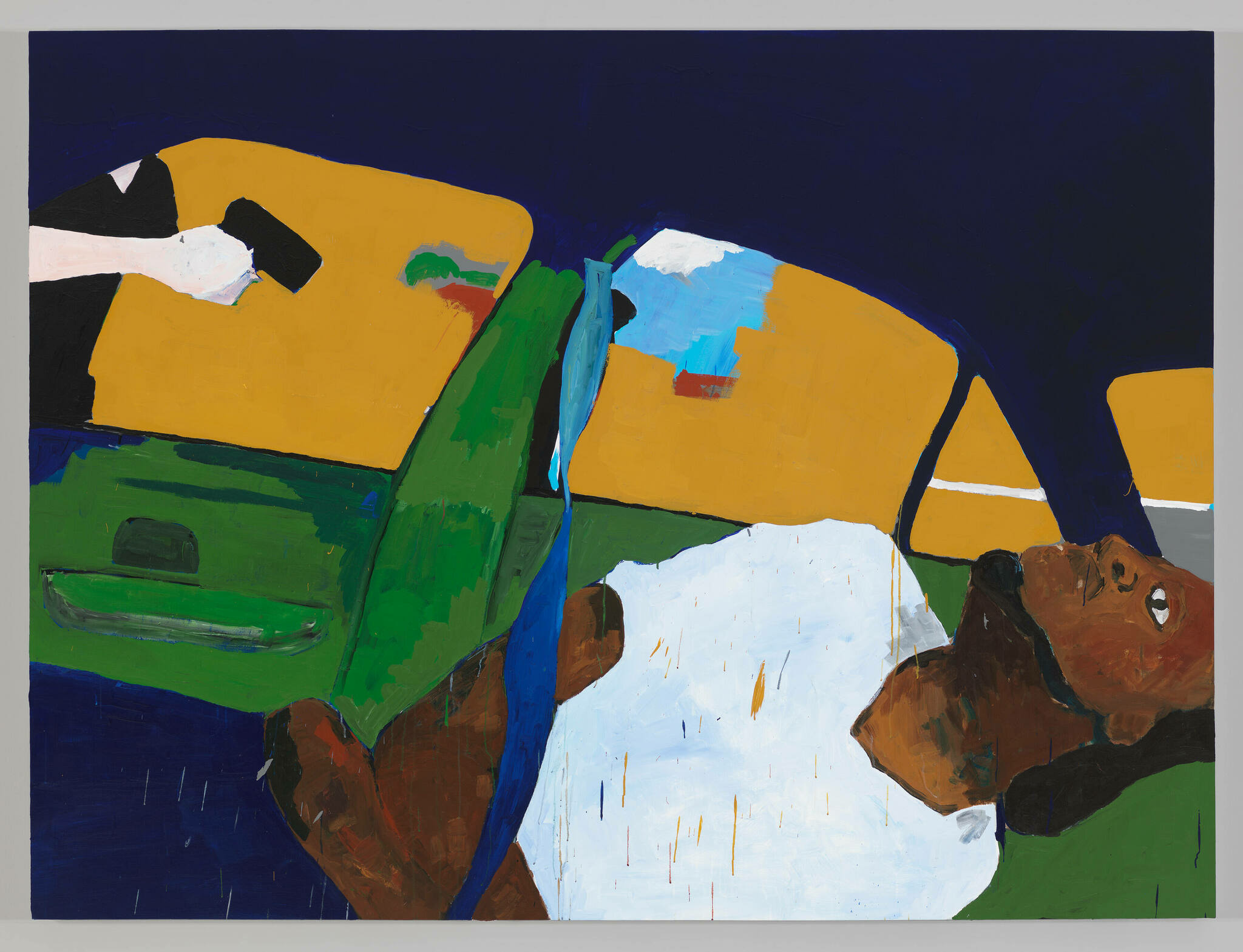
When I first started experimenting with GPT4 with Vision, GPT4 would tend to describe this image as being abstract, inside a car, with a bear in the backseat. What the painting actually shows is the murder of Philando Castile in his car by a police officer in 2016. While it isn’t necessarily surprising that an algorithm might mistake Taylor’s stylized abstraction of a man for something else, given the documented history of racism by AI/ML algorithms, this isn’t the kind of mistake to be shrugged off. But when I re-ran this image through our tagging pipeline the current keywords were:
GPT4
abstract, painting, colorful, modern art, bold lines, geometric shapes, blue background, yellow, green, white, black, brush strokes, contemporary
Google Vision
World, Organism, Paint, Art, Creative arts, Font, Rectangle, Painting, Tints and shades, Pattern
No bear.
I’m not entirely sure what to make of this. The lack of determinism with GPT4 may mean that run enough times, I’d get back the problematic keywords once again (though at the time of writing this and running it half a dozen times I’m not). Or it’s possible the model has changed enough since I first started working with it that this wouldn’t happen anymore. I have no way to know.
The actual conclusion
GPT4 with Vision is a big enough improvement over Google Vision label detection that it was an easy decision to swap over our internal usage to it. Whether this is good enough to utilize publicly, and can be contextualized well enough or the prompt massaged enough to blunt the concerns of bad keywords, I’m still unsure. An imperfect tool is a lot easier to explain to staff who use our online collection regularly than it is to a person who might come to our site once from a link someone else shared with them, and a lot less likely to cause harm.
There’s clearly a lot of promise here, and I hope we can find ways to utilize it.
Rachel Rossin: The Maw Of
The Maw Of is an immense, incredible project with a ton of moving pieces. And some of those pieces took a fair bit of work to adapt to the museum’s various systems, including an IRL installation for Refigured.
Rebuilding digital signage at the Whitney
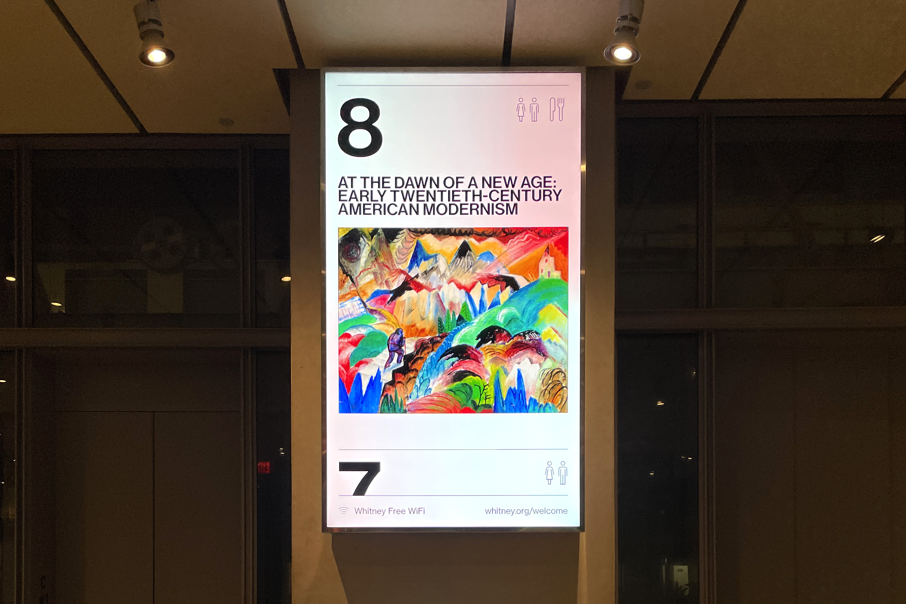
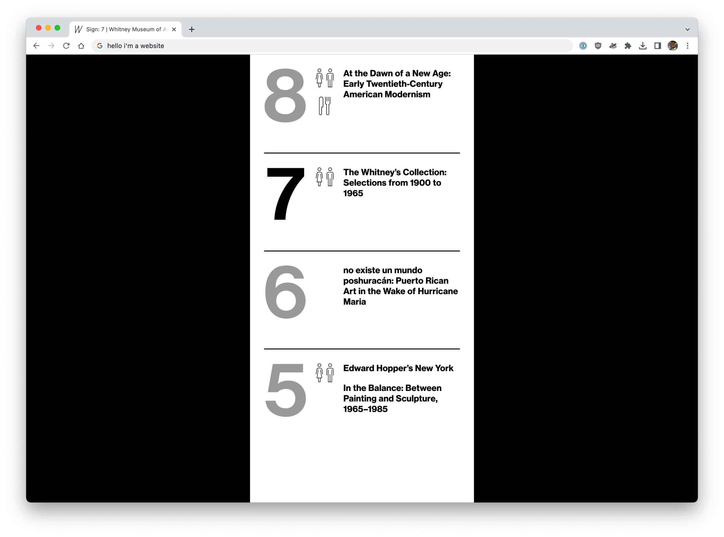
It’s webpages. The museum’s new digital signage system is webpages.
Some background
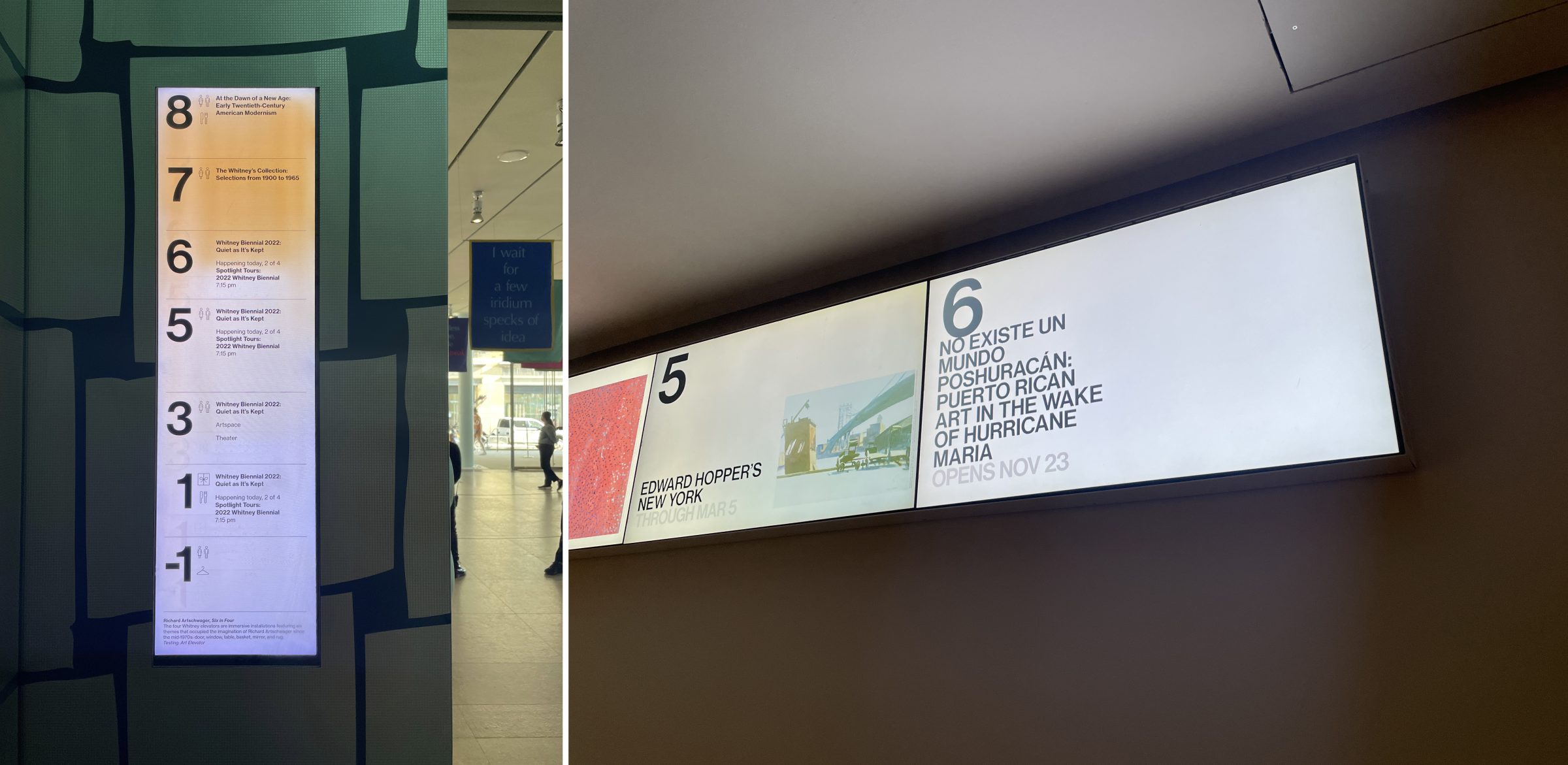
Since opening in 2015, the Whitney’s 99 Gansevoort building has been served by digital signs on every floor plus a pair outside the lobby on the terrace. Each of these approximately 18ish displays of various shapes and sizes have been driven by some fairly complicated software, outputting some manner of template that mostly shows the various exhibitions and events happening around the museum. For the screens outside of the building, this is mostly promotional content, while the interior screens act as tools for wayfinding and determining what’s available to a visitor and on what floor. It’s these interior screens that are most critical to people visiting the Whitney, and also cause the most technical problems.
As the hardware began to age out and fail, the opportunity was there to re-work how these kinds of displays were driven, and build a more modern and supportable software solution. For us that meant turning to the web.
The old way: Flash + XML
The interior screens were basically Flash templates fed by a big XML file that we output regularly from the CMS that powers whitney.org. That XML file was ingested by a separate stack of software, representing multiple pieces of 3rd party solutions, and it was in that ingestion that many of the problems we’ve faced over the last few years came from. Fundamentally the data models between what we input on whitney.org to build out our exhibitions and events online did not match that of the system we were pushing to for signage, and in that gap there have been a lot of bugs. Neither data model was necessarily wrong, but the fact they didn’t match was an issue, and it became more and more of one as we gradually altered the content we were posting.
Similarly, our digital design practices also drifted over the years, while the signage templates stayed static. Part of that was technical limitations, but part of it was also just the fact that nobody wanted to touch anything when the stakes are multi-day screen outages.
The new way: HTML + React
It feels a little goofy to say this, but since 2015 the web has only continued its growth as an actual platform for applications. Whether that’s the popularity of solutions like Electron for app delivery, or React and Vue for building interactive UI’s, or just the fact that CSS has gotten to the point where complex layouts are no longer a pain thanks to Flexbox and Grid. The web is really really good for building out the kind of solution you need for robust digital signage, and it has the advantage of being something that the Museum is already skilled-up to do. It can also be iterated on alongside our primary website, whitney.org, in a way that would never be possible with a more bespoke software solution.
For the new signage software we built out some new endpoints for our CMS’s API, and new single-page React apps for each kind of sign. We are using websockets for some instantaneous controls over the signs, but for the most part they just poll for changes every 30 seconds. Content is pulled (via the API) largely from the same exhibition and events records we enter into the CMS for display on whitney.org, so there’s no double-entry into separate systems.
The biggest obstacle to this approach wasn’t building the web apps (this was somewhat tricky, but we didn’t need to use websockets or have robust animations), or getting buy-in (this was an easy sell, given how messy the alternatives would be). What turned out to be the trickiest piece of the puzzle was figuring out what hardware would be most appropriate to run these webpages.
Enter BrightSigns
Essentially what we needed for hardware would be something that would:
- Be able to display a webpage with a relatively modern browser
- Be relatively easy to setup
- Be very stable
- Be performant enough for smooth animations at high resolution
- Not require constant updates, or hounding about updates, or messages from the OS, or any other kind of interruptions when we least expect it
It’s possible to configure PCs, or Macs, or Linux boxes to do everything we needed, but the overhead for that kind of solution would be extremely challenging for our relatively small staff. We’re not in a position where we could be building out robust tooling for management of a fleet of full-on computers, and troubleshoot whatever issues we’d surely run into with OS updates or problems with running a chromeless Chrome. So we needed something more off the shelf, designed to run a webpage fullscreen for long periods of time with minimal upkeep. And thankfully for us BrightSigns are able to do just that.
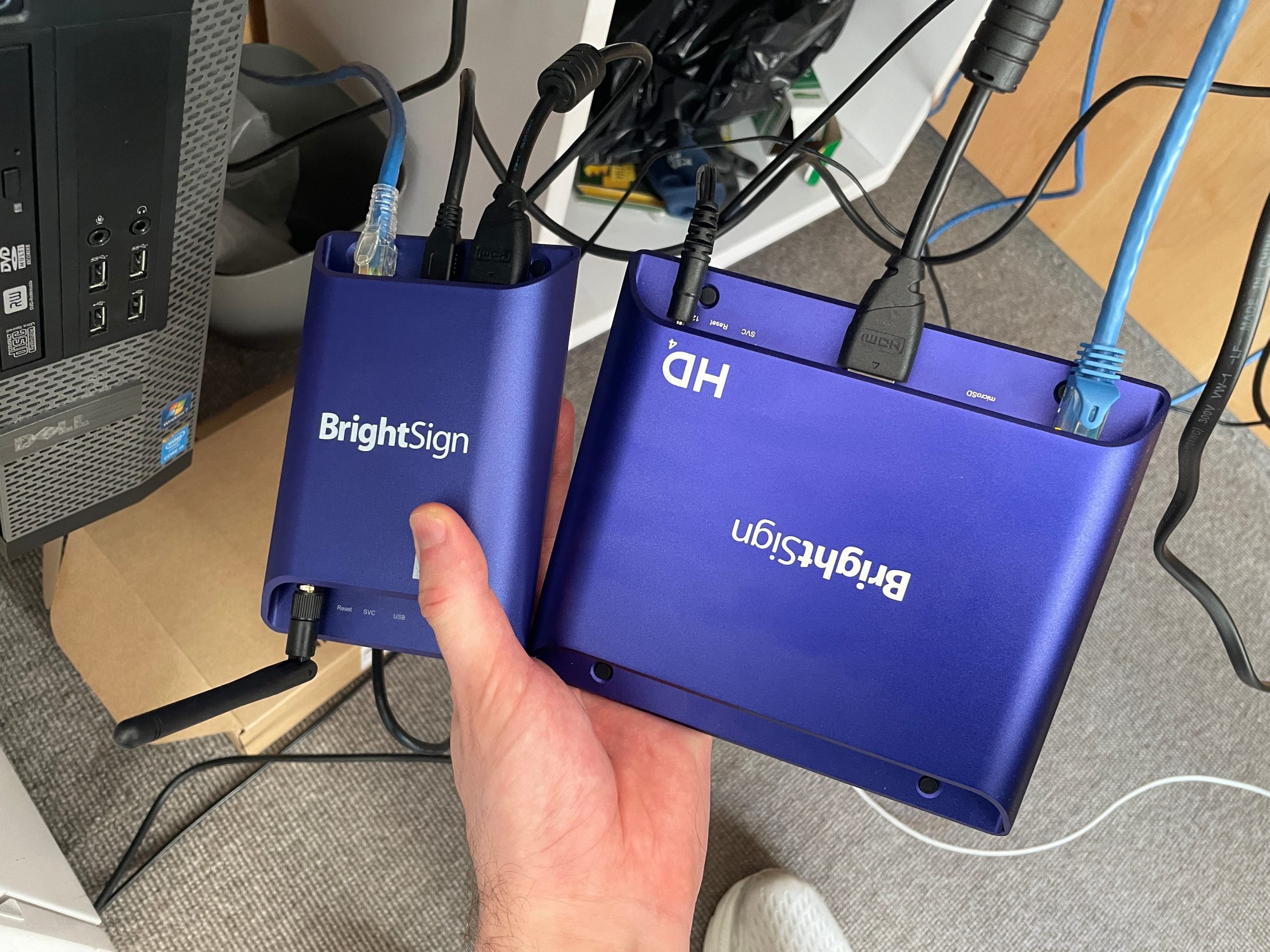
BrightSigns are basically just small Linux computers running an OS built for digital signage. If you work at a museum that shows video installations, you might already have a whole bunch of them. They’re relatively inexpensive and easy to source, and they form the hardware side of our new web-based approach. They’re not perfect, and BrightAuthor:connected is…not exactly dream software, but it’s good enough.
The results
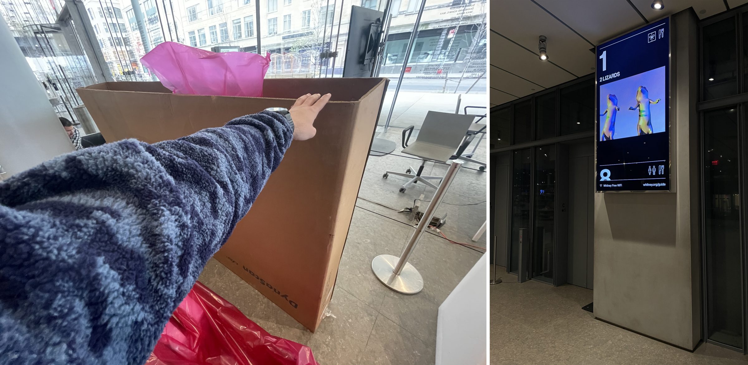
At the time of writing this, we’ve replaced the majority of the old displays with new hardware, and we’ve swapped out all content inside the building to be running on the new website/BrightSign stack. While there’s been some hiccups as we’ve adjusted, there’s no question this was the right approach for the future. We are in a far better position now to own the experience on these displays, and adapt them as the museum continues to grow and change.
And because they’re webpages, they also play Sunrise/Sunset now 😊.
Mimi Ọnụọha: 40% of Food in the US is Wasted (How the Hell is That Progress, Man?)
I did the coding for this project which included some slightly tricky video crossfading for seamless playback. The music loop is going to play in my head forever.
Rayyane Tabet: Becoming American
Becoming American is a project for the 2022 Whitney Biennial that includes a technical intervention across all of whitney.org, where visitors are prompted with questions from the US citizenship test.
Stepping into open access
This is what we are here for, as a sector: To make the results of human creativity from all times and all corners of the world accessible to all citizens, to foster new knowledge and inspire new creativity.
Merete Sanderhoff (SMK) on open access
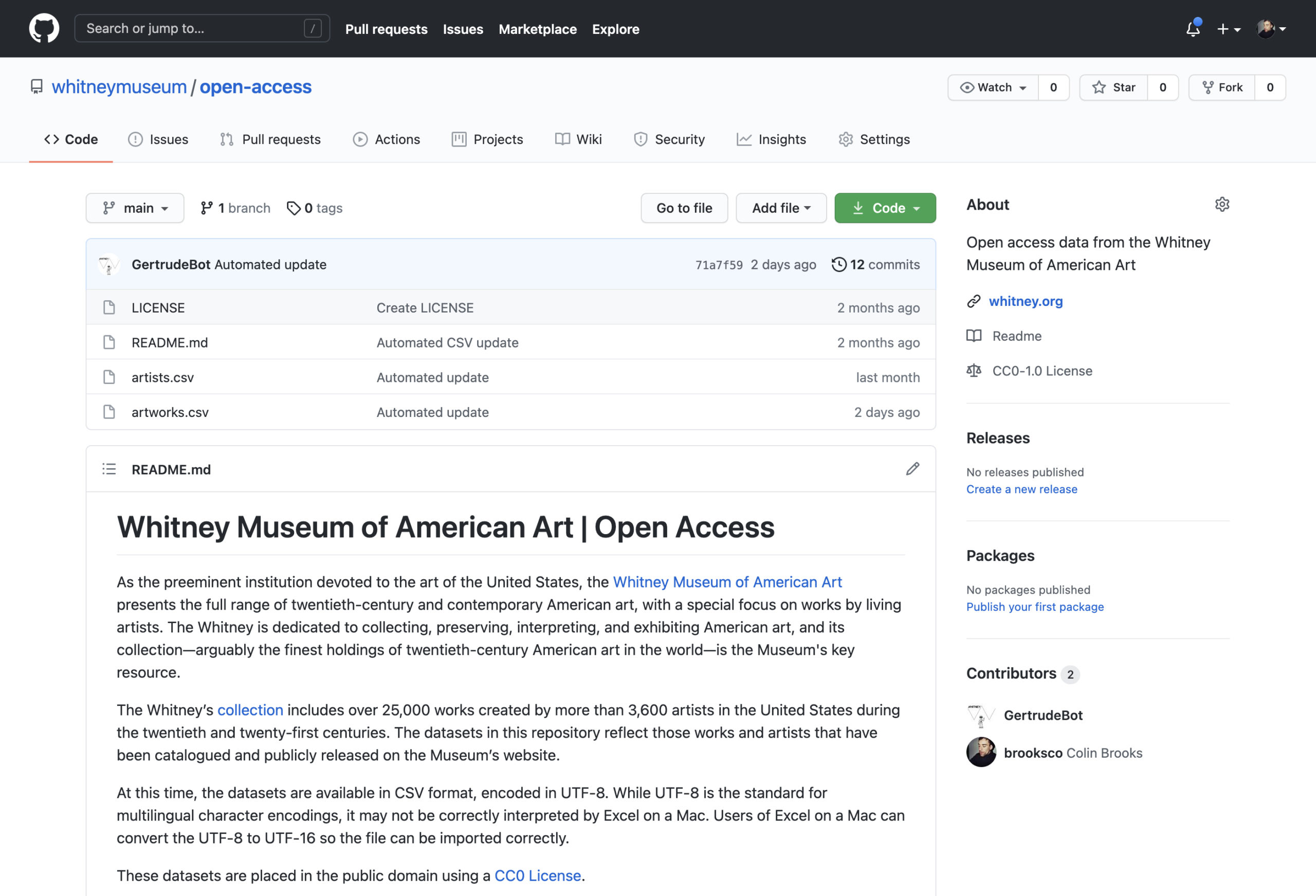
It’s here. It’s finally here. The Whitney Museum of American Art’s first completely public open access datasets:
https://github.com/whitneymuseum/open-access
This has been a long time coming, and something we’ve been excitedly watching many of our peers embrace. So what exactly is this?
What open access means
Open access is the sharing of collections data or other culturally-rich information held by galleries, archives, libraries, and museums to the public, with limited to no restrictions, for the purposes of exploration, scholarship, and other creative endeavors.
Or…
Open access is taking the contents of our collection and releasing the data about artists and artworks in a useable, digestible format, with no-rights-reserved licensing.
Or…
Open access is putting spreadsheets on the internet.
Why open access matters
It aligns with our mission and values
The Whitney exists to serve a diverse public, and strives to be as experimental and responsive as the artists we work with. We do this in significant part by sharing our collection, through exhibitions at the Museum and more recently the internet. Open access is a modern, digital approach to sharing information about our collection, that encourages the public to explore and answer questions about the art that we hold.
It supports divergent narratives
A robust open access program is an acknowledgement that no one owns the narratives and histories the Museum strives to illuminate. By releasing data around our collection into the public sphere we make it easier for people outside the Museum to analyze trends within that data, and generate novel discoveries for themselves or others.
It provides an accurate source of data
Open access is a chance to ensure that to the extent possible, accurate data and assets are available to the public, lessening the need for inaccurate 3rd party resources. This has been a problem for others in the past.
It is increasingly expected
Open access is gradually being embraced across the sector. Institutions with robust open access initiatives include: The Met, MoMA, Cooper Hewitt, Brooklyn Museum, Art Institute of Chicago, The Smithsonian, The Walters Museum, The Cleveland Museum of Art, The Getty, Minneapolis Museum of Art, Rijksmuseum, SMK, Te Papa, Europeana, and many others.
What we’re releasing right now
You can head to our GitHub open access repository and download the artists.csv or artworks.csv spreadsheets, containing almost exactly the same information as on any of our whitney.org/collection pages. At this time we are not including object labels or artist bios, but otherwise the data should mirror what you see if you were to visit any given artist or artwork in the online collection. That data is licensed under a Creative Commons CC0 license, which means we have effectively placed it in the public domain, where you are free to do with it as you please (though we do ask that you don’t misrepresent the dataset, and attribute it to the Museum where possible).
What’s next
There is always more data to release, and perhaps most conspicuously absent from this release are any images. This is a first step for the Whitney in publicly releasing our data in such a transparent, structured form, and there will surely continue to be further steps along this journey.
Thank you to everyone who has worked to make this possible.
Looking forward to seeing what you create.
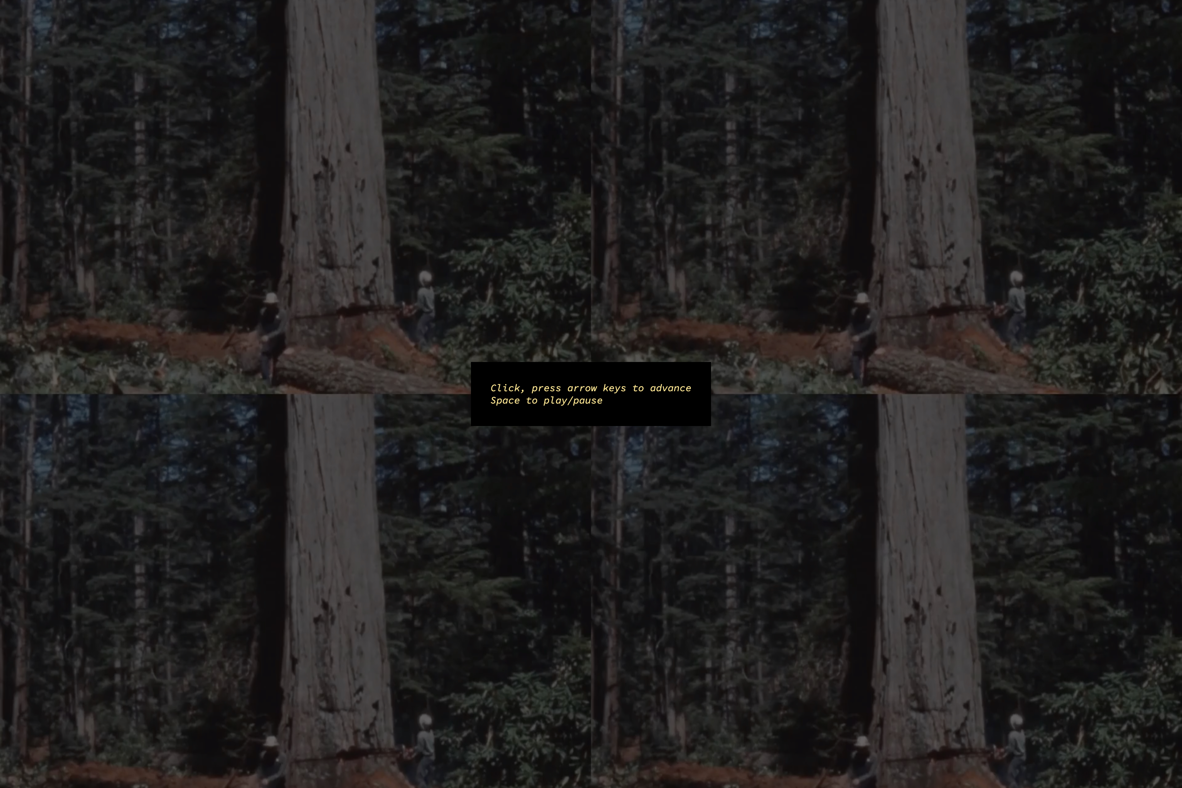
Sunrise/Sunset and letting artists take over the museum
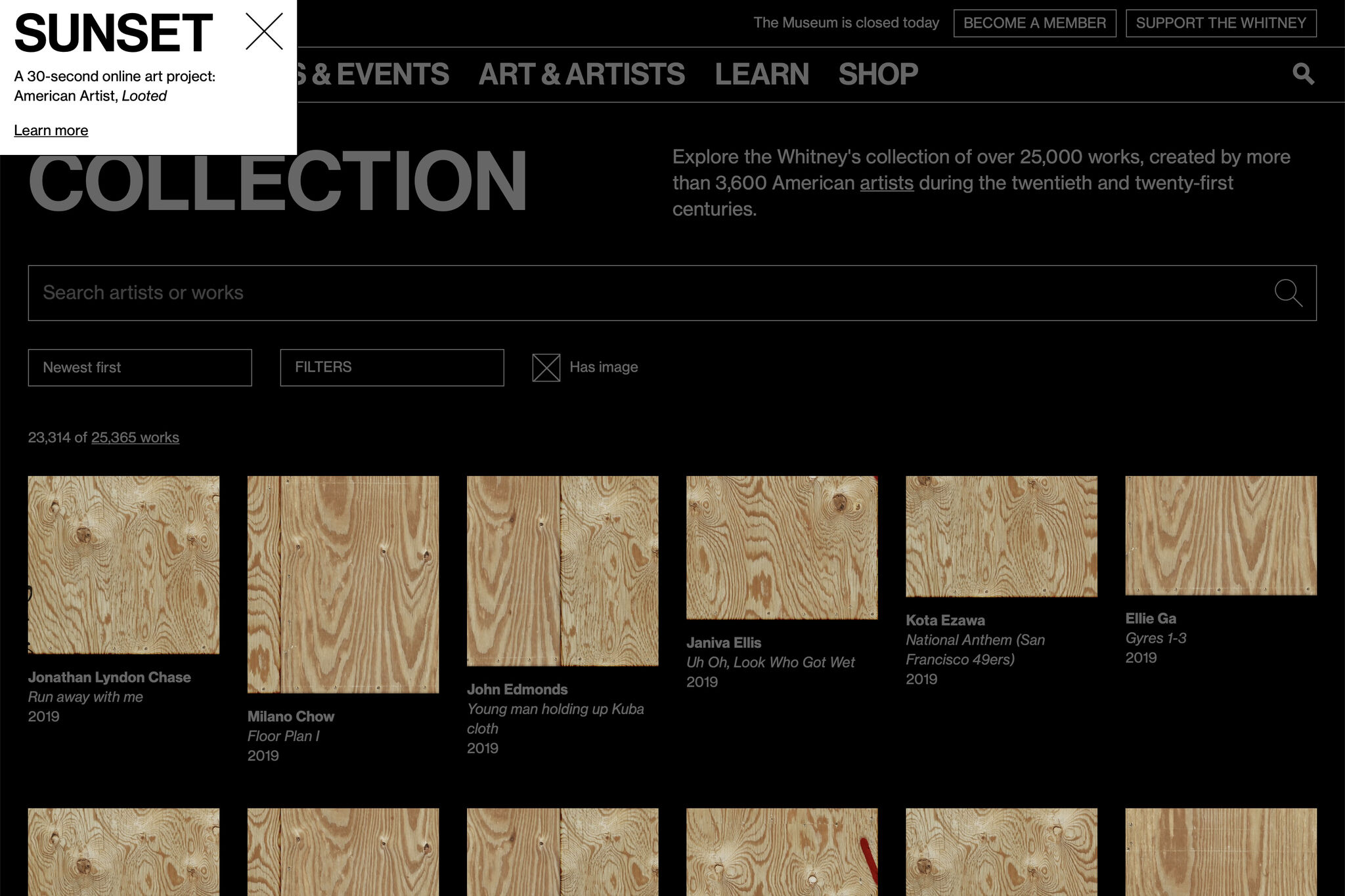
Recently we published a new Sunrise/Sunset on whitney.org by American Artist, called Looted. The artist and project has been written about elsewhere, and while the most important thing I can say is go check it out, I think it’s also a good moment to talk about why Sunrise/Sunset is such an important, and unique series.
Since 2009 at sunrise and sunset (New York City time) whitney.org has been taken over by artists. For those 30 or so seconds twice a day, what happens on whitney.org is up to them. We’ve hosted figure eight balls, glowing orbs of light, color swatches of real sky, talking AI assistants, and 3d animated seabirds among others before most recently boarding up all images on the site. We’ve done this across 3 different iterations of whitney.org, and just watching the recordings can feel like a trip into the Wayback Machine.
As a developer, Sunrise/Sunset is my favorite part of my job. Working with these artists to help realize a vision is a direct connection to supporting their work, something that can otherwise feel abstracted. The process of receiving a project that may be fully or partially baked, and adapting it to operate within the structures of whitney.org is a rewarding challenge that changes from work to work. The web has evolved a lot in a decade, and it shows as these artists adapt the medium to their uses. Whether that’s the proliferation of Canvas, or CSS animation, or the birth and subsequent death of unmuted autoplaying video.
Most broadly, I think the series speaks to something deeper about what a museum can be. Sunrise/Sunset is a wholesale handing over of institutional space in a way you rarely see IRL. While an exhibition or installation might receive significant input from an artist on its design, you just can’t tear out the walls of a multi-million dollar building like you can tear down elements in the DOM. Sunrise/Sunset lets an artist come in, change anything they want about a museum space, and do it differently tomorrow.
Next sunrise is 6:05am, EST.
michaelbot.website
Q: what is michaelbot?
A: square adjust placement and save each one alone or something Holy cow I love it
(michaelbot is a TensorFlow ML model served by Flask, trained on texts parsed from iMessage, that crashes a lot on an undersized server)
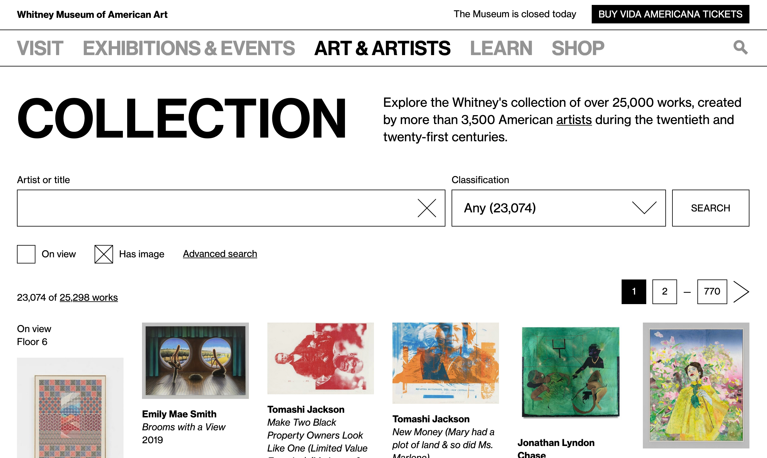
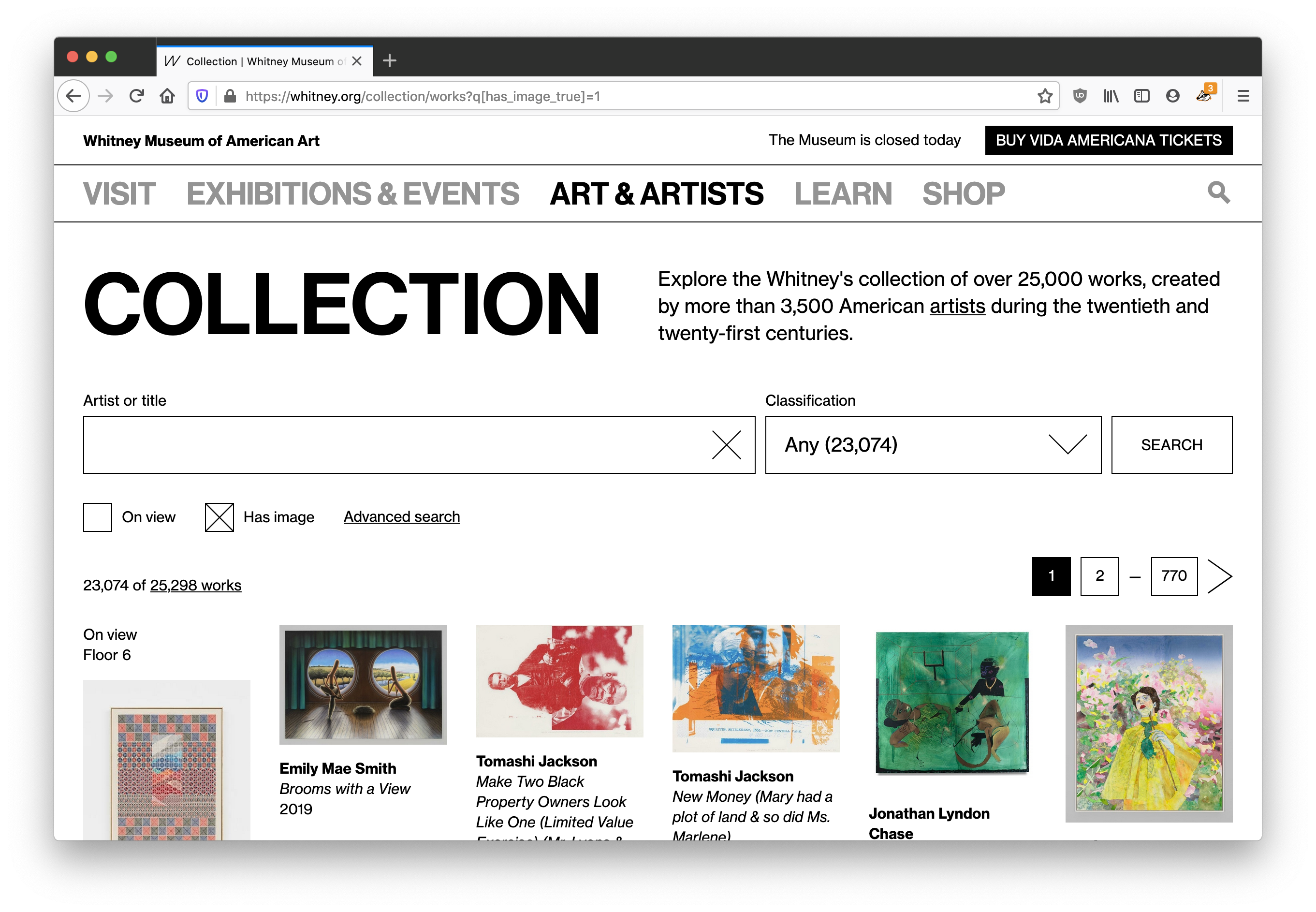
Relaunching the Whitney’s Online Collection…again
*Author’s note: I’ve been sitting on a half-finished draft of this for too long, and while I know this is a bit of an odd time to share, I have very little else to do. I hope that these kinds of online museum resources can be a positive outlet for boredom and inspiration in the weeks and months ahead.*
Last year we replaced our separate online collection site with a new experience integrated within whitney.org. We made this shift for a number of reasons, but the biggest was that this allowed us to take full control over the UI/UX, and start building out an experience that allowed for more kinds of exploration. What users saw when they came to the online collection changed greatly, but the underlying data and the software delivering it to whitney.org stayed the same. For that reason, that initial work was always going to be part one of an (at least) two part project; we had to tackle the systems that delivered the data as well.
The challenge of magic middleware
To launch the initial version of the full online collection when the new building opened (2015), we worked with an outside agency to build a set of internal tools that would pull data out of our database of record (TMS, or “The Museum System”), an API that would ingest that data, and a public-facing website that would present that data for easy access. When we relaunched the collection last year, we replaced the final stop of that system (the public-facing website), but we left alone the tools and API. The former continued to pull data out of TMS, and the latter simply switched to feeding the new collection experience on whitney.org rather than the old. We’ve since replaced both.
The challenge with our middleware wasn’t that it was buggy or lacking in performance; on the contrary, it did what we needed it to and served us well for 5 years despite being built and launched in an extremely tight timeline. But as the Museum has grown, so too has our expectations of the online collection. We needed a system that could expand with us, while staying supportable.
Moving to more durable infrastructure
One of the challenges of being part of a small dev team at a non-profit cultural organization is making sure we’re not biting off more than we can chew, because we don’t have much capacity for something to go wrong. Supporting a smaller number of apps and stacks is one way to make things more sustainable, and in this case we had an option built and supported by the same company that makes TMS: eMuseum.
eMuseum and its associated parts plugs directly into TMS, and outputs collection data to an intended-to-be-public website, alongside an (optional) API. As I’ve written about before, we want the online collection to be deeply connected to the rest of the whitney.org experience. We’ve done this through importing collection data directly into our primary content management system (CMS), from our previous API. With eMuseum offering a robust and flexible API, supported by a vendor that we are already committed to working with, it seemed a good fit…and a lot less daunting than writing our own solution from scratch.
What eMuseum offers us are small but meaningful improvements over our existing API, and a much larger increase in peace of mind over being able to maintain the software, and make adjustments to how it works. It also slotted into our existing cms-to-collection-syncs without a huge amount of work, given the work we had already done.
What else is new?
Despite being an infrastructure-focused project, our move to a new API ended up coming with a number of noticeable improvements to the online collection…on top of changes we’ve already been making quietly over the last year. Some of those improvements:
1. Larger images
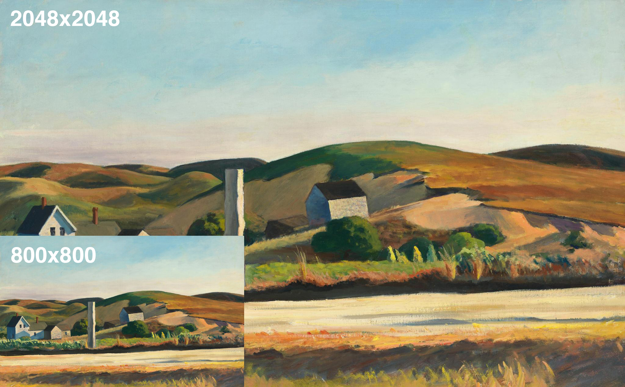
Now that we’re able to make meaningful changes to our collection middleware, we’ve updated all of our various image sizes to be substantially larger (currently up to 2048×2048)…based on more modern interpretations of fair-use, and updated licensing agreements.
2. Temporary images
Previously, for images to be pulled into the online collection they had to be present in a specific folder structure that corresponded to our collection documentation initiative. That did not allow for temporary images, supplied by the artist, gallery, or ourselves, to be used since they wouldn’t be stored in those set folders. With that limitation removed, we are able to start posting images of objects sooner after they’re acquired and before they are fully documented.
3. Linkable portfolios
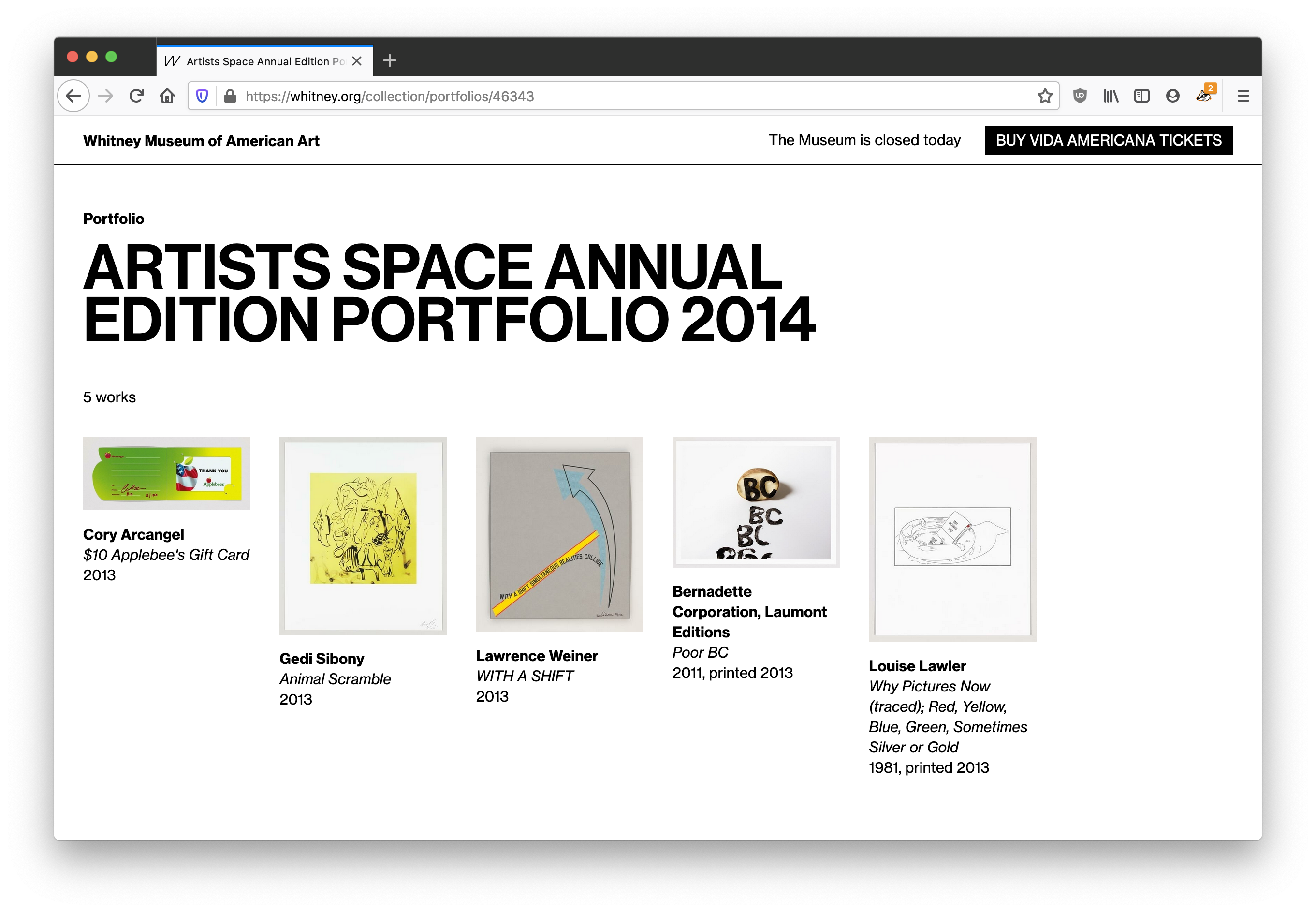
Previously, the most we would do for objects in a portfolio or series would be to add a label like “1 of 5 in Portfolio Name”, with no way to link to either a view of that portfolio, or even show what the other objects were. With our more feature-rich API in place, we are now able to link to a new view within the online collection that will show all objects in a given portfolio, from each object page.
4. Simpler workflows
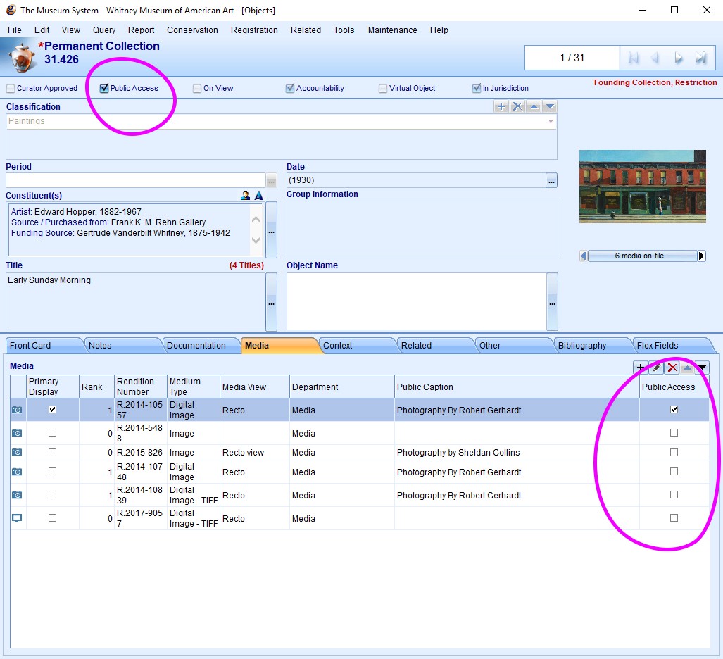
On the administration side, previously what objects would show up in the online collection was based on a variety of settings and TMS “object packages” that made it difficult to quickly diagnose why a particular image or object might not be visible online. With our ability to now configure the API more deeply, we’ve altered our import rules to be based on simple “Public Access” checkboxes in TMS, so it is much more transparent what will appear online.
What’s next?
With both the frontend and backend of the online collection now relaunched, one of the biggest items on our whitney.org wishlist is now complete, roughly 3 years after we launched our new CMS. Going forward, we are in a better position to iterate on the online collection, rather than fully rebuilding major pieces of it. We should be able to push forward new public-facing experiences, whether that’s open access (*crosses fingers*), new kinds of interpretive resources, or something else entirely.