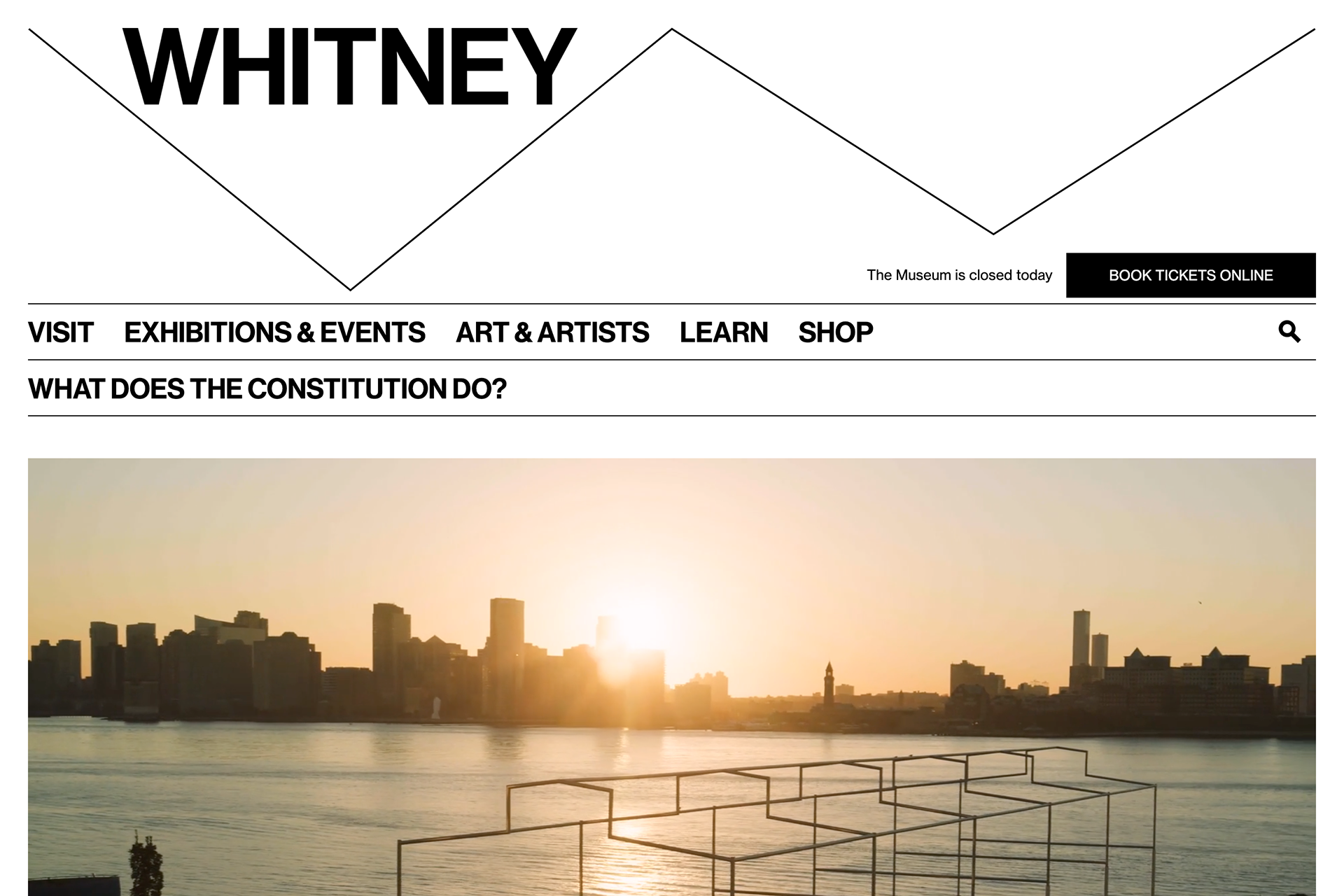
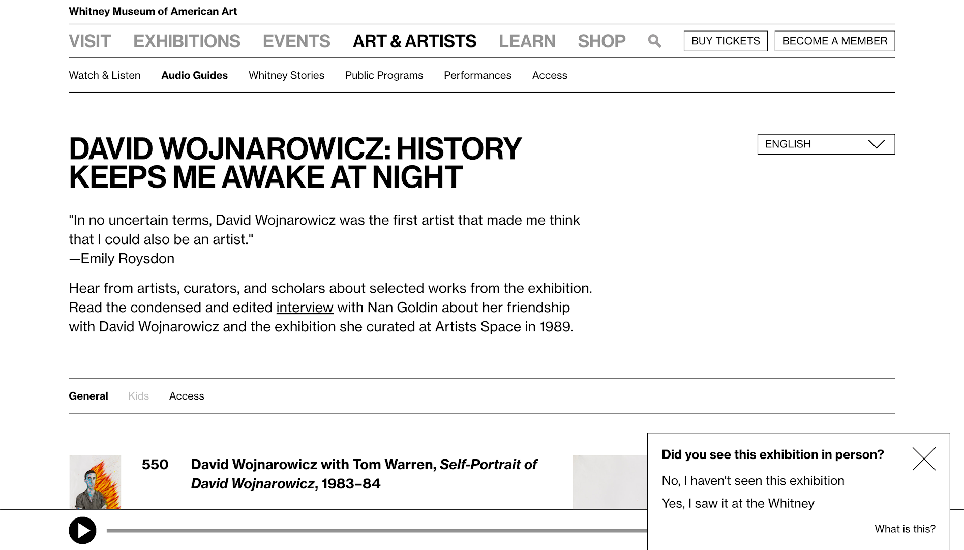
Becoming American is a project for the 2022 Whitney Biennial that includes a technical intervention across all of whitney.org, where visitors are prompted with questions from the US citizenship test.
Author: colinbooks
Stepping into open access

This is what we are here for, as a sector: To make the results of human creativity from all times and all corners of the world accessible to all citizens, to foster new knowledge and inspire new creativity.
Merete Sanderhoff (SMK) on open access
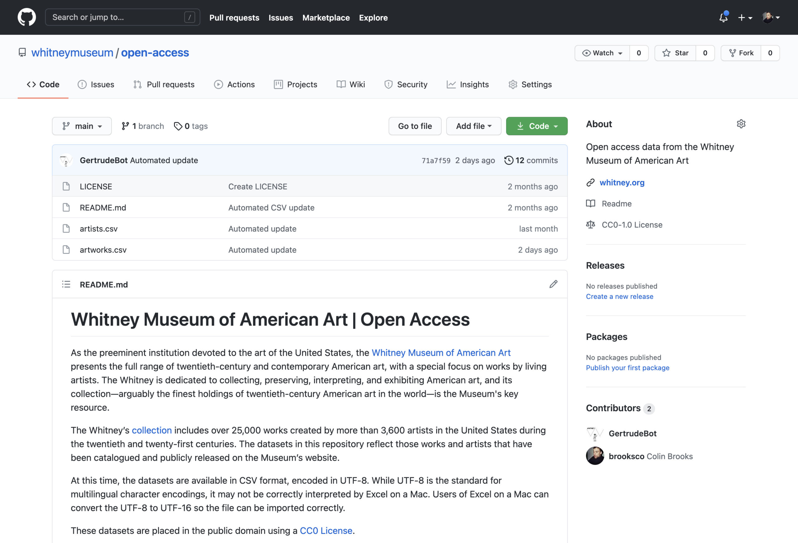
It’s here. It’s finally here. The Whitney Museum of American Art’s first completely public open access datasets:
https://github.com/whitneymuseum/open-access
This has been a long time coming, and something we’ve been excitedly watching many of our peers embrace. So what exactly is this?
What open access means
Open access is the sharing of collections data or other culturally-rich information held by galleries, archives, libraries, and museums to the public, with limited to no restrictions, for the purposes of exploration, scholarship, and other creative endeavors.
Or…
Open access is taking the contents of our collection and releasing the data about artists and artworks in a useable, digestible format, with no-rights-reserved licensing.
Or…
Open access is putting spreadsheets on the internet.
Why open access matters
It aligns with our mission and values
The Whitney exists to serve a diverse public, and strives to be as experimental and responsive as the artists we work with. We do this in significant part by sharing our collection, through exhibitions at the Museum and more recently the internet. Open access is a modern, digital approach to sharing information about our collection, that encourages the public to explore and answer questions about the art that we hold.
It supports divergent narratives
A robust open access program is an acknowledgement that no one owns the narratives and histories the Museum strives to illuminate. By releasing data around our collection into the public sphere we make it easier for people outside the Museum to analyze trends within that data, and generate novel discoveries for themselves or others.
It provides an accurate source of data
Open access is a chance to ensure that to the extent possible, accurate data and assets are available to the public, lessening the need for inaccurate 3rd party resources. This has been a problem for others in the past.
It is increasingly expected
Open access is gradually being embraced across the sector. Institutions with robust open access initiatives include: The Met, MoMA, Cooper Hewitt, Brooklyn Museum, Art Institute of Chicago, The Smithsonian, The Walters Museum, The Cleveland Museum of Art, The Getty, Minneapolis Museum of Art, Rijksmuseum, SMK, Te Papa, Europeana, and many others.
What we’re releasing right now
You can head to our GitHub open access repository and download the artists.csv or artworks.csv spreadsheets, containing almost exactly the same information as on any of our whitney.org/collection pages. At this time we are not including object labels or artist bios, but otherwise the data should mirror what you see if you were to visit any given artist or artwork in the online collection. That data is licensed under a Creative Commons CC0 license, which means we have effectively placed it in the public domain, where you are free to do with it as you please (though we do ask that you don’t misrepresent the dataset, and attribute it to the Museum where possible).
What’s next
There is always more data to release, and perhaps most conspicuously absent from this release are any images. This is a first step for the Whitney in publicly releasing our data in such a transparent, structured form, and there will surely continue to be further steps along this journey.
Thank you to everyone who has worked to make this possible.
Looking forward to seeing what you create.
Sunrise/Sunset and letting artists take over the museum
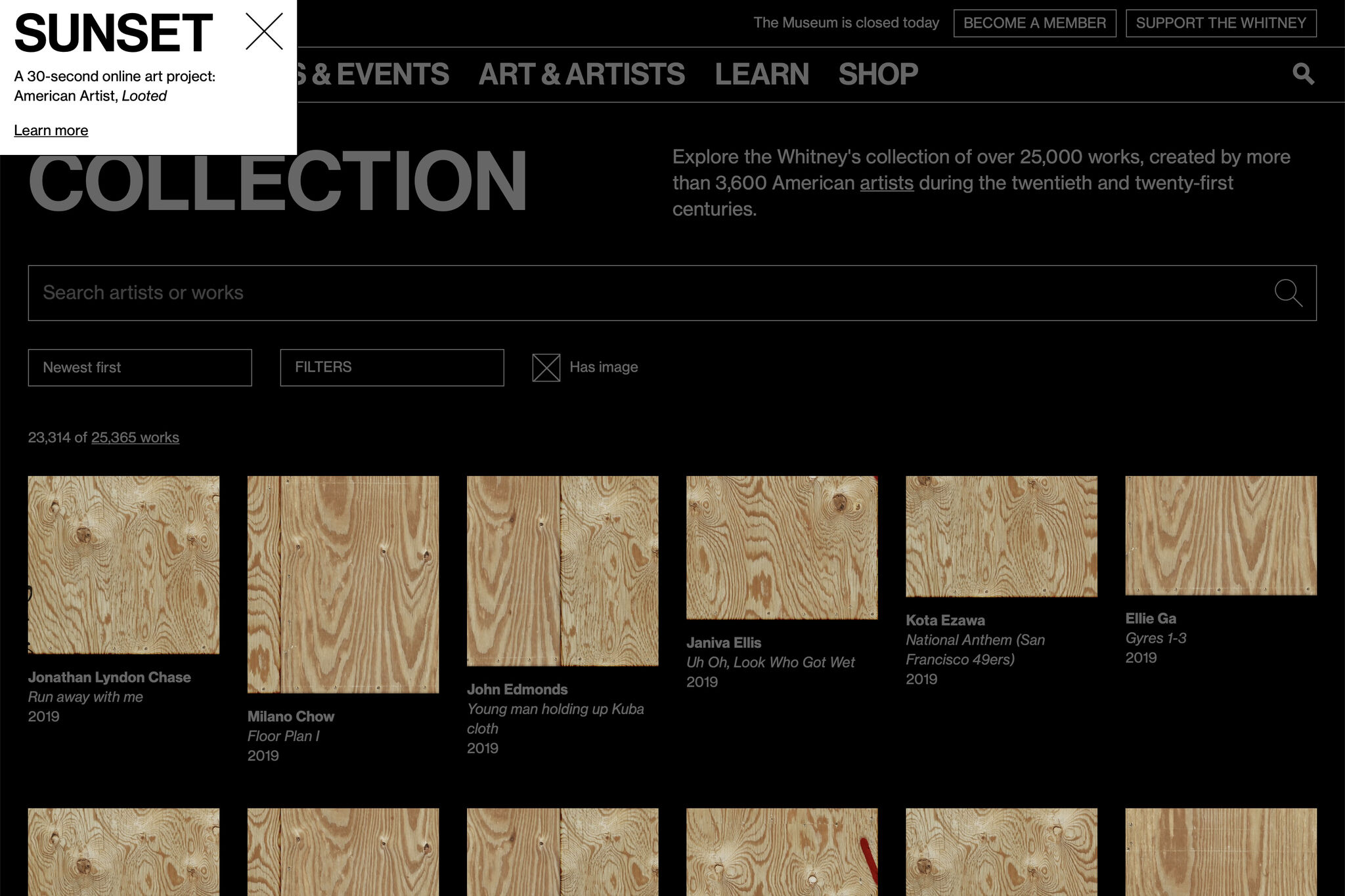
Recently we published a new Sunrise/Sunset on whitney.org by American Artist, called Looted. The artist and project has been written about elsewhere, and while the most important thing I can say is go check it out, I think it’s also a good moment to talk about why Sunrise/Sunset is such an important, and unique series.
Since 2009 at sunrise and sunset (New York City time) whitney.org has been taken over by artists. For those 30 or so seconds twice a day, what happens on whitney.org is up to them. We’ve hosted figure eight balls, glowing orbs of light, color swatches of real sky, talking AI assistants, and 3d animated seabirds among others before most recently boarding up all images on the site. We’ve done this across 3 different iterations of whitney.org, and just watching the recordings can feel like a trip into the Wayback Machine.
As a developer, Sunrise/Sunset is my favorite part of my job. Working with these artists to help realize a vision is a direct connection to supporting their work, something that can otherwise feel abstracted. The process of receiving a project that may be fully or partially baked, and adapting it to operate within the structures of whitney.org is a rewarding challenge that changes from work to work. The web has evolved a lot in a decade, and it shows as these artists adapt the medium to their uses. Whether that’s the proliferation of Canvas, or CSS animation, or the birth and subsequent death of unmuted autoplaying video.
Most broadly, I think the series speaks to something deeper about what a museum can be. Sunrise/Sunset is a wholesale handing over of institutional space in a way you rarely see IRL. While an exhibition or installation might receive significant input from an artist on its design, you just can’t tear out the walls of a multi-million dollar building like you can tear down elements in the DOM. Sunrise/Sunset lets an artist come in, change anything they want about a museum space, and do it differently tomorrow.
Next sunrise is 6:05am, EST.
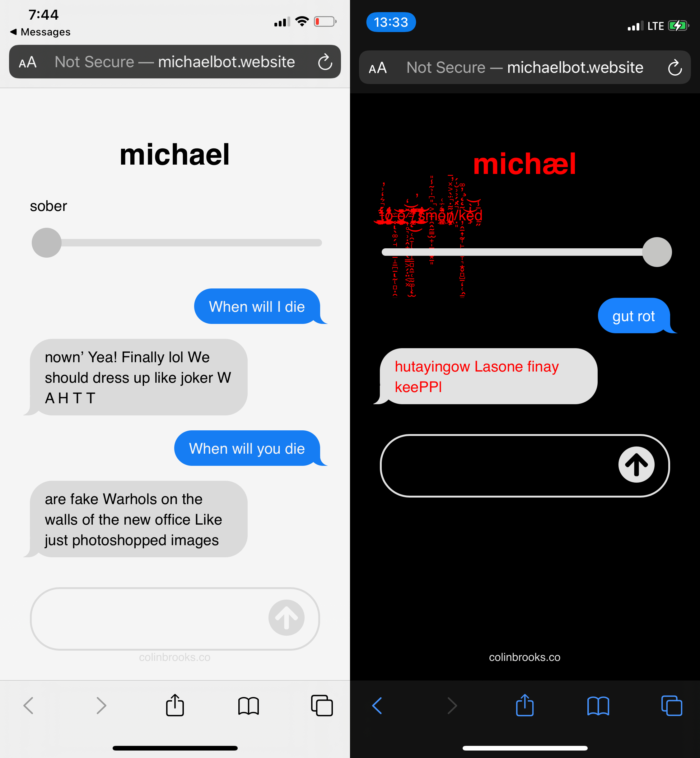
michaelbot.website
Q: what is michaelbot?
A: square adjust placement and save each one alone or something Holy cow I love it
(michaelbot is a TensorFlow ML model served by Flask, trained on texts parsed from iMessage, that crashes a lot on an undersized server)
Relaunching the Whitney’s Online Collection…again
*Author’s note: I’ve been sitting on a half-finished draft of this for too long, and while I know this is a bit of an odd time to share, I have very little else to do. I hope that these kinds of online museum resources can be a positive outlet for boredom and inspiration in the weeks and months ahead.*
Last year we replaced our separate online collection site with a new experience integrated within whitney.org. We made this shift for a number of reasons, but the biggest was that this allowed us to take full control over the UI/UX, and start building out an experience that allowed for more kinds of exploration. What users saw when they came to the online collection changed greatly, but the underlying data and the software delivering it to whitney.org stayed the same. For that reason, that initial work was always going to be part one of an (at least) two part project; we had to tackle the systems that delivered the data as well.
The challenge of magic middleware
To launch the initial version of the full online collection when the new building opened (2015), we worked with an outside agency to build a set of internal tools that would pull data out of our database of record (TMS, or “The Museum System”), an API that would ingest that data, and a public-facing website that would present that data for easy access. When we relaunched the collection last year, we replaced the final stop of that system (the public-facing website), but we left alone the tools and API. The former continued to pull data out of TMS, and the latter simply switched to feeding the new collection experience on whitney.org rather than the old. We’ve since replaced both.
The challenge with our middleware wasn’t that it was buggy or lacking in performance; on the contrary, it did what we needed it to and served us well for 5 years despite being built and launched in an extremely tight timeline. But as the Museum has grown, so too has our expectations of the online collection. We needed a system that could expand with us, while staying supportable.
Moving to more durable infrastructure
One of the challenges of being part of a small dev team at a non-profit cultural organization is making sure we’re not biting off more than we can chew, because we don’t have much capacity for something to go wrong. Supporting a smaller number of apps and stacks is one way to make things more sustainable, and in this case we had an option built and supported by the same company that makes TMS: eMuseum.
eMuseum and its associated parts plugs directly into TMS, and outputs collection data to an intended-to-be-public website, alongside an (optional) API. As I’ve written about before, we want the online collection to be deeply connected to the rest of the whitney.org experience. We’ve done this through importing collection data directly into our primary content management system (CMS), from our previous API. With eMuseum offering a robust and flexible API, supported by a vendor that we are already committed to working with, it seemed a good fit…and a lot less daunting than writing our own solution from scratch.
What eMuseum offers us are small but meaningful improvements over our existing API, and a much larger increase in peace of mind over being able to maintain the software, and make adjustments to how it works. It also slotted into our existing cms-to-collection-syncs without a huge amount of work, given the work we had already done.
What else is new?
Despite being an infrastructure-focused project, our move to a new API ended up coming with a number of noticeable improvements to the online collection…on top of changes we’ve already been making quietly over the last year. Some of those improvements:
1. Larger images

Now that we’re able to make meaningful changes to our collection middleware, we’ve updated all of our various image sizes to be substantially larger (currently up to 2048×2048)…based on more modern interpretations of fair-use, and updated licensing agreements.
2. Temporary images

Previously, for images to be pulled into the online collection they had to be present in a specific folder structure that corresponded to our collection documentation initiative. That did not allow for temporary images, supplied by the artist, gallery, or ourselves, to be used since they wouldn’t be stored in those set folders. With that limitation removed, we are able to start posting images of objects sooner after they’re acquired and before they are fully documented.
3. Linkable portfolios
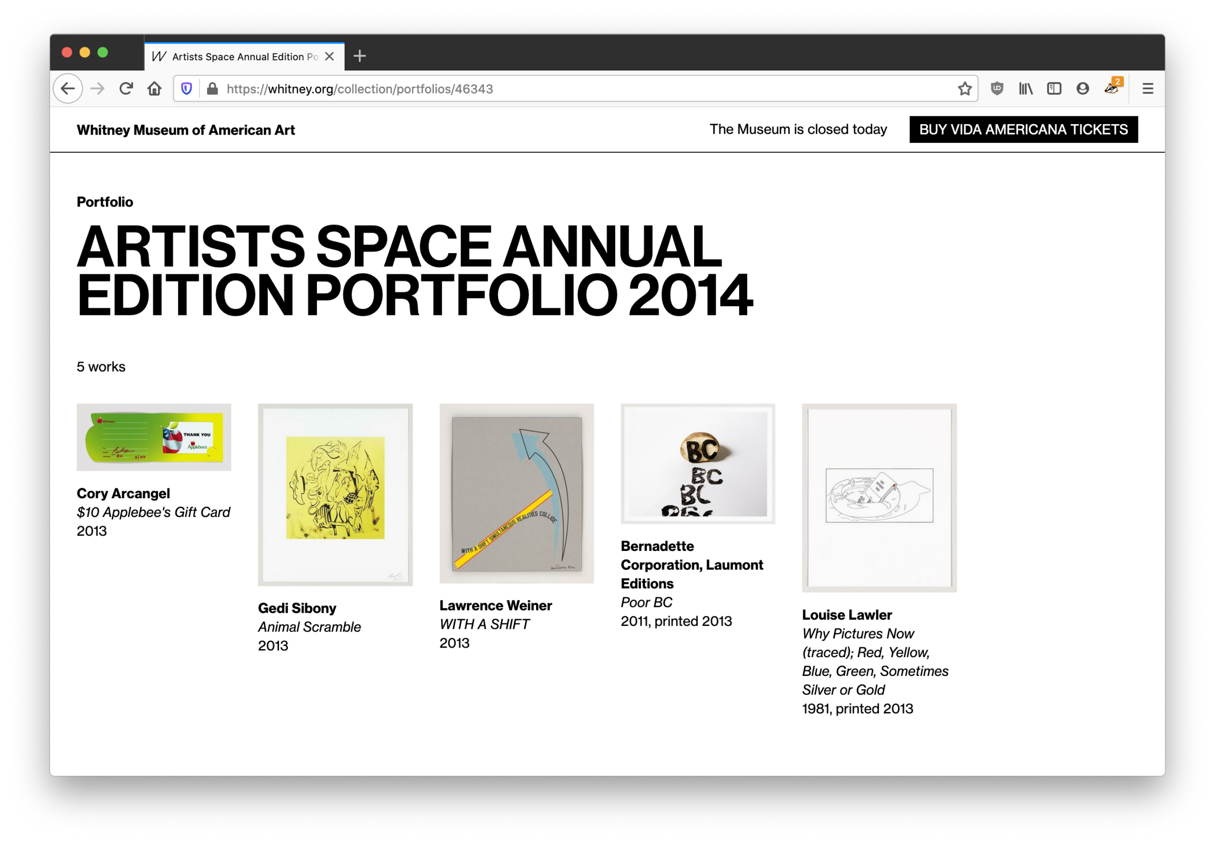
Previously, the most we would do for objects in a portfolio or series would be to add a label like “1 of 5 in Portfolio Name”, with no way to link to either a view of that portfolio, or even show what the other objects were. With our more feature-rich API in place, we are now able to link to a new view within the online collection that will show all objects in a given portfolio, from each object page.
4. Simpler workflows
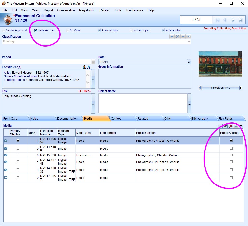
On the administration side, previously what objects would show up in the online collection was based on a variety of settings and TMS “object packages” that made it difficult to quickly diagnose why a particular image or object might not be visible online. With our ability to now configure the API more deeply, we’ve altered our import rules to be based on simple “Public Access” checkboxes in TMS, so it is much more transparent what will appear online.
What’s next?
With both the frontend and backend of the online collection now relaunched, one of the biggest items on our whitney.org wishlist is now complete, roughly 3 years after we launched our new CMS. Going forward, we are in a better position to iterate on the online collection, rather than fully rebuilding major pieces of it. We should be able to push forward new public-facing experiences, whether that’s open access (*crosses fingers*), new kinds of interpretive resources, or something else entirely.
QR Codes: Alive and Well in the Museum?
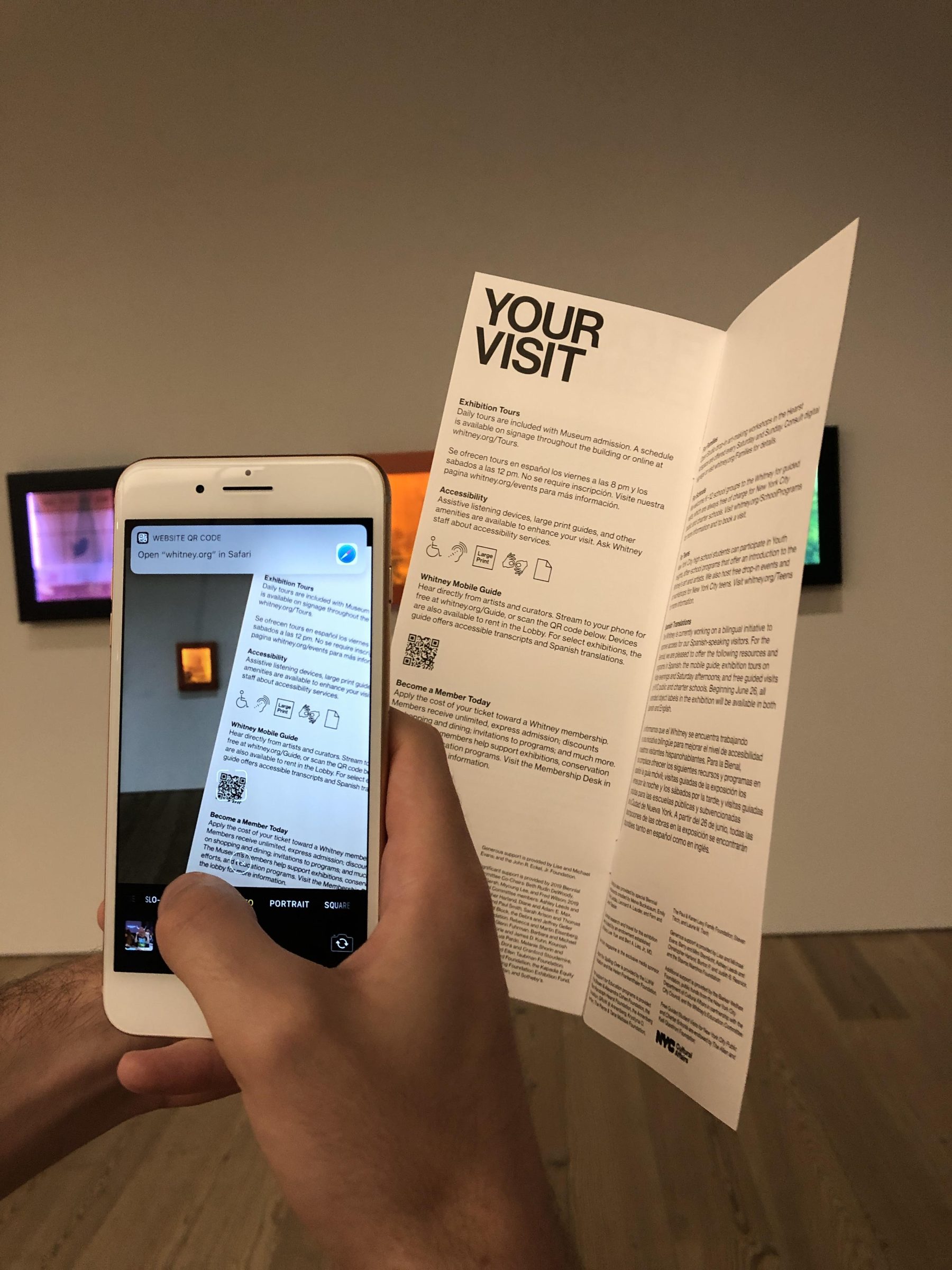
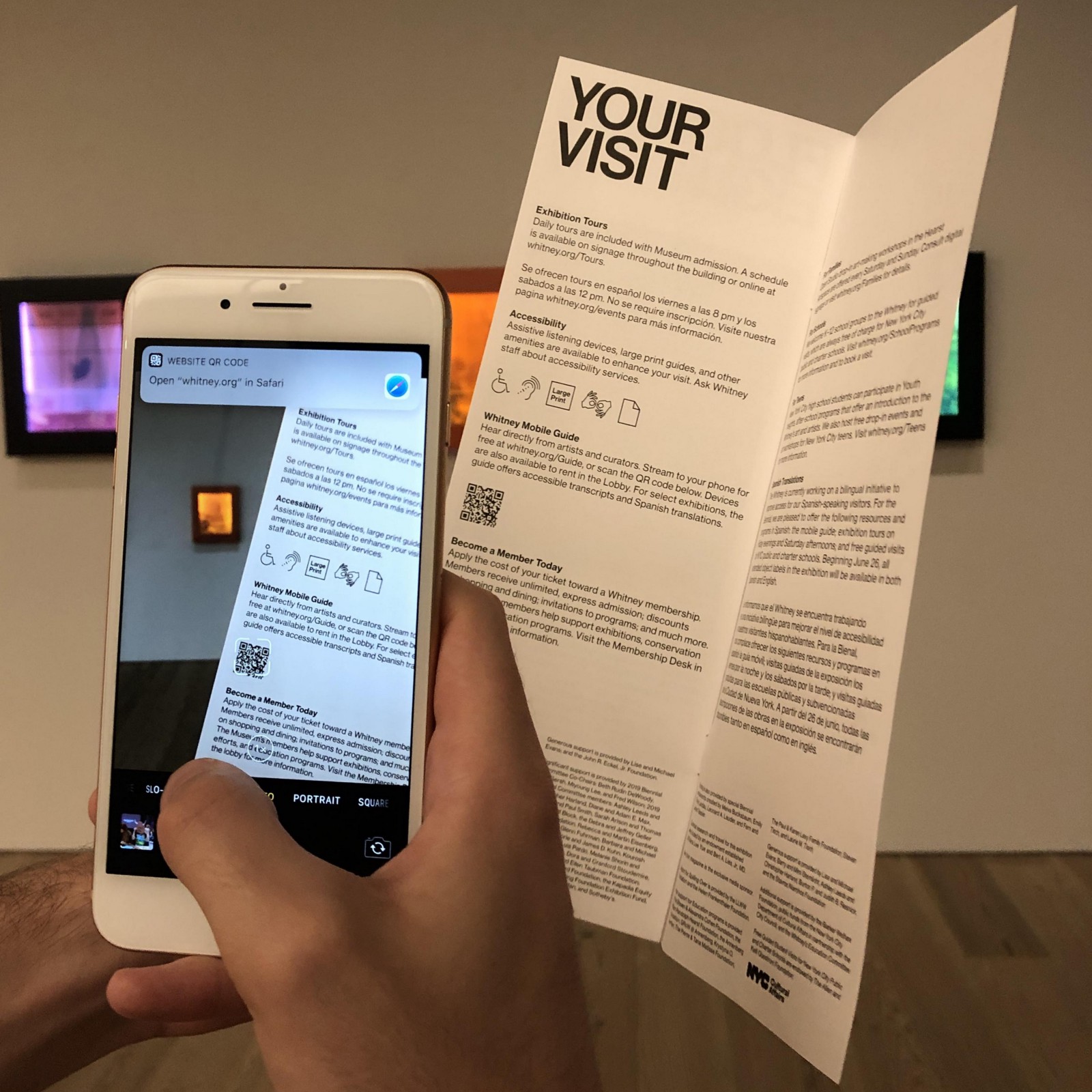
I can’t tell you if QR codes are dead, undead, or if they never died in the first place, but I can tell you we’ve been trialing them at the Whitney Museum of American Art over the last year. Anecdotally, everybody familiar with what QR codes are seems to have an anecdote about them, but we wanted to determine more systematically whether or not they might be a useful tool for driving visitors into digital content while at the Museum, with any meaningful levels of utilization. And as it turns out, for us, QR codes are alive and well.
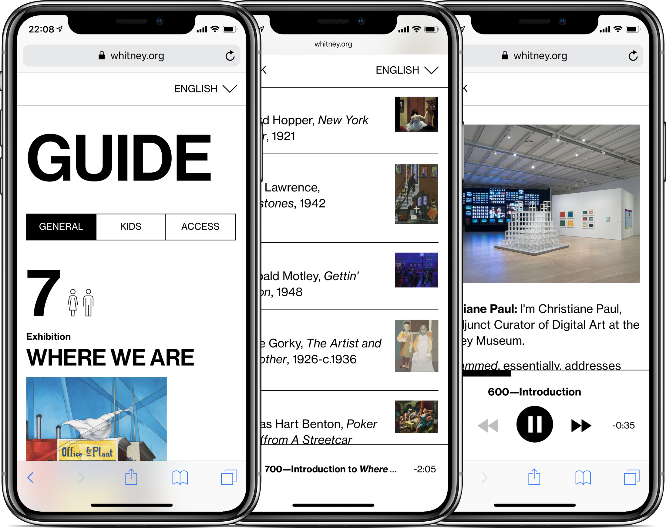
Connecting to the Mobile Guide
With our recently launched Mobile Guide one of our goals has been to get more people engaging with the experience on their own devices. To achieve that goal, we have to get visitors to open up a URL on their phone. That may sound small, but even little barriers can seriously affect take-up rates, as evidenced by the increasingly widespread death of the museum app (see: The Met, Tate, Guggenheim, etc.), in no small part due to the need to download what will for most visitors be a one-off experience. And while we can shorten the URL to something generally easy to read and type (whitney.org/guide), not all visitors are adept screen-typers, and this might be just enough to put them off if they didn’t already consider themselves “audio guide people”. Enter QR codes.
iOS 11 and a better QR experience
Historically, one of the biggest annoyances of QR codes has been the need to download an app just to read the codes, which could then open other apps or websites. Many Android phones have built in readers, but with our visitors skewing heavily towards the iPhone and the difficulties of messaging around different models of devices, that wasn’t particularly useful for us. With the release of iOS 11 in 2017 however, iPhones gained native QR scanning abilities in the camera app, opening up the viability of QR as a part of our digital strategy.
The benefit to being built-in to the native camera meant that nearly all of our visitors with smartphones would have a device that could seamlessly scan and open a URL to our Mobile Guide experience, without having to type anything in. For less tech-savvy visitors in particular, this is extremely useful, because even if they don’t know they have a reader in their camera, staff can reliably direct them to it faster than they can type in a URL, which can be subject to typos or other mistakes.
Starting the trial
Knowing that a significant portion of the museum’s visitors would at least technically be able to scan QR codes, we started placing the codes in a number of places throughout the building. Every QR code we placed led into our Mobile Guide, but the URLs were built slightly differently in each case so we could track a) the number of total QR scans and b) know which placements were the most effective. We did this by adding a unique query parameter to each QR code URL that would be picked up by our Google Analytics after the code was accessed.
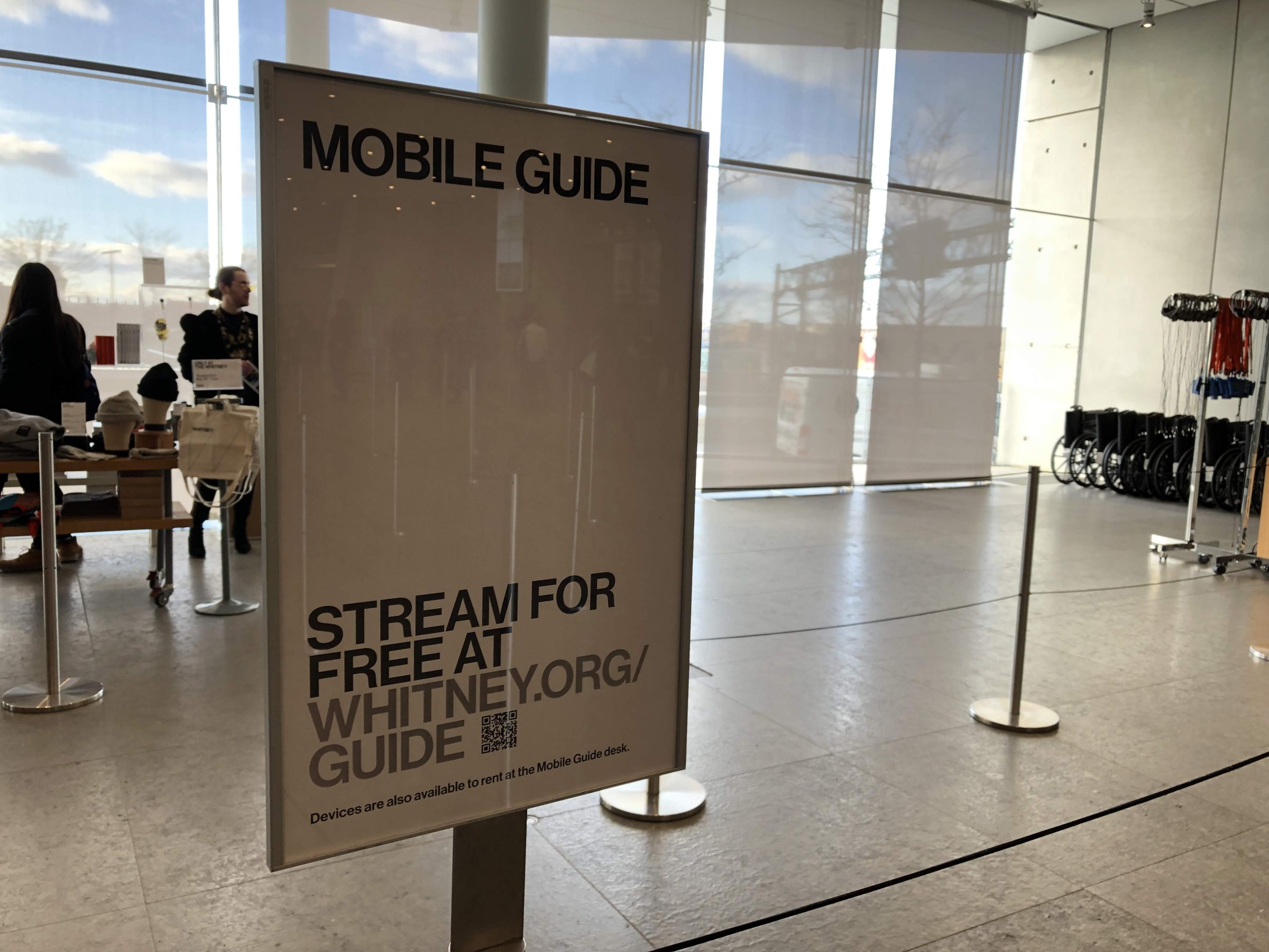
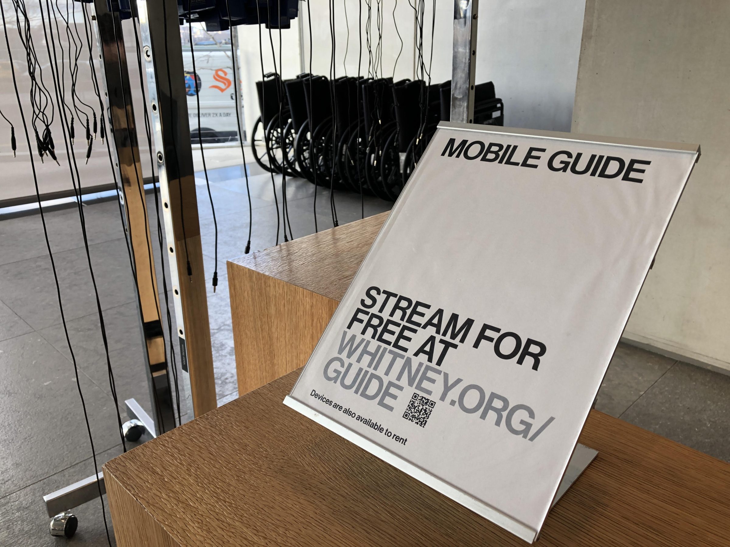
Gradually we rolled out QR codes in a number of locations across the museum. Those locations and their numbers of respective scans between Nov 2018 and May 2019 are listed below.
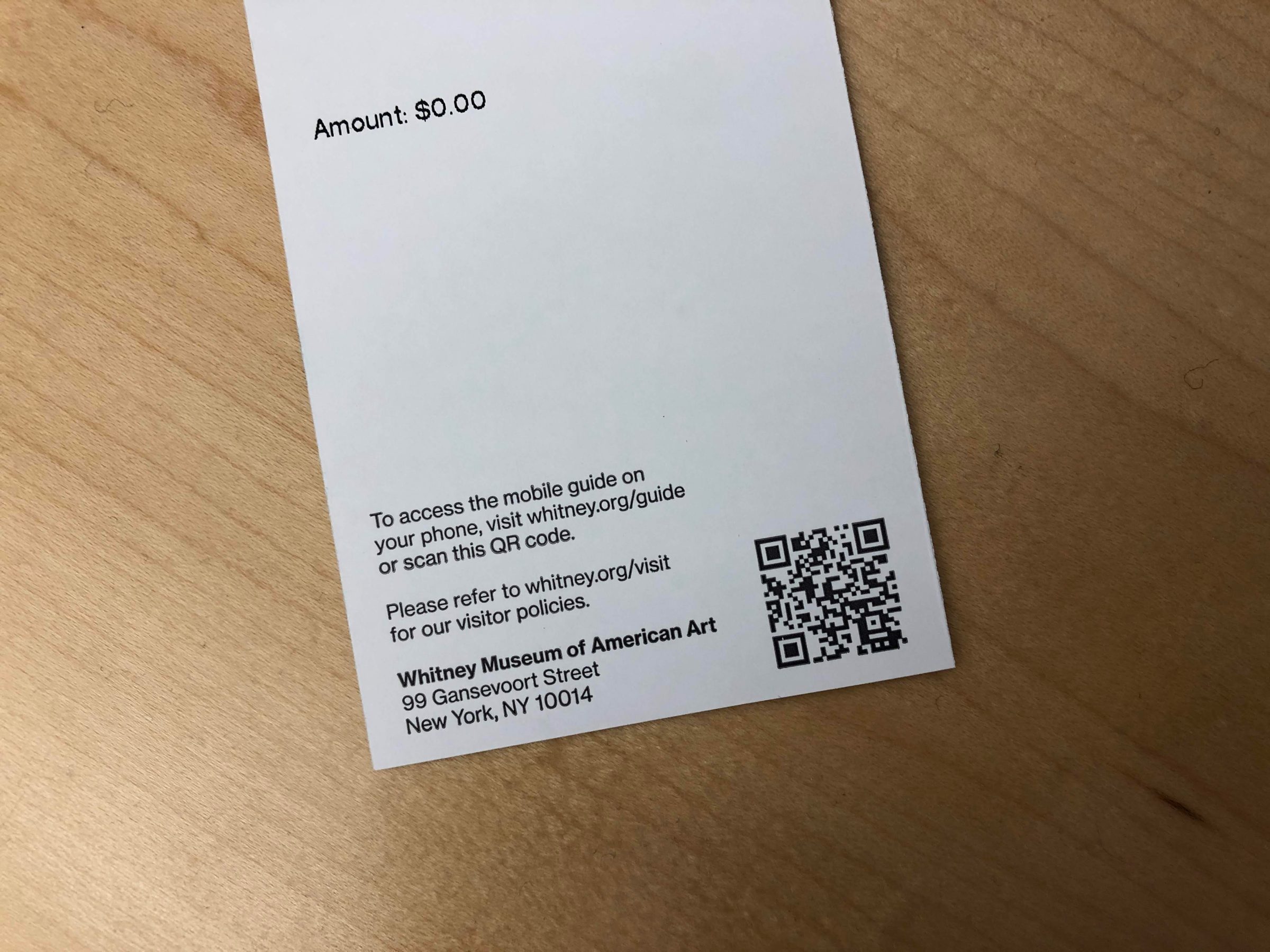
Tickets
4,169 scans
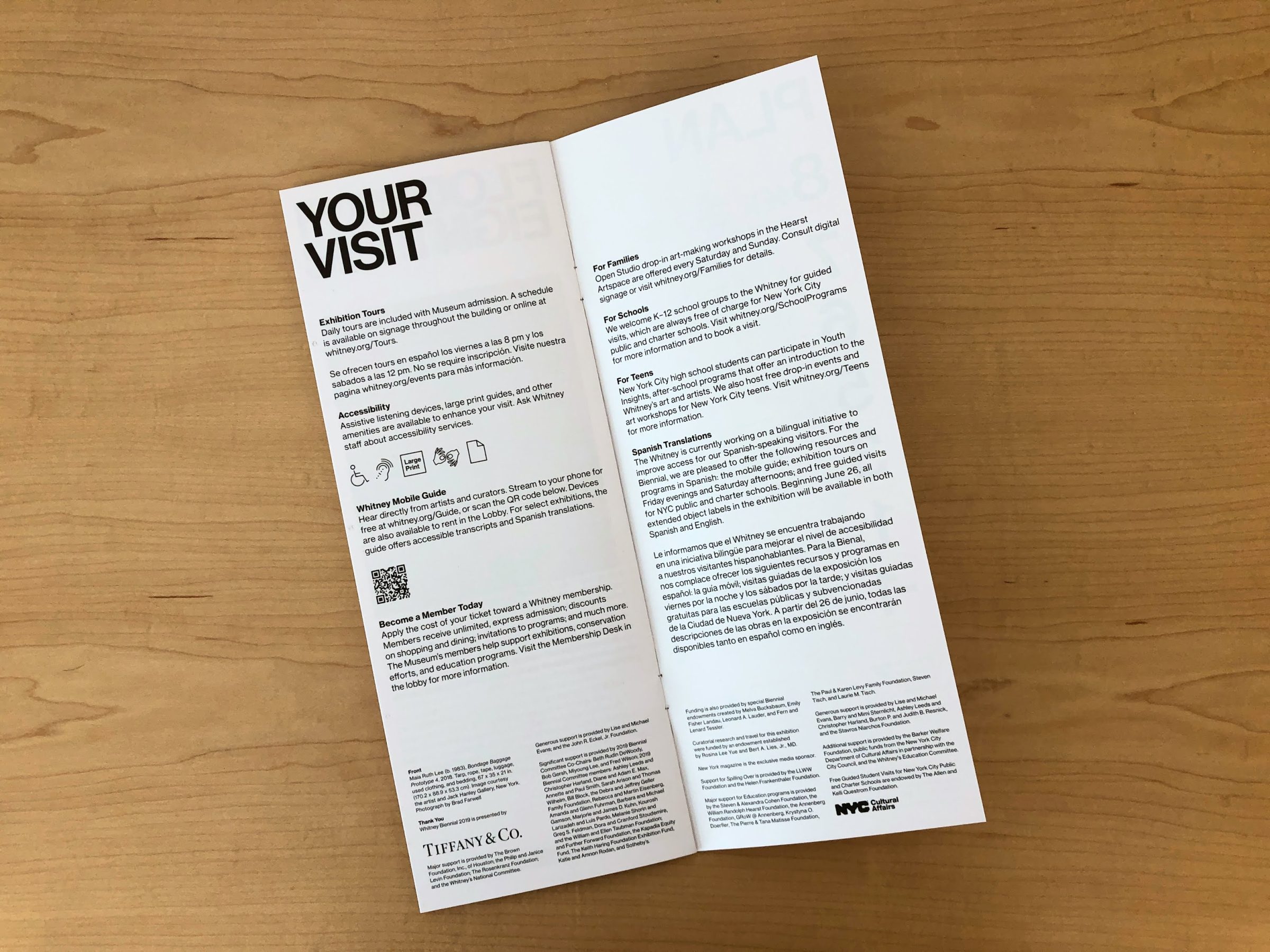
Museum guides
4,110 scans
Lobby stanchions
2,289 scans
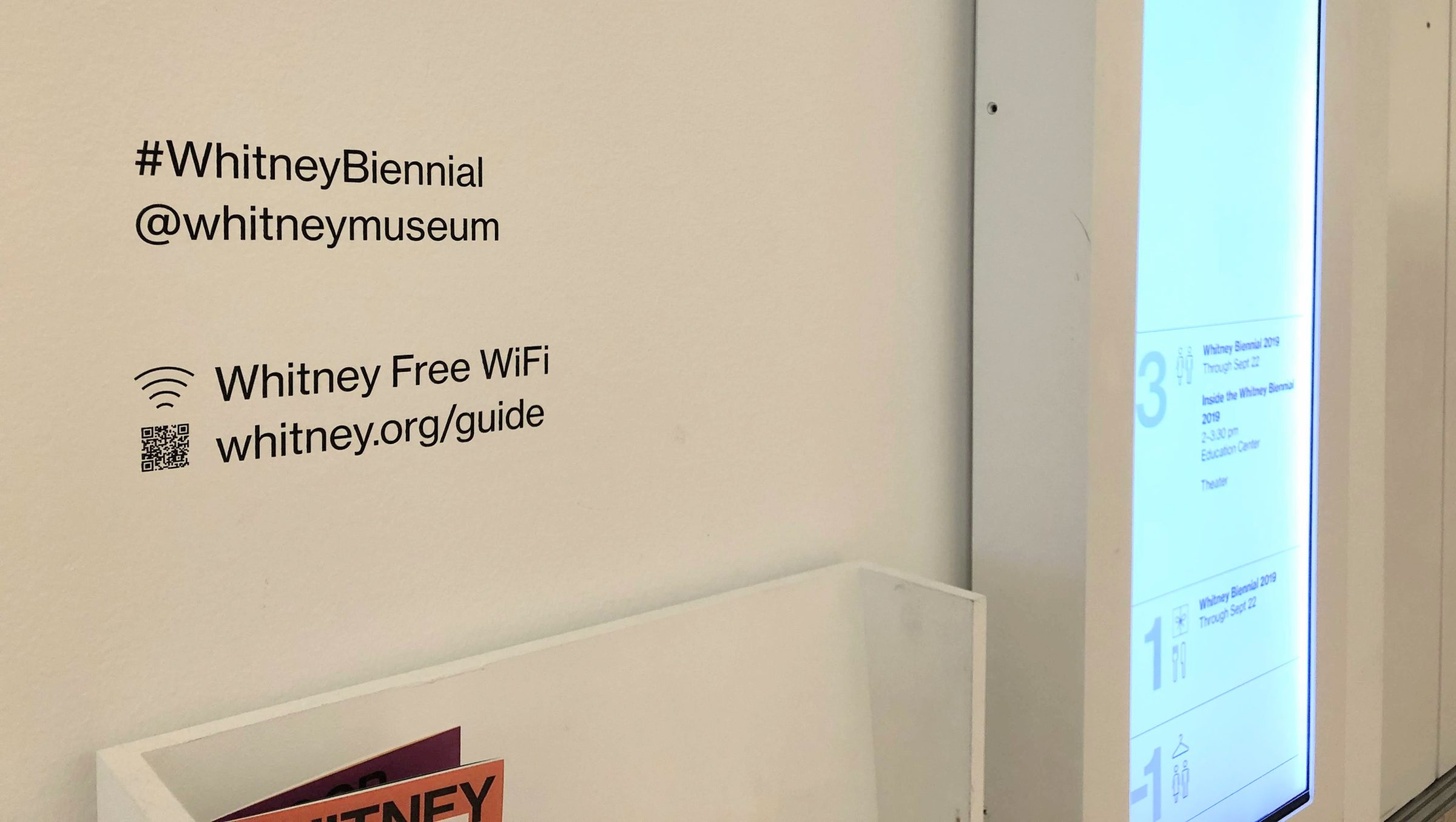
Elevator wall labels
745 scans

Tour stanchions
562 scans
Contextualizing the results
In total, we saw a total of 11,875 sessions from QR code scans (based on unique pageviews) from Nov 2018 to May 2019. Those sessions were initiated by approximately 7,100 users, out of a total Mobile Guide user base of nearly 34,000. And while the ratio of QR-begun sessions to total usage has shifted as certain wall vinyls have changed and ticket stock has rotated, overall QR scanning has been responsible for a significant portion of the Mobile Guide pick-up since we began rolling it out. That more than 1/5 visitors access the guide through a QR code is huge, and at certain points during the Warhol run of show it was responsible for more than 1/4.
Where we go from here
When we began talking about alternative ways to get visitors into the Mobile Guide, one of the most interesting options was just out of reach—NFC tags, which could be placed on signs, walls, counters, and anywhere else. Unfortunately, while most Android phones allow for URLs to be opened from a tap on an NFC tag, iPhones (at the time) did not outside of native NFC-reading apps. However, with the iPhone XS and XR, it appears that this is changing, which should eventually open up this option as consumers gradually replace their older devices. The clear benefit of NFC over QR in this case, is that with NFC visitors would not need to open even their camera, and could instead simply tap their devices at the counter as they enter and be on their way.
In the mean time, we are continuing to place QR codes throughout the museum, and adjusting our standard ticket to permanently include a code on the reverse.
TL;DR: Apparently QR codes work, pass it along.
Relaunching Softly: the Whitney’s Online Collection
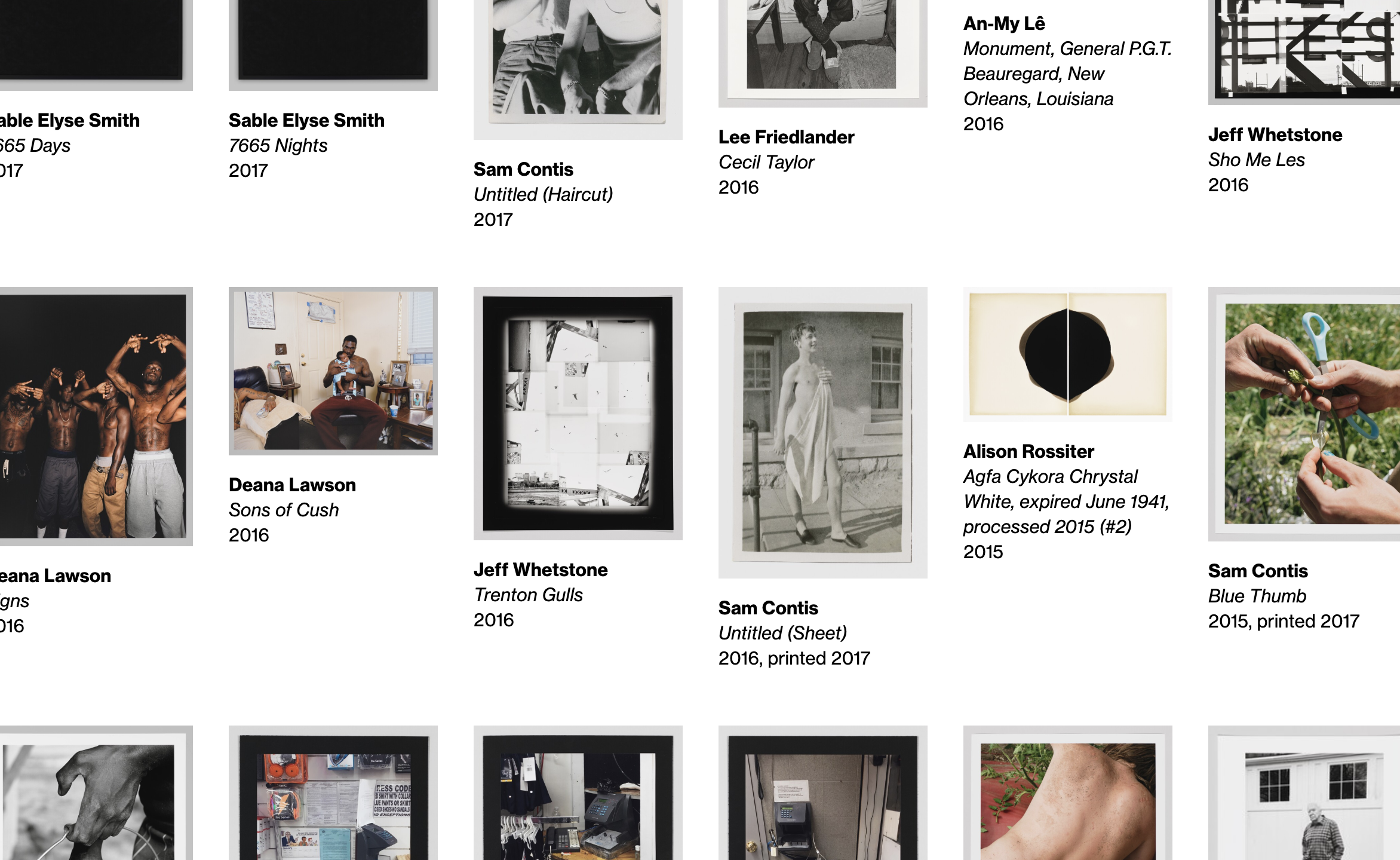
The Whitney’s collection defines and drives much of our mission and our work. It is a unique resource, offering a lens into the historical and contemporary landscape of American art through more than 3,400 artists and 23,000 works of art. With the opening of the Whitney’s new building in 2015, nearly every work in the Museum’s collection was made available online for the first time.
That the initial platform was developed and launched alongside a flurry of other initiatives reflects the challenges, scope, and successes of the release. And while the online collection has been something to celebrate, now coming on five years later we are ready to start making improvements.
Saying goodbye to collection.whitney.org
The core challenge of any museum’s online collection work is reflected in how many systems and limitations are in play, at all levels of any technical stack. When we first launched the complete online collection, Cogapp and Whitney staff worked together to build a solution that would push our data out of The Museum System (TMS), our database of record, and into forms usable publicly online. Previously the result of this effort lived at collection.whitney.org, which notably is separate from the primary hub of our content and information that lives at whitney.org. Having separate systems allowed for a simpler initial implementation of the collection, but as both the Museum and ambition has grown, so too has the need to bring these separate platforms together.
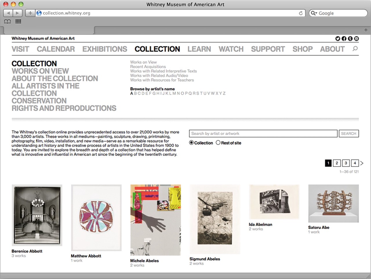
After the relaunch of whitney.org gradually (and also quietly) in 2017, we began laying the groundwork for pulling the collection into our new custom in-house-built Content Management System (CMS), biting off bits and pieces as we have been able, to slowly build out a solution behind the scenes. By the end of 2018, the collection was fully imported and integrated into whitney.org, syncing on a regular basis, and had a barebones but functional (and non-public) user interface. In short, we had built the majority of a new collection in quiet, as a non-project.
The reasons why we did things this way are complicated, but the succinct version is that while the online collection is important to everyone it is also rarely a priority. So much of what the Museum does on a day to day basis is tied to exhibition programming, either for current shows or those on the horizon, that carving out time to look back or undertake the difficult infrastructural work inherit to collections can be extremely difficult. In this light, performing the bulk of this project over a long period of time without a hard deadline was one of the only ways we could be sure it would happen. As the Museum’s Digital Media department, it is our responsibility to undertake this kind of work because it ties so closely to our mission to enable greater access to the art and Artists we represent, for anyone and everyone we can.
So that said, why build a new collection at all? What does integrating it into our primary web CMS get us that the separate platform did not? There are three main reasons:
1. Global improvements elsewhere on whitney.org improve the collection
As we’ve improved elements of whitney.org like the site’s navigation, font sizes, spacing, accessible markup, and other global aspects, none of those changes have previously fed back into the online collection due to it living on a separate platform. By integrating the two frontends into the same custom Ruby on Rails CMS, work that we do elsewhere will not need to be duplicated on the collection, and the collection will benefit from nearly two years worth of continual improvements to the main site.
2. Deeper and easier relationships between artists, artworks, and related content
In addition to global improvements, we can leverage Rails’ built-in relationship concepts that we use all across whitney.org, to draw links between the collection records and videos, audio, exhibitions, events, products, Whitney Stories, essays, and other online content. And while the previous platform did a certain level of this (through non-trivial manual efforts), by keeping it all within the same ecosystem it becomes both more expansive and easier to manage.
3. Simplified development going forward
Having two entirely separate stacks to produce visually comparable frontends is complicated, and requires separate development environments and domain expertise. By bringing much of the system into our primary CMS, it will take less time going forward to iterate on new features, and more of our code can be reused.
Beyond those three main reasons, there were a whole host of smaller ones, from improved accessibility, to mobile performance, to fixes for bugs, to new search and sort options. All of which on their own constitute major improvements, and ones that would be recognized as such both by internal stakeholders and the public. It is in that vein that we decided to launch what we had, softly, while also using it as a chance to prime our thoughts for what we could really offer with our online collection in the future.
What we launched
The updated online collection encompasses two main strands: one, an artist-centric approach, and the other an artwork-centric one. This is reflective of our positioning as the “Artists’ Museum”, and also the more standard need to surface what works are in the collection. Both sections are deeply interlinked, and are best thought of as two twinned entry points into the Whitney’s collection, history, and mission.
whitney.org/collection/works
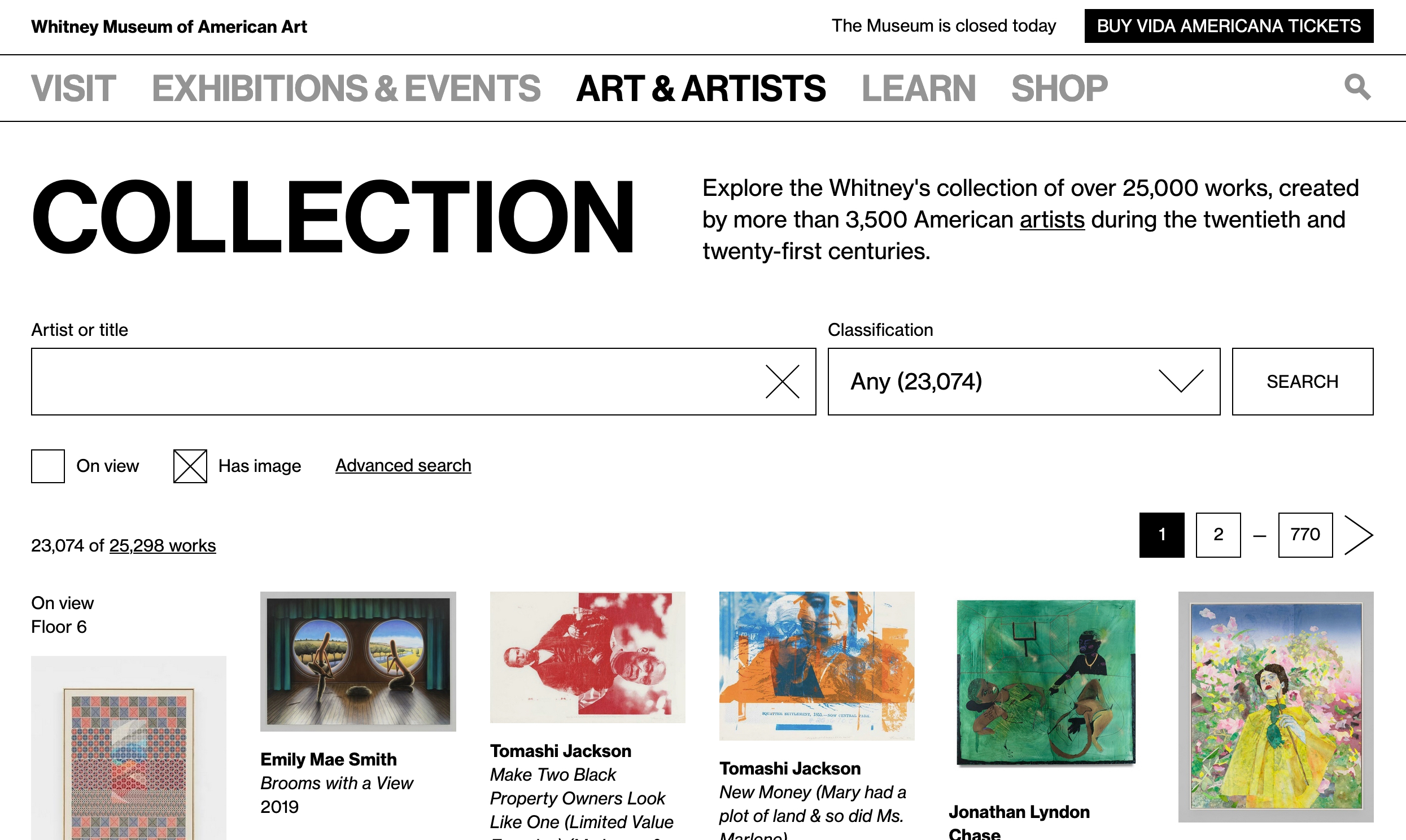
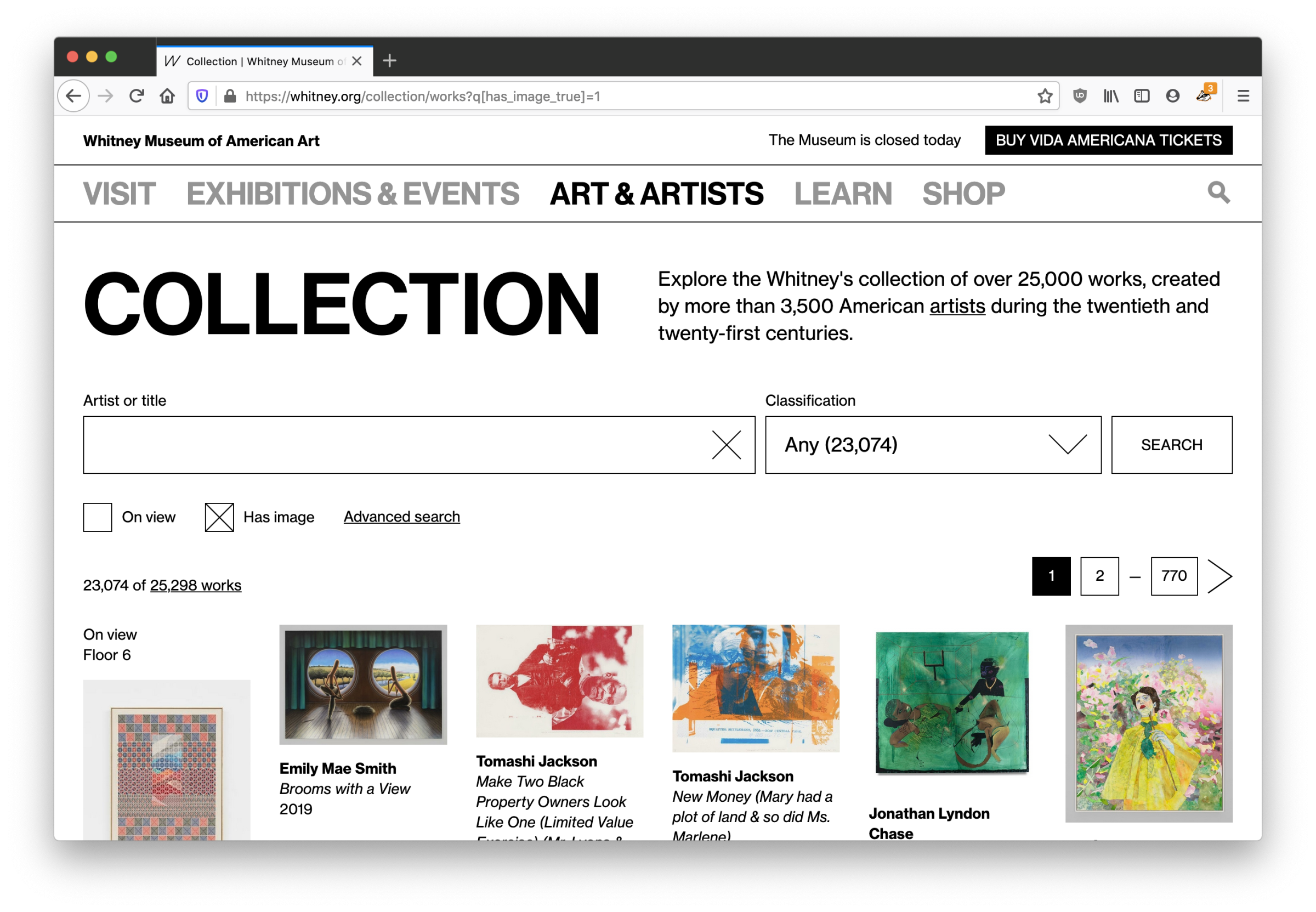
The bread and butter of any online collection is of course the art. Our updated whitney.org/collection/works page is the new hub for exploring what artworks are in the Whitney’s collection.
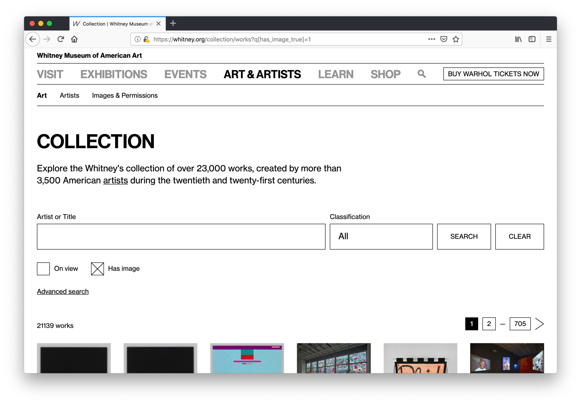
The biggest change from the old collection.whitney.org is that now all sorts and filters are featured on one page instead of being separated across many, and they can be combined and toggled on or off in concert with one another. Which means no more navigating distinctly between what’s “on view” and “works with audio or video”, or being unable to search within the selection of works that have complete object labels, or are on view, or any other qualification— all fields and properties can be leveraged as needed, from one page, with no limit or restrictions on how many can be active at once.
We’ve also taken the opportunity to start fixing certain features that over time drifted into non-functional states on the previous site, while also adding new ones including the ability to view only works that have images (a critical distinction for many users), and to filter by classification or medium. Most of these features take the form of extra fields (revealed by clicking “advanced search”), rather than a single integrated search box, which is something we will be closely monitoring and user testing.
One of the primary goals was to launch with as many search and sort options as possible so that we could see how each feature gets used in practice. Rather than launch a minimal viable product (MVP) we wanted to launch something closer to a maximum to give us the broadest possible scope of data on real usage. Once the trends start to become clear, we can then begin to pare back and invest development resources as the true needs continue to surface.
whitney.org/artists
The second of the two sections, whitney.org/artists, did not have a clear equivalent on the old collection.whitney.org, which was limited to showing lists of artists by the first letter of their last name. With all the artist data pulled into our primary CMS, we for the first time had the ability to reorganize and reframe this section into something more respectful of how we think about the Artists in our collection.
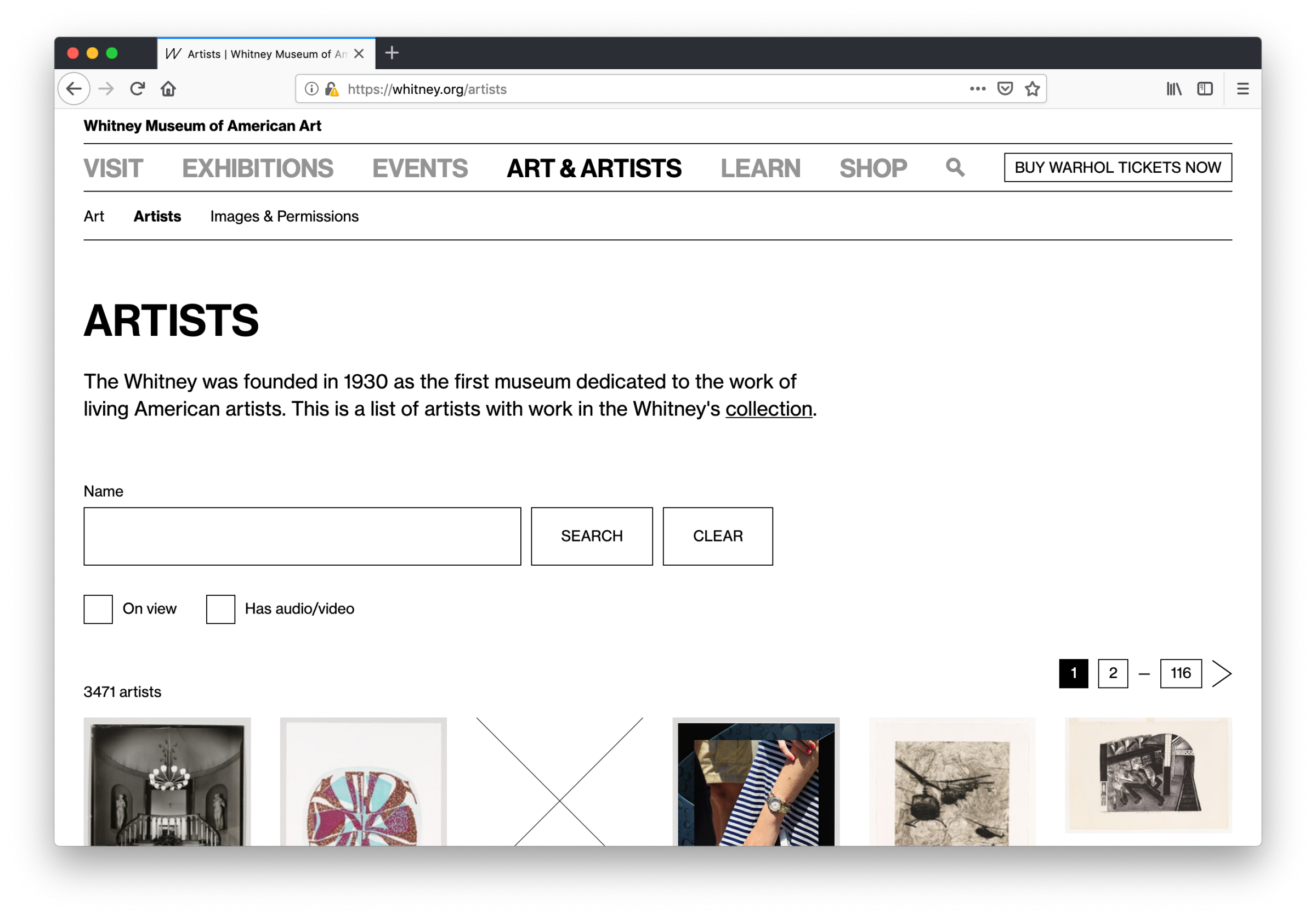
Similar to the more standard collection works view, we’ve also added new features here while fixing the intention behind some old ones: artists can be filtered by those that have works on view in current exhibitions, or by those that have audio or video content. Both are options that were not possible on the previous site, and in the case of the latter is a particularly large improvement — we generate a substantial amount of video content around particular artists that might not include any works in our collection, so under a system that only surfaces video if it’s tied to a specific work, much of our video would remain buried. By allowing for more content to be associated and discovered at the artist level, we are aligning better with our overall content strategy.
What comes next?
This is just the first initial step in bringing the collection closer to the rest of what we do online. With our new hubs for collection artists and artworks we can begin to analyze our data, user test with our colleagues and our visitors, and push forward in building an online collection that better reflects the Museum’s mission, and supports the artists within it.
The Whitney’s Mobile Guide
Dimensions of Museum Data
Google analytics was not built for the arts. Most of the time that’s fine: as a museum we still care about all kinds of standard metrics. Pageviews still matter, session behavior matters, referrals matter, ecommerce matters, and when we need something specific to our platform or its extensions we can usually cover it with custom event tracking or find another tool that can give us what we need. But as we’ve tried to more cohesively analyze data around our exhibitions, it’s become more and more labor intensive to identify the throughlines between content spread across different aspects of our online presence. There are a number of ways we’re working to answer this challenge, and one is through better utilizing custom dimensions.
What are custom dimensions?
Custom dimensions are a feature of Google analytics that allows you to create your own organizing principles for your data. For the Whitney, this means we could associate behavior by internally important concepts like exhibitions, events, artists, or visitor motivations. Dimensions can slice across all the metrics we already track, but allow for different ways to frame investigations of our content. They are effectively a label, following rules of our choosing, to brand existing data in ways that are meaningful for an art museum.
Isn’t there [x] [y] or [z] platform that could do this?
Adding more tags and the burden (both human and technical) of more platforms fragments our ability to cohesively analyze our data, and impacts our ability to answer basic questions about the things we do and the exhibitions and artists we support. What we need are faster ways to look at our data in the proper contexts, and as a relatively small organization we simply don’t have the time to be endlessly checking and supporting a large number of reporting platforms.
So how are custom dimensions useful in practice?
The original question that instigated much of our work with custom dimensions was, on the surface, a straightforward one:
“How can we measure of the performance of online exhibition content before, and after it opens?”
Fundamentally that’s a question with two primary components: 1) Time, and 2) Performance relative to that time. And both aspects are theoretically available with all of our existing web analytics data: we know when shows are open and when they’re closed, and we have all manner of metrics to track the videos and features that we could review during those windows. But what becomes immediately apparent after any attempt to start collecting that data for review is just how much labor would be involved in comparing across exhibitions.
Exhibitions do not all open at the same time, and they don’t close at the same time. Shows are almost always operating under their own schedules, so something as basic as choosing the time range in Google Analytics becomes horrendously tedious as it means doing separate reporting for each and every show, since Google Analytics has no concept of an exhibition opening date. And even if that were feasible for a small team, the second ruining factor for this approach is that not all of our exhibition focused content lives on a single page — important media like essays, or audio guides, or Whitney Stories live outside the traditional exhibition pages we put together, so any review centered only on say whitney.org/exhibitions/programmed, won’t cover everything we need it to. And that isn’t even starting to cover related behavior that is absolutely tied to exhibition performance like selling tickets or memberships online, or diving into other related resources like the collection or events.
In short, exhibition performance depends on multiple aspects of whitney.org, and a concept of time that is not natively accessible within Google Analytics.
Solving the problem
Starting with the assumption that someone interested in an exhibition will visit the exhibition page on whitney.org, we built out a number of custom dimensions to assist us in tracking exhibition performance across the site. The dimensions we added for exhibitions all depend on a user first visiting an exhibition page. Once they’ve done that, their session is tagged with three dimensions:
- Exhibition. The title of the exhibition.
- Exhibition phase. “Present,” “future,” or “past” depending on if the exhibition is currently open, yet to open, or closed.
- Exhibition relative date. A numerical value representing the number of days from the opening date (4 days before would be “-4”, 10 days after would be “10”, and opening day would be “0”).
With these three dimensions in place it becomes possible to build segments or reports based only on a single exhibition, but review data from everything they did across the site during that session, from watching videos to diving into the collection after reading about a show to purchasing tickets. It also becomes possible to build reports for all exhibitions, but limit it to a specific phase (e.g., pre-opening), or an exact range of days (e.g., the week before opening). All of that data was possible to gather before, but by building the attribution into the Google Analytics structure it becomes far less labor intensive.
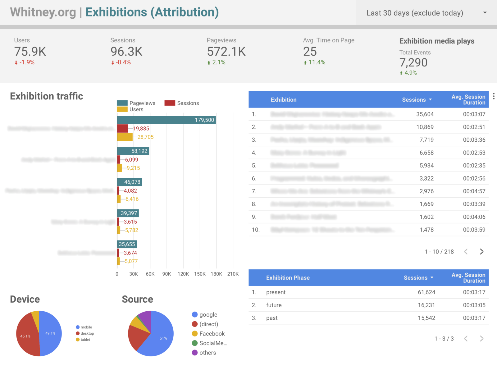
Outside of answering the original question of what performance looks like before and after an exhibition opens, this approach offers up a host of other interesting ways to slice our data. One of the most significant is in being able to easily attribute our ticket and membership sales to specific exhibitions. Prior to these dimensions, it was possible to build segments that filtered based on sessions that included specific exhibition pages, and review ecommerce conversion rates, but with the updated tracking in place it became trivial to setup Data Studio dashboards that labeled transactions by exhibition title rather than by url (which is not a small gain in terms of readability and by extension share-ability), alongside all sorts of other metrics.
Again the benefit is less about enabling technically new data, than offering up easier and more human-friendly ways to view it. Instead of manually checking the dates for a specific exhibition it is now possible for us to create reports framed in ways that cover many. Considering the last 9 months of exhibition data since the start of 2018, some of the points that are now easy to pull include:
- 66% of exhibition traffic has been to exhibitions while they were open, 19% to ones that were closed, and 15% to ones opening in the future.
- Users viewing presently open exhibitions spent 20% longer on the site on average than those looking at past or upcoming ones.
- 83% of exhibition-driven revenue came from shows that were currently open, and 16% from ones opening in the future.
- 76% of exhibition-associated audio guides views came from shows that were currently open, and 20% from ones that have already closed.
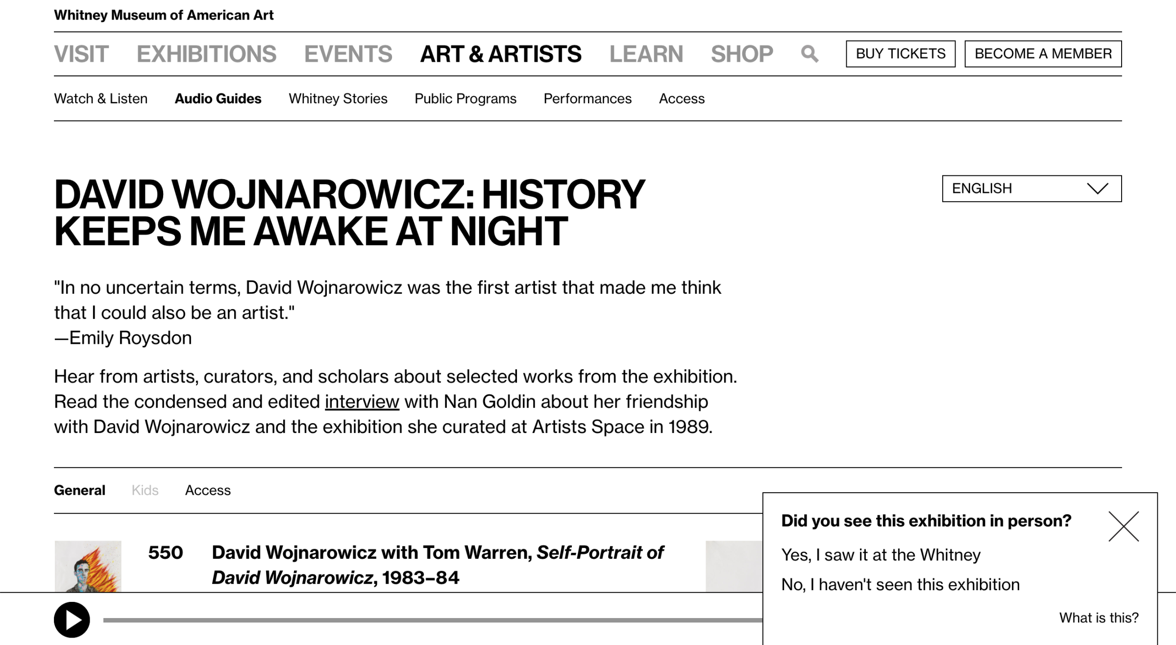
So far the top traffic (opening, +58, +1) and top earning days (-98, +60, -97) for our exhibition pages have been a bit a bit all over the place, reflecting specific news events and marketing efforts, which suggests that much of this sort of data will take time to settle into clearer trends. However, much of these kinds of time-based comparisons can be supported through other investigative methods. For example, in the case of audio guide usage, we ran a one question motivation survey on the audio guide section of the site asking users if they had seen the associated exhibition at the Whitney. Of the 964 responses we collected, 69% of those users said they had seen the show, and the remaining 31% that they had not. Combined with the data point above, it is clear that the majority of external-to-the-building audio guide usage occurs post-visit, after seeing the show and while it is still open.
What are the limitations?
All that said, one really critical assumption here is that most users are visiting only one exhibition page, or that the last exhibition they view is the most important one for the purposes of our data (as that last-view will override any earlier exhibition-related values for their session). Given our usage data on whitney.org, this seemed reasonable given the small fraction of users that view multiple exhibition pages during a session, but it is important to keep in mind.
What else can this kind of approach be used for?
Aside from the three exhibition-focused dimensions discussed here, we have 9 others that cover other aspects of the site. Three are used in the same way as exhibitions for events, and the remaining 6 are used for things like tracking audio guide and Mobile Guide usage, language settings, and visitor motivations (look for a future post for a deep dive on that). By re-framing how we could consider our exhibition analytics data, other avenues for improvement quickly presented themselves.
Conclusion
Google Analytics custom dimensions have been a vital part of our journey to be able to consistently and useful report on our exhibition performance. The challenge of answering our original question is still ongoing, in large part because of the need of having to see multiple shows go through our updated data-collecting process, but also because we are still figuring out what metrics are meaningful for our particular content.
Understanding our audiences: The Whitney’s Website Visitor Survey and its broader context
I was part of a presentation at MCN 2018 on a visitor motivation survey (VMS) we ran on whitney.org. As a group we covered the context of motivation-based surveys at museums and some key learnings for the Whitney, both in results and in strategy.
